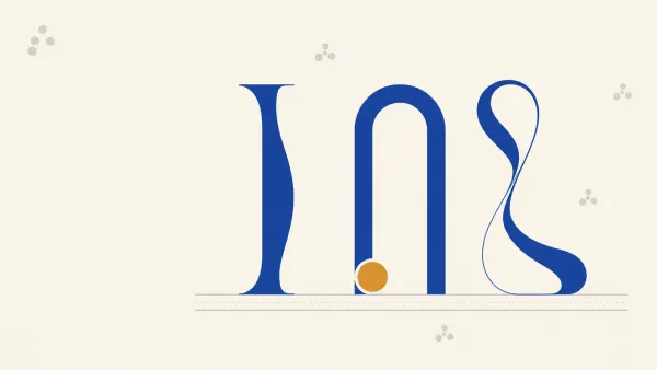
Building a logo from perfect circles and rectangles rather than freehand pen-tooling is not just a design preference. It has real consequences downstream, on business cards, corflute signs, vehicle wraps, and every other surface the brand ends up on. Clean geometry reproduces predictably. Hand-drawn curves that look right on screen can betray you when they are scaled to three metres or reversed out of a dark background at small size on a business card.
The shape builder tool, available in Illustrator, Affinity Designer and most modern vector apps, lets you construct logos by combining and subtracting perfect primitives instead of drawing every curve by hand. It is faster, more editable, and produces geometry a printer can trust.
Here is how the workflow runs, and why it matters when the file lands on a press.
Why geometric construction beats pen-tooling for print
Pen-tooling a logo from a sketch is fine for a bespoke, hand-lettered look. But when a client wants a clean modern mark, the kind that has to work on a roll-up banner, a label, and an engraved product tag, every curve should be mathematically consistent.
Three practical reasons this matters for production:
- Scaling behaviour. A circle with a defined radius will always look like the same circle at 20mm or 2m. A hand-drawn "circle-ish" curve will show its wobble as it scales up on signage.
- Reversibility. When a logo has to run in negative, white on black or knocked out of a photo on a pull-up banner, asymmetric curves suddenly look lopsided. Geometric marks stay balanced.
- Editability. Clients change their minds. A logo built from primitives can be re-spaced, re-weighted, or re-proportioned in minutes. A pen-tooled mark often has to be rebuilt.
The shape builder tool in plain terms
The tool does two things. It adds overlapping shapes into a single path, and it subtracts intersecting regions to carve shapes out.
That is it. Two operations. But it changes how you think about building a logo.
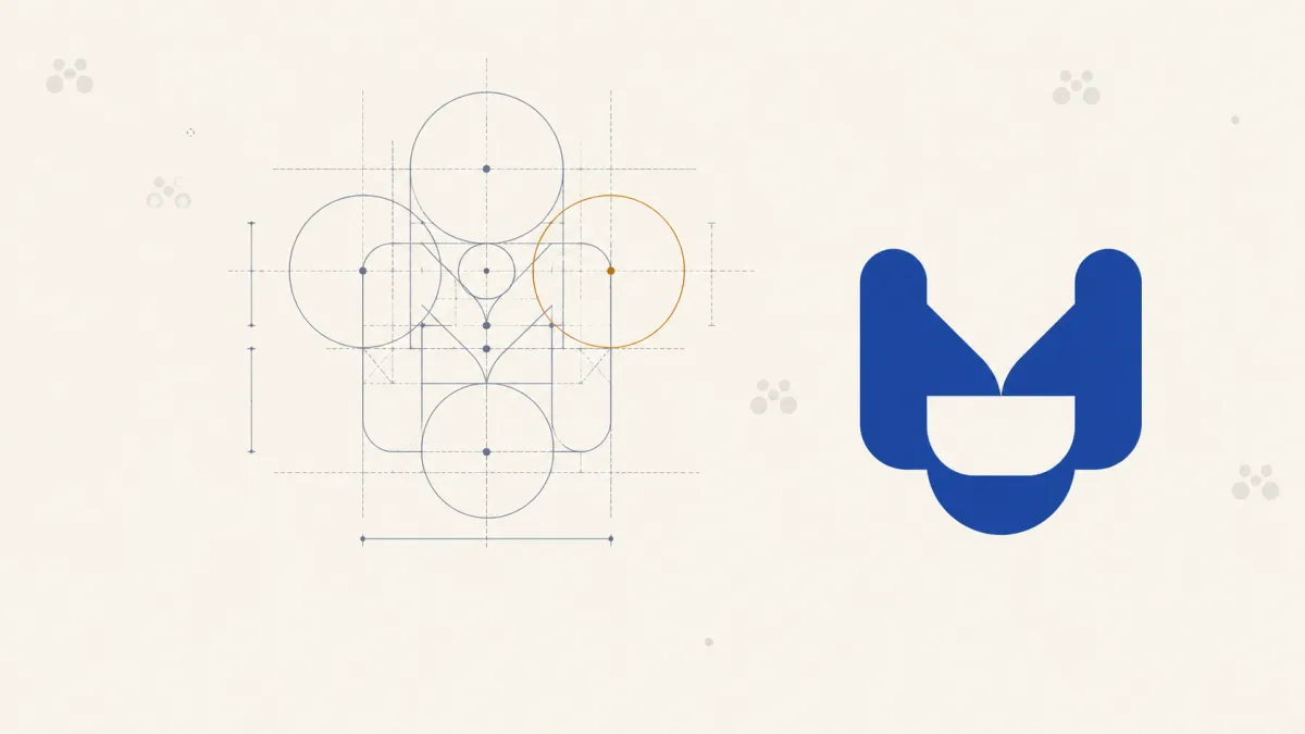
Instead of drawing an "S" curve by hand, you construct it out of rectangles and circles positioned on a grid, then merge and subtract until only the letterform remains. The result is a vector where every curve has a defined radius, every straight edge is truly straight, and every join is a clean tangent.
The same tool underpins other construction techniques too. Our walkthrough on building a modern gradient logo icon for print uses it to carve offset bands through a letterform rather than to build hard geometry.
Building an "S" from primitives
Here is the construction logic, using an S as the example. The same approach works for almost any geometric mark.
- Start with the backbone. Drop a rectangle for the main stroke of the S. Use a stroke with no fill, so you can see the geometry while you work.
- Add corner circles. Place perfect circles at each end where you want the S to curve. Align the circle diameter to the rectangle's width, which guarantees the curves flow into the straight sections without a kink.
- Copy and mirror. Duplicate the rectangle-plus-circles arrangement, flip it, and position it to form the opposite curve of the S.
- Add the hinge circle. Where the two curves meet in the middle, drop another circle sized to match. This is the pivot that ties the whole letterform together.
- Merge and subtract. Select everything, then use the shape builder's plus to merge the shapes into a single form. Use the minus to remove the interior regions you do not want, which are the negative spaces inside the curves.
What you are left with is a perfectly geometric S. No pen tool. No hand-drawn curves. Every arc has a defined radius. Every stroke is a defined width.
Why this matters when the file goes to press
A logo built this way behaves predictably across every product a brand needs. That is the connection worth making explicit.
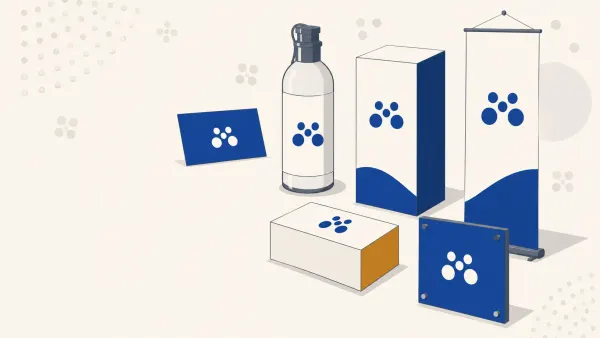
On business cards and small print. Thin sections of hand-drawn curves can pinch to nothing at small sizes. Geometric construction gives you a defined minimum stroke width you can measure and enforce, which is critical for maintaining legibility when the mark is embossed, foiled, or printed very small.
On large-format signage. Scale a hand-drawn logo to over a metre wide on corflute and every inconsistency becomes visible from across a car park. Geometric marks scale without exposing their construction.
On rolls and labels. When a logo is repeated thousands of times on labels on rolls, tiny inconsistencies stack up visually across a sheet. Clean geometry keeps the mark tight at every impression.
On vehicle wraps and pull-up banners. These formats often crop, reverse, or overlay the logo. A geometrically balanced mark survives all three. A pen-tooled one often does not.
Working with sketches: hand-drawn feel, geometric build
None of this means abandoning sketching. The best geometric logos still start on paper or in Procreate. The sketch establishes proportion, weight, and character. The vector build then translates that intent into precise geometry.
Two ways to run this workflow:
- Sketch, then rebuild. Import the sketch as a reference layer. Ignore its exact curves and build clean primitives that match its proportions. The final logo captures the spirit of the sketch, not its wobbles.
- Sketch, refine, then rebuild the tight sections. Keep hand-drawn character where it belongs, in a rough terminal or an organic swash, and use shape builder for the parts that need to be dead consistent: counters, joins, repeated strokes.
File preparation checklist before sending to a trade printer
Once the logo is built, a few production checks save trouble downstream:
- Convert to outlines. Any type components should be outlined before supply, so there is no font substitution risk.
- Check stroke widths. Very fine strokes are unreliable at final print size and are the first thing to drop out at distance on large format. Convert strokes to filled shapes so widths scale correctly with the artwork.
- Colour mode. Screen-designed logos in RGB will shift when converted to CMYK. Vibrant blues, greens, and oranges are the usual casualties. Convert early and adjust so the client approves the CMYK version, not the RGB one.
- Supply as vector. PDF or AI, not a rasterised PNG. Trade printers need the vector to scale cleanly and to handle edges correctly on press.
- Include a mono version. One-colour black, one-colour white, and full-colour at minimum. Every brand needs all three for real-world print applications.
When geometric construction isn't the right answer
Honest caveat: not every logo should be built this way. Script logos, hand-lettered marks, illustrative brand marks, and heritage-style identities often need the character that only hand-drawn curves provide. The shape builder workflow shines for modern, geometric, systematised identities: monogram marks, letterforms with strong straight-and-curve contrast, and app icons.
Match the technique to the brief.
Frequently Asked Questions
What does the shape builder tool actually do? It performs two operations on overlapping shapes: adding them together into a single path, and subtracting the intersecting regions to carve pieces away. That is enough to construct complex letterforms and marks entirely from circles and rectangles, without drawing a single curve by hand.
Why build a logo from primitives instead of using the pen tool? Because the geometry becomes measurable and repeatable. Every arc has a defined radius and every stroke a defined width, so the mark scales from a business card to a vehicle wrap without exposing wobbles, stays balanced when reversed out, and can be re-proportioned quickly when a client changes their mind.
Do I have to give up sketching? No. Sketching is still the fastest way to establish proportion, weight and character. Import the sketch as a reference layer and rebuild it with clean primitives that match its proportions, so the final mark keeps the spirit of the sketch without inheriting its inconsistencies.
Is geometric construction right for every logo? No. Script wordmarks, hand-lettered marks and illustrative or heritage identities usually need the character that hand-drawn curves provide. Geometric construction suits modern, systematised marks such as monograms, app icons and letterforms with strong straight-and-curve contrast.
What should I check before sending a logo to a trade printer? Outline any type, convert strokes to filled shapes so widths scale with the artwork, convert to CMYK and get client approval on that version rather than the RGB one, supply vector rather than raster, and include mono black and reversed white variants alongside the full-colour master.
Key Takeaways
- The shape builder tool constructs logos from primitives using merge and subtract operations, with no pen-tooling required.
- Geometrically built logos scale predictably from business cards to large-format signage, reverse cleanly, and stay balanced in negative space.
- Align circle diameters to rectangle widths so curves flow into straights without kinks.
- Before sending to a trade printer: outline fonts, check stroke widths, convert to CMYK, supply as vector, and include mono variants.
- Geometric construction suits modern, systematised identities. Script and illustrative marks still call for hand-drawn curves.
When the logo's done, we'll handle the rest
A clean vector is the first half of a good print job. Faithful reproduction across every substrate the brand touches is the second half. Mediapoint runs trade printing for designers, resellers, and sign shops across Australia: business cards, corflute, banners, labels, vehicle graphics, the lot. Once the identity is locked, browse the full catalogue or send us the artwork for a quote.