Trusted by 1,000+ Australian Print Resellers

Reliable Lead Times & Delivery Dates

Blind Shipped or White-Labelled

envelopeenvelope-active
notificationnotifications
cartcart
useruser

Logo Design for Print: Bridging Brand Identity to Production

Logo Design for Print: Bridging Brand Identity to Production

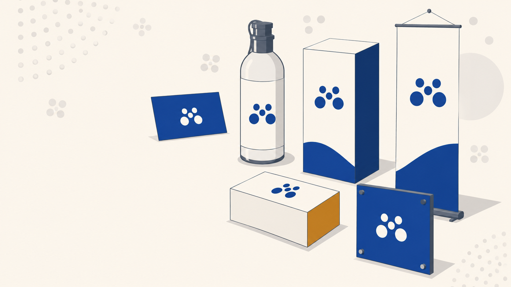
Every logo eventually leaves the screen. It gets embossed on a business card, stretched across a pull-up banner, wrapped around a vehicle, or die-cut into a label. That is when the design decisions made in Illustrator start showing their real character. The good ones hold up, and the weak ones fall apart.

There are three attributes that consistently define a good logo: simplicity, legibility, and appropriateness. They are not new ideas, but they matter more than ever when a single mark has to reproduce cleanly across a dozen different substrates. Here is how each one behaves once the file goes to print.

Simplicity: the attribute that survives scaling

Simplicity is the foundation. A logo has to work when it is scaled up onto a shopfront and scaled down onto a pen. The simpler the mark, the more it holds together across that range.

On screen, complexity is forgiving. Fine detail, subtle gradients, and delicate line work all render fine at 300% zoom on a high-resolution display. On press, none of that is guaranteed.

What simplicity means in production terms:

  • Thin lines vanish at small sizes. A hairline stroke that looks crisp in your artboard can drop out entirely when printed at business card scale, especially on uncoated or textured stocks where ink spreads slightly into the fibres.
  • Fine detail muddies on large-format substrates. Push that same logo onto a mesh banner and any intricate inner detail turns into visual noise once you factor in the mesh perforations and typical viewing distance.
  • Complex marks cost more to reproduce faithfully. Foil stamping, embossing, screen printing on merchandise and vinyl cutting for signage all reward simple, bold shapes and punish fussy detail.

If a logo cannot survive being reproduced at around 15mm wide in a single flat colour, it is not simple enough. That is the working test.

Legibility: readable at every size, on every substrate

Legibility is separate from simplicity. A logotype can be visually simple and still unreadable if the letterforms are too tight, too thin, or too clever.

The question to ask is whether someone can read this from across a car park when it is on signage, and read it on a business card held at arm's length. Both extremes need to work.

Where legibility breaks down in print:

  • Tight letter spacing looks refined at 200pt but fills in with ink at 8pt. Letters merge, and the wordmark becomes a shape rather than a word.
  • Ultra-thin display fonts disappear when reversed out of a dark background on outdoor signage, where the print process and the viewing distance both work against fine strokes.
  • Low-contrast colour pairs that pass on-screen can shift once converted to CMYK. A soft grey on cream might have plenty of contrast on your monitor and almost none on a printed page.

Much of this comes back to the typeface itself, and our guide to choosing brand fonts that print well covers how serif, sans and script each behave once they are printed small.

Build the logo at its smallest intended size and test it there first. If it holds at that size, it will hold everywhere else. If it does not, no amount of scaling up will fix the underlying problem.

Appropriateness: does the mark match the industry?

The third attribute is appropriateness, meaning whether the logo fits the industry it represents. A funeral home with a novelty wordmark in hot pink is not going to build trust. A children's toy brand with a stark, brutalist mark will not feel warm.

That said, appropriateness is not a straitjacket. If every designer defaulted to the obvious visual language of an industry, every accountant would have a blue serif logo and every café would have a hand-drawn coffee cup. There is room to push against the expected, as long as the mark still communicates something honest about the business.

The tension is this: appropriate enough that the audience gets it instantly, distinct enough that it does not blend into every competitor.

Originality is overrated, systems are not

Chasing pure originality is usually a trap. The more determined a designer is to create something completely unlike anything else, the further they tend to drift from what actually works.

Logo design is largely a system. Certain shapes read as trustworthy, certain type pairings read as premium, certain proportions read as balanced. Working within that system is not a failure of creativity. It is how you produce marks that function.

The useful reframing comes from Austin Kleon's book Steal Like an Artist: nothing is truly original. Every designer is shaped by the work they have seen, the environment they are in, the music they listen to. Pulling influence from other logos, illustrations, and imagery is part of the process, not by copying, but by absorbing how other designers have solved similar problems.

That is different from stealing. Taking a whole mark and tweaking it is not design work. But being influenced by a shape here, a construction principle there, a colour approach from something entirely unrelated, that is how good work gets made.

How this affects print production

Every one of these attributes has a downstream consequence when the logo goes to press. A few practical notes worth flagging:

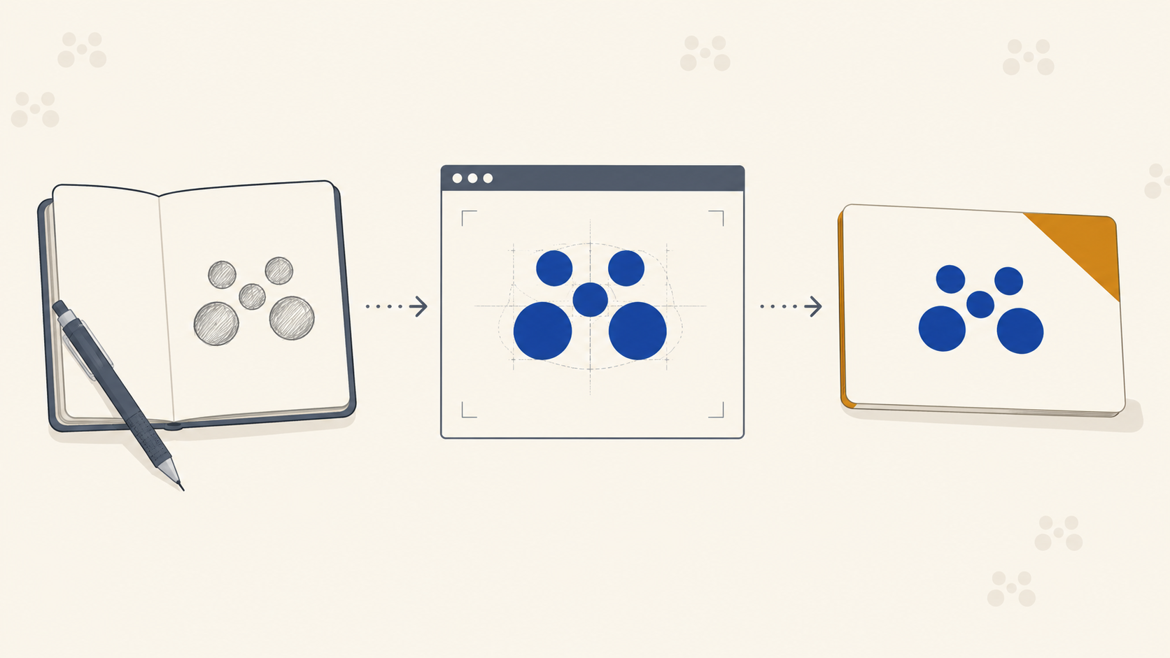
  • Build in vector. Every logo should be finalised as vector artwork. Raster logos fall apart the moment they are scaled beyond their native resolution, and any large-format print will expose that immediately. Our walkthrough on taking a logo from sketch to production-ready mark covers that conversion properly.
  • Test in CMYK early. Colours that look punchy in RGB can go flat or muddy in CMYK. Bright oranges dull, vibrant blues shift toward purple, and neon greens are close to impossible to reproduce in standard four-colour process. If the brand relies on a specific colour, specify it as a Pantone and check the CMYK equivalent before signing off.
  • Design a small-scale version. A logo lockup that includes a tagline or fine detail often needs a simplified version for small applications. Build that variant during the identity phase, not later when a client is trying to fit the logo onto a swing tag.
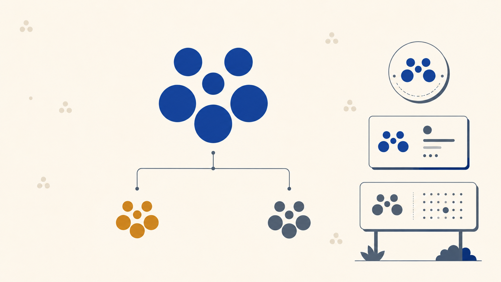
  • Consider single-colour reproduction. At some point the logo will need to work in one colour, for embroidery, foil, engraving, or single-colour print on labels. If the mark relies on colour separation to make sense, it will struggle.

Research is where the work actually starts

Before any of the above matters, there is the research phase: understanding the client, the industry, and what other brands in that space are doing. Skipping this is how designers end up producing something that is technically well-crafted but competitively invisible or wildly off-brief.

Look at the direct competitors. Look at adjacent industries for inspiration. Look at what has been done to death and needs to be avoided. That research is what tells you where "appropriate" ends and "distinctive" begins for this specific client.

Frequently Asked Questions

What makes a good logo? Three attributes do most of the work: simplicity, so the mark survives being scaled from a swing tag to a shopfront; legibility, so it reads at every size and on every substrate; and appropriateness, so it fits the industry it represents without disappearing into it. A mark that satisfies all three will reproduce reliably across every product a brand needs.

How do I know if my logo is simple enough? Reproduce it at around 15mm wide in a single flat colour. If the detail holds and the mark is still recognisable, it is simple enough. If fine lines drop out or inner detail turns to mush, the design needs simplifying before it goes anywhere near a press.

Does a logo need to look like others in its industry? It needs to be legible to that industry's audience, not identical to its competitors. Appropriateness means the mark communicates something honest about the business quickly. Within that, there is real room to differentiate, and the best marks are usually the ones that sit just outside the expected visual language without abandoning it.

Is it acceptable to take inspiration from other logos? Absorbing how other designers have solved similar problems is a normal part of the craft. Studying construction, proportion and colour approaches across other work, including work from unrelated fields, is how designers develop judgement. Taking a finished mark and tweaking it is not that, and it is not design work.

Why does my logo need a single-colour version? Because plenty of applications cannot reproduce colour at all. Embroidery, foil stamping, engraving and single-colour vinyl all need a flat one-colour version of the mark. If the design only makes sense when its colours are separated, it will fail on a meaningful share of the products the brand eventually orders.

Key Takeaways

  • Simplicity is what lets a logo survive scaling from a business card to a building. Test the mark small and in one flat colour. If it holds, you are on track.
  • Legibility has to work at both extremes. Tight spacing and thin strokes fail in print long before they fail on screen.
  • Appropriateness anchors the mark in its industry, but originality within a system beats forced uniqueness every time.
  • Influence is not theft. Absorbing how other designers solve problems is part of the craft. Copying finished work is not.
  • Vector, CMYK-tested, and single-colour-ready. These three technical checks separate a logo that looks good in a case study from one that performs across every real-world application.

Ready to see how your logo prints?

Getting the identity right is the designer's job. Reproducing it faithfully across business cards, signage, labels, and displays is ours. Mediapoint is the trade printing partner Australian designers and resellers use when the brand is finalised and the client needs it produced cleanly, consistently, and on spec. Browse the full catalogue or send through your artwork for a quote.