Most print problems don't start at the press. They start on the designer's screen, hours or days before the file lands in a trade printer's prepress queue. The four issues below account for the bulk of artwork rejections we see — and all four are entirely avoidable with a tighter file prep routine.
If you're designing for print resellers, sign shops, or sending artwork direct to a trade printer, this is the checklist to run before every upload.
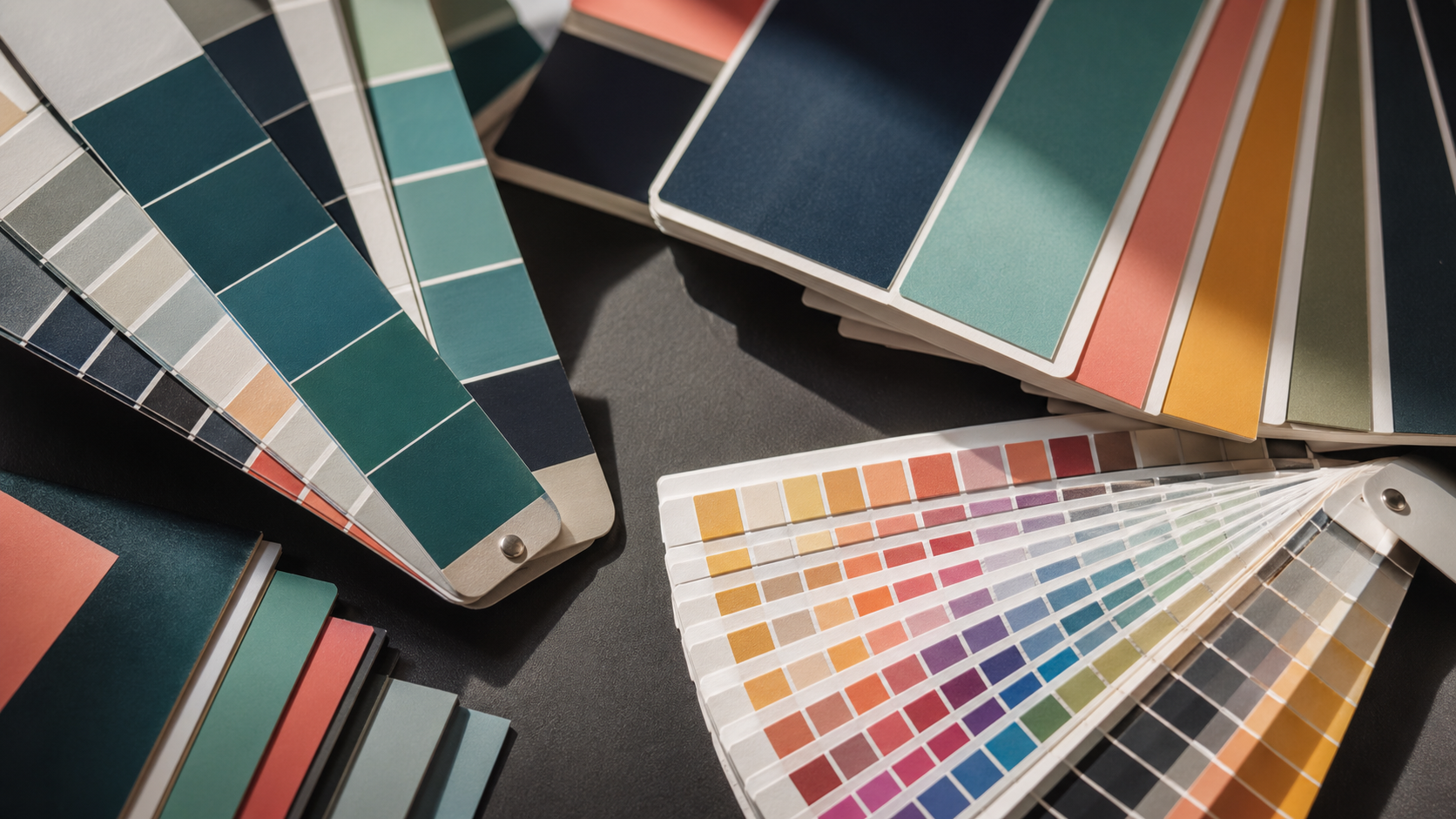
1. Wrong Colour Mode: RGB vs CMYK
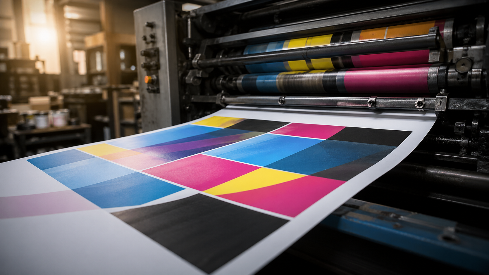
This one still trips up experienced designers. RGB is for screens. CMYK is for print. Press output is built from cyan, magenta, yellow, and black inks, and that's the gamut your file needs to be working in from the start.
Designing in RGB and converting at the last minute is the worst of both worlds. Vibrant blues, electric greens, and saturated oranges that looked perfect on your monitor will shift noticeably once they're forced into CMYK. The client sees the proof, the colour's gone flat, and now you're explaining why.
A few practical habits:
- Set your document to CMYK from the moment you open a new file in Illustrator, InDesign, or Photoshop.
- If you're working from RGB photography, convert and soft-proof early so you can adjust saturation while you still have time.
- For brand colours, use Pantone references where possible and convert to CMYK with intent — don't let the software guess.
- Black text and rich blacks: keep small body text at 100% K only. Use a rich black build (e.g. C40 M30 Y30 K100) for large solid black areas where flat K looks washed out.
If a brand colour is critical and CMYK won't hit it, talk to your printer about spot colour options before you commit.
2. Resolution: Match PPI to the Final Print Size
The default "300 PPI" rule is a starting point, not a universal answer. It applies to anything viewed at arm's length — business cards, flyers, brochures, A4 and A3 posters. For those formats, 300 PPI at final size is the benchmark.
Once you scale up to large format, the rules change because viewing distance changes:
- A2 to A1 posters: 200–300 PPI is fine.
- A0 and pull up banners: 150 PPI is generally enough.
- Large outdoor banners and building signage: 100 PPI, sometimes lower, works because viewers are metres away.
- Billboards: 25–50 PPI at full size is standard.
The mistake is treating a 300 PPI A4 file as good enough for an A1 poster — once you scale it up, you're effectively printing at 75 PPI and it'll look soft. Always check resolution at the final output size, not at whatever you happened to design at.
For pull up banners and similar display work, build the artwork at 1:1 or 1:2 scale at 150 PPI and you'll have plenty of detail without wrestling with multi-gigabyte files.
3. Fonts: Outline Them or Package Them
Your printer doesn't have your font library. If you send a live-text PDF and the font isn't embedded properly, you'll get substitution — and substitution means reflowed text, broken layouts, and a reprint at someone's expense.
Two reliable fixes:
- Outline the type. In Illustrator, select all and Type > Create Outlines. In InDesign, the equivalent is exporting a print-ready PDF with fonts embedded (or converting to outlines on a duplicate file before export). Outlining converts text to vector shapes — no font dependency, what you see is exactly what prints.
- Package the file. InDesign's File > Package collects all linked images and fonts into one folder. Send that folder if the printer needs editable files for imposition or last-minute corrections.
A note on outlining: once type is outlined, it can't be edited as text. If there's any chance of copy changes, send a packaged file or a properly embedded PDF instead. For most trade print jobs where the artwork is signed off and final, outlining is the cleaner option.
Also watch hairline strokes and thin type at small sizes. Anything under 0.25pt won't reproduce reliably on offset or digital presses, and reversed-out text under 8pt in a serif face will likely fill in.
4. File Format: Ask Before You Send
PDF, JPEG, EPS, TIFF, native AI or INDD — every printer has a preferred workflow. Most trade printers want press-ready PDF/X-1a or PDF/X-4 because it locks in colour profiles, embeds fonts, and flattens transparency predictably.
But "press-ready PDF" isn't one thing. Specifications that matter:
- Bleed: 3mm minimum for most jobs, 5mm for large format. Marks on, offset to match the bleed.
- Crop marks and registration: include them for trimmed work, omit them for finished-size large format.
- Colour profile: check whether the printer wants a specific ICC profile embedded (e.g. FOGRA39, US Web Coated SWOP, or their own custom profile).
- Transparency: flatten before export if you're unsure how the RIP will handle live transparency.
- Image embedding: embed, don't link, for final supply.
If you're producing artwork for a substrate you haven't worked with before — corflute, mesh banner, vinyl decals, label rolls — ask the printer for their artwork spec sheet. A two-minute email saves a re-supply later.
A Quick Pre-Flight Checklist
Before you hit send on any print file, run through this:
- Document is CMYK (or includes correct spot colours).
- Resolution is correct at final output size.
- Fonts outlined or properly embedded.
- Bleed and crop marks set per printer's spec.
- File format matches what the printer asked for.
- Final size is right — including any allowance for finishing (eyelets, hems, pole pockets on banners).
- Artwork has been viewed at 100% and reviewed for stray points, overprint issues, and rogue layers.
It takes five minutes and prevents 90% of the back-and-forth that delays jobs.
Key Takeaways
- CMYK from the start. Don't design in RGB and convert at the end — colour shifts will catch you out.
- Match PPI to print size. 300 PPI for small format, scale down sensibly for large format and signage.
- Outline or embed fonts. No live text without embedded fonts. Ever.
- Confirm file format with your printer. PDF/X is the standard, but specifics vary — ask for the spec sheet.
- Bleed, crop marks, and final size matter as much as the four points above. Build them in from the start.
Outsourcing Production? We've Got the Press Side Covered
Knowing the file prep rules is one thing. Having a trade printer who'll flag issues before they become reprints is another. Mediapoint runs trade printing for designers, resellers, and sign shops across Australia — from labels on rolls through to large format banners and rigid signage. Send us your artwork spec questions, or request a quote on your next job via quoting on our portal and we'll handle the production while you focus on the client.