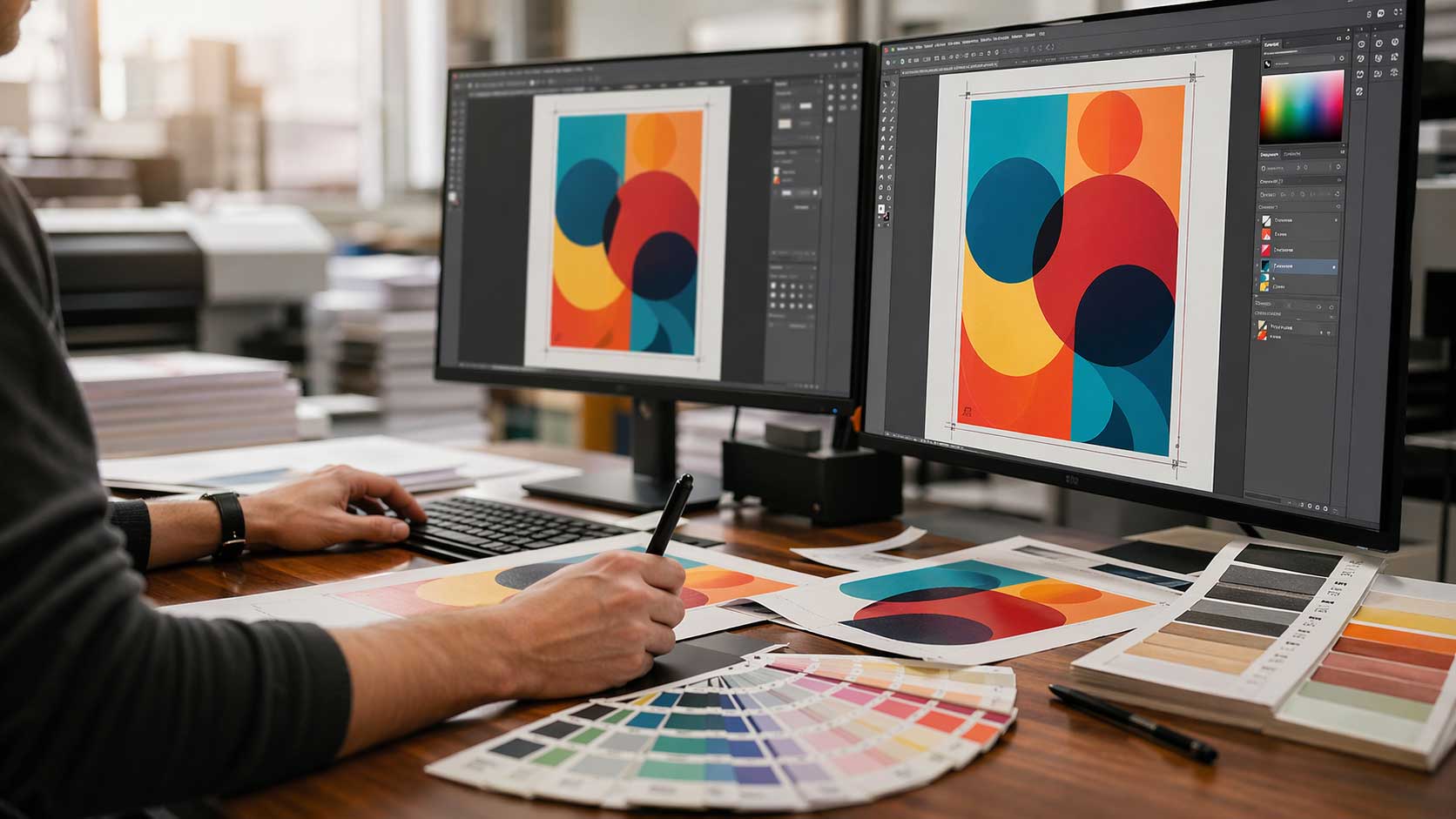
Good design on screen doesn't always translate to good print. A file that looks crisp in Illustrator can land on the press with fuzzy text, muddy blacks, or a colour shift that has the client on the phone before the ink dries.
Most print problems aren't caused by the press. They're caused by file setup decisions made weeks earlier. If you're a designer preparing artwork for a trade printer, these ten tips cover the fundamentals that separate clean jobs from reprints.
1. Don't Use Rich Black for Small Text
Rich black: a mix of all four CMYK channels gives you a deep, dense black that looks great in large solid areas. It's the wrong choice for body copy.
The problem is registration. Four plates need to align perfectly, and even a fraction of a millimetre off will make small text look fuzzy or haloed. On lighter stocks, ink spread compounds the issue and letters start to blur together.
For any text under roughly 18pt, use 100% K only. Save rich black (a common build is C60 M40 Y40 K100) for large display type, solid fills, and backgrounds where registration drift won't be visible.
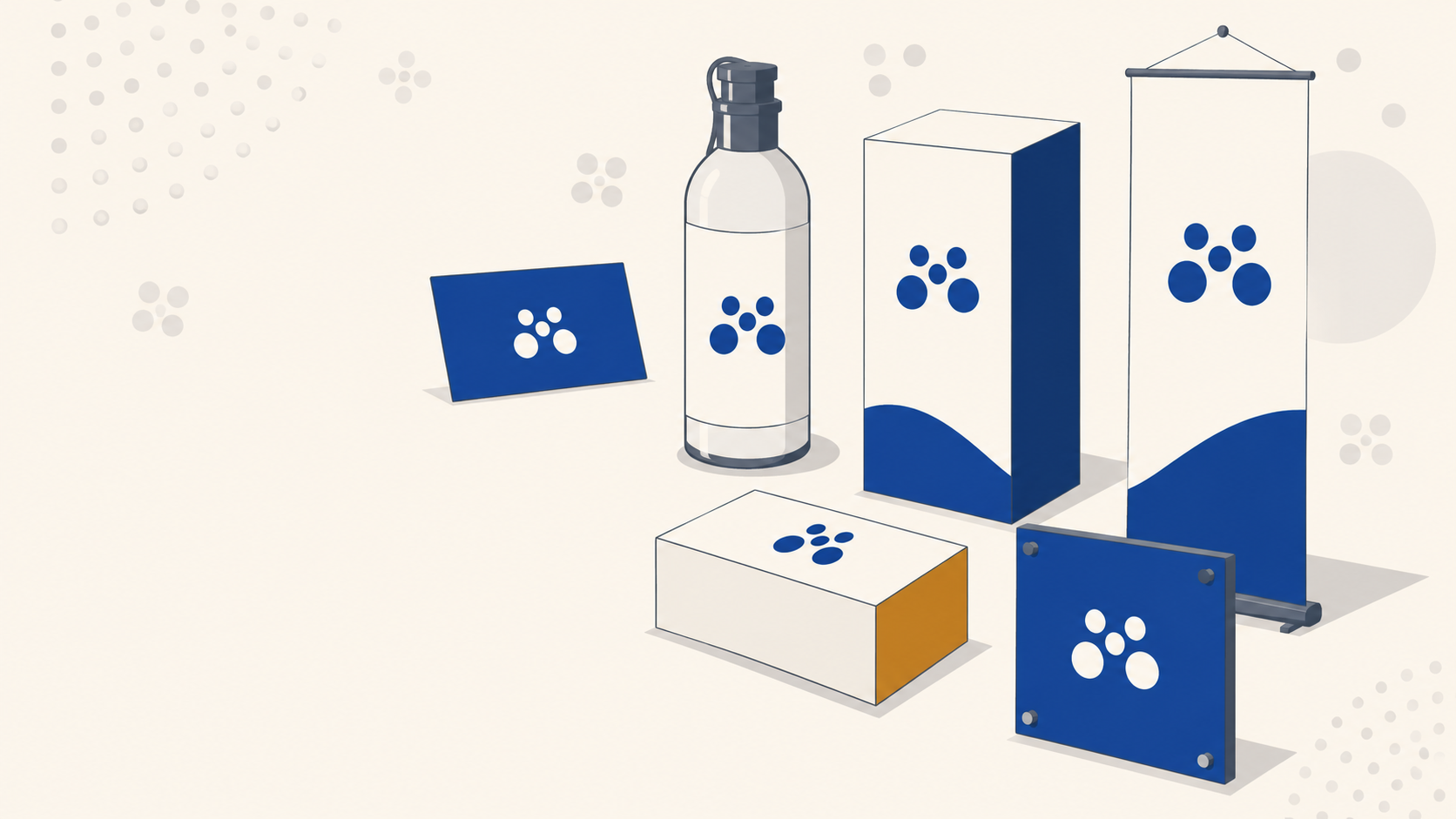
2. Treat Paper Stock as a Design Decision
Paper weight and finish change how a design is perceived before anyone reads a word. Designers who only work digitally often treat stock as an afterthought, it's not.
- Gloss lifts photographic colour and gives a sharp, reflective finish. Good for promotional work and imagery-heavy pieces.
- Matt and uncoated stocks feel more premium and tactile, and they're easier to read under harsh lighting. Good for editorial, business cards, and brand collateral.
- Weight (GSM) affects durability. 350gsm is standard for business cards; 150gsm suits flyers; 300gsm+ is appropriate for presentation folders and packaging.
Heavier, smoother stocks also hold finer detail and richer colour. If the design relies on sharp imagery or subtle gradients, don't spec a lightweight uncoated sheet and hope for the best.
3. Outline Fonts or Embed Them — Always
Sending a layered file with live type and no embedded fonts is one of the most common reasons jobs get held up at prepress. If the printer doesn't have your exact font, the software will substitute — and you won't know until the proof comes back wrong.
Two reliable options:
- Convert to outlines before export. Locks the text as vector shapes. No font dependency, pixel-perfect to what you designed.
- Embed the fonts in your PDF export settings. Keeps the text editable if corrections are needed but still displays correctly on any system.
Outlining is safer for final artwork. Keep a live copy for yourself in case of revisions.
4. Scale Down Large Format Artwork
Setting up a 6m × 3m billboard at full size and 300 PPI will crash your machine. There's no need to work that large.
For large format work like billboards, building wraps & large posters, set the document at a fraction of final size. A common approach is 1:10 scale. A 6000mm × 3000mm billboard becomes 600mm × 300mm at 300 PPI, which the printer scales up to 30 PPI at final size.
That sounds low, but it's fine. Viewing distance does the work. Nobody reads a billboard from two metres away. Standard scaling conventions:
- 1:10 for billboards and building signage
- 1:4 or 1:2 for A0/A1 posters and trade show graphics
- Full size at 150 PPI for anything viewed up close
5. Ask the Printer for Their Colour Profile
CMYK isn't one thing. The colour gamut shifts depending on the press, the inks, and the substrate. A file exported with a generic US SWOP profile will print differently on a digital press running on uncoated stock in Melbourne.
Before you finalise artwork, ask your trade printer which ICC profile they want. They'll typically specify something like FOGRA39 or PSO Coated v3 for coated stocks, or an uncoated equivalent. Matching the profile from the start avoids dull colour, incorrect dot gain, and the dreaded "the blue came out purple" email.
This five-minute conversation prevents the majority of colour complaints.
6. Use Vector Wherever You Can
Raster has its place — photography, textures, complex illustration. For logos, type, icons, and any geometric artwork, vector is always the better print choice.
Vector scales infinitely without loss. It prints with crisp edges at any size, from a business card to a three-metre corflute sign. It also produces smaller file sizes and fewer RIP errors at the printer.
If a client hands you a raster logo, redraw it before the job goes to press. It's worth the hour.
7. Use High-Resolution Imagery (At the Right Resolution)
For standard print viewed at arm's length — brochures, flyers, magazines, business cards — images should be 300 PPI at final output size. Below 250 PPI and you'll start to see softness.
For large format viewed from distance, the rules relax. A pull up banner or mesh banner can look sharp at 100–150 PPI because the viewer is further back. Billboards can get away with 30 PPI.
Don't upscale low-res images in Photoshop and hope nobody notices. They will.
8. Keep the Colour Scheme Disciplined
Trade print jobs often span multiple products — business cards, signage, banners, stickers, packaging. Colour consistency across all of them is what makes a brand look professional.
Work from defined brand swatches with locked CMYK values (and Pantone references if the budget allows). Don't eyedropper colour from JPEGs. Don't let RGB values slip into a print file and rely on conversion. Set up your document in CMYK from the start.
If the client's brand uses a specific corporate blue, get it right once and reuse that swatch across every job.
9. Check Bleed, Safe Area, and Crop Marks
Assume the reader knows what bleed is. The issue isn't knowledge — it's consistency.
- 3mm bleed on all edges for standard print (business cards, flyers, brochures)
- 5mm bleed for larger format and signage
- Safe area of at least 3–5mm inside the trim for anything you don't want cut off
Export with crop marks, bleed marks, and the correct PDF preset (usually PDF/X-1a or PDF/X-4 for modern workflows). Flatten transparency if you're not sure how the RIP will handle it.
10. Test Print Before You Commit to a Run
The cheapest insurance in print is a proof. Before you sign off on a run of 5,000 flyers, 500 labels on a roll, or a batch of pull up banners, get something on paper.
Options:
- Digital proof from the printer — quick and cheap, shows content and layout but not exact colour
- Hard copy proof on the actual stock — closer to final, catches colour and finish issues
- Wet proof on the final press — most accurate, most expensive, usually reserved for critical jobs
For anything over a few hundred units, or anything going to a client who'll scrutinise colour, pay for the proof. A reprint costs ten times more than a proof ever will.
Key Takeaways
- Use 100% K for small text, not rich black, to avoid registration fuzziness
- Outline or embed fonts on every export — no exceptions for final artwork
- Scale down large format files (typically 1:10) and note the ratio for the printer
- Request the printer's ICC colour profile before finalising artwork
- Prefer vector for logos and type; 300 PPI raster for standard print
- Always run a proof before committing to a production run
Send Clean Files, Get Clean Prints
Getting these fundamentals right on your end makes the production side run smoothly — fewer prepress queries, faster turnaround, and a final product that matches what you designed. Mediapoint handles trade printing for designers, resellers, and sign shops across Australia, from business cards through to large format signage. If you've got a file ready to go or want to check a spec before you send it, get in touch for a quote on your next job.