Trusted by 1,000+ Australian Print Resellers

Reliable Lead Times & Delivery Dates

Blind Shipped or White-Labelled

envelopeenvelope-active
notificationnotifications
cartcart
useruser

Typography Techniques That Print Clean Across Every Product

Typography Techniques That Print Clean Across Every Product

Typography is where most brand systems either hold together or fall apart, and it is also where a lot of files come unstuck at the production stage. A hierarchy that looks tidy on a 27 inch monitor can collapse on a business card. A hand-drawn logotype can look sharp in Illustrator and print soft if it was not outlined properly. Kerning issues that were invisible on screen become impossible to ignore on a two-metre pull-up banner.

Below are four typography techniques worth building into your workflow, each reframed with the production side in mind. If you are designing brand systems that need to print, across cards, signage, labels and packaging, these are the habits that keep the work consistent from screen to press.

Build the Type System From the Body Text Up

Most designers set the headline first and work down. That is backwards. The body text is what dictates whether a layout is actually readable, so it should dictate the rest of the scale.

A reliable starting point:

  • Body text: 12pt, light or regular weight, leading around 16pt (roughly 1.3 times the font size).
  • Line length: aim for 7 to 11 words per line, or about 6 lines per paragraph block. Anything wider gets tiring to read, anything narrower turns into ragged noise.

Once the body is locked in, generate the rest of the hierarchy by scaling up from it. The golden ratio (1.618) is a clean multiplier, but 1.5 or 2 times works just as well. What matters is that every size in the system relates mathematically to the body. Nothing is picked at random.

A workable five-tier system:

  1. Body: 12pt, light
  2. Subheader: body multiplied by 1.618, roman or regular
  3. H2: previous multiplied by 1.618, medium
  4. H1: previous multiplied by 1.618, medium
  5. Title: previous multiplied by 1.618, bold

Notice the weight jumps. Skipping a weight between tiers (light, roman, medium, bold) gives the hierarchy visible contrast without needing dramatic size differences.

How this affects print production

Type systems built on-screen often forget minimum print sizes. A "small" caption at 8pt on your screen might sit at the edge of legibility on a business card, and if you are using a very light weight, the strokes can break up on uncoated stock where ink spreads slightly into the fibres.

Practical rules for print:

  • Business cards and labels: do not go below 6pt, and avoid ultra-light weights at that size. Light weights need at least 8 to 9pt to hold on coated stock.
  • Corflute and signage: headline weights that look medium on-screen often need to be bumped to semibold or bold to punch through at viewing distance.
  • Reversed type (white on dark): ink spread makes reversed thin strokes look thinner still. Add half a weight when reversing anything below 10pt.

Which weight and category you are working with changes all of this, so it is worth being deliberate about the typeface itself before you build the scale. Our guide to choosing brand fonts that print well covers how serif, sans and script each behave on press.

Customise Letterforms for Logotypes, Properly

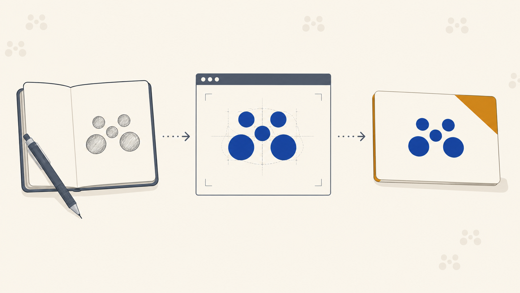
Turning existing type into a custom logotype is one of the fastest ways to give a brand a distinctive mark without commissioning a full custom typeface.

The process:

  1. Set the word in a serif or sans that already has the right feel.
  2. Convert to outlines (Cmd/Ctrl + Shift + O in Illustrator).
  3. Ungroup so each letter is an independent shape.
  4. Use the pen or pencil tool to redraw terminals, tweak junctions, or replace whole sections of letters.

Even small changes, a modified "a" terminal, a custom ligature, an extended crossbar, separate a logotype from the base font and make it defensible as a mark.

How this affects print production

Once type is outlined, a few things change for production:

  • The file is now vector art, not text. Good news, because there are no font embedding issues and nothing to substitute at RIP.
  • Overlapping paths become a problem. After customising, use Pathfinder and Unite (or the equivalent) so each letter is a single closed shape. Overlapping outlines can cause overprint artefacts and unpredictable trapping on some presses.
  • Check the smallest reproduction size. A modified terminal that looks sharp at 100mm might disappear at 15mm on a lanyard tag. Test the mark at every size it will be used before delivering to the client.
  • Keep the editable version. Once outlined, you cannot change the letterforms without redrawing. Always archive the pre-outlined file.

Custom logotypes also need to survive being printed on rough substrates like corflute or mesh banner scrim. Fine detail in a logotype gets swallowed by the texture, so if the mark will end up on rough materials, simplify accordingly.

The Mirror Trick for Kerning and Tracking

Every designer has stared at a logotype knowing something is off and been unable to pinpoint it. The fix is embarrassingly simple: flip it horizontally.

Once mirrored, your brain stops reading the word and starts seeing letterforms as shapes. Uneven spacing, awkward pairs, and inconsistent counter sizes jump out immediately. Fix them in the mirrored version, flip back, done.

The same technique works for:

  • Full logotypes
  • Wordmarks
  • Extended headline type on posters
  • Any typographic composition where something feels off but you cannot say why

How this affects print production

Kerning problems that are borderline on-screen become obvious in large format. A pair that reads as fine on a business card is glaring on a three-metre pull-up banner. Scale reveals every gap.

Before sending anything large-format to press:

  • Zoom to 100% at final print size (or larger) in your artwork.
  • Do the mirror check on any wordmark or headline.
  • Check the space around punctuation. Commas and full stops often need a nudge that is not visible until they are 200mm tall.

Fixing kerning after the print run is not a fix, it is a reprint.

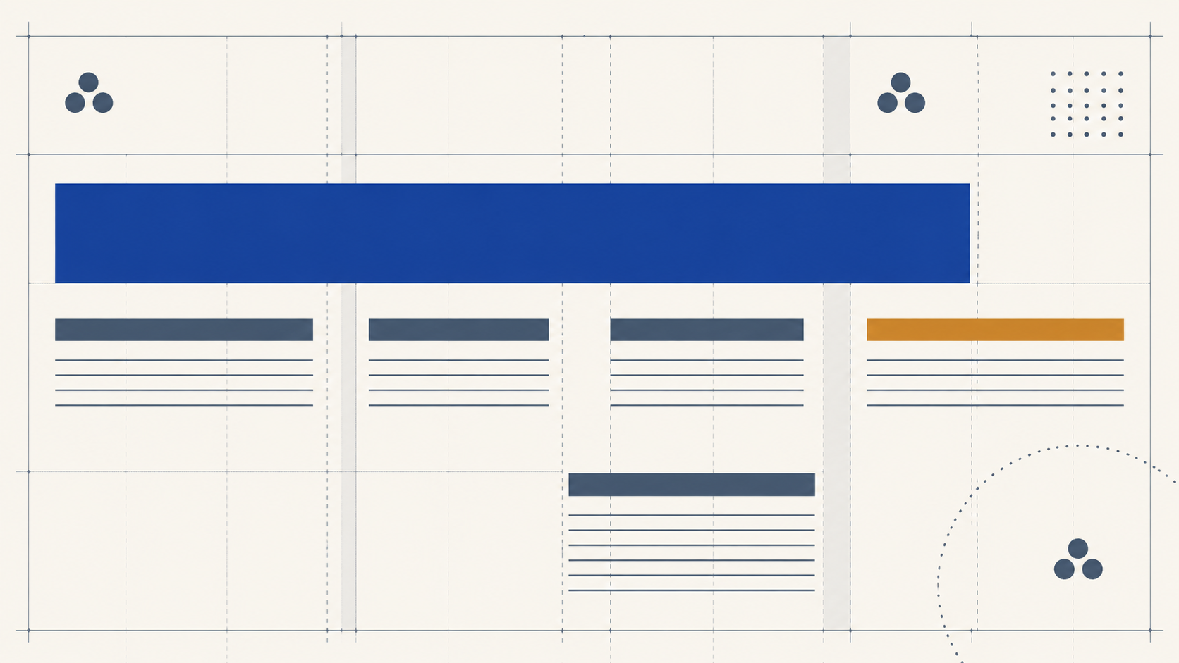
Use a Grid, and Make the Numbers Talk to Each Other

A grid does not restrict a layout, it liberates it. Once the structure is set, the designer's job stops being "where does this go?" and starts being "which position works hardest?"

A workable setup for most editorial or poster work:

  • Columns: 12, divisible by 2, 3, 4, and 6, so it collapses cleanly into any modular arrangement.
  • Rows: 6 or 12.
  • Margins: generous. Tight margins fight the eye.
  • Gutters: set them to a value that is divisible by your baseline leading. If your body leading is 16pt, use 4pt or 8pt gutters. Everything snaps.

One grid can generate a dozen distinct compositions. Duplicate the layout, move the image module, shift the headline block, and you get the same grid, a different result, and a consistent brand feel across a whole campaign. If you want to go deeper on which grid suits which job, our guide to composition, grids and flow walks through the full range.

How this affects print production

Grid discipline is what makes a brand system reproducible across formats. When the designer moves from a business card to an A2 poster to a vehicle wrap, a proportional grid means everything scales without needing to be redrawn.

Two production notes:

  • Bleed sits outside the grid. Extend background elements 3mm past the trim, but keep type and key content inside the safe zone. 5mm from trim is a good habit for most jobs.
  • Grids and labels. For label printing on rolls, the grid needs to account for die-cut tolerance. Keep type well clear of the die line, because labels can shift slightly during cutting and type that sits right on the edge will look misaligned.

A tidy grid is also a diagnostic tool. If a layout looks wrong, dropping the grid on screen usually shows exactly which element is off-axis.

Frequently Asked Questions

How do I build a type scale for a print layout? Start with the body text, not the headline. Set a body size and leading that is genuinely comfortable to read, around 12pt with 16pt leading and 7 to 11 words per line, then generate every other tier by multiplying up from it using a consistent ratio such as 1.618 or 1.5. That way every size in the system relates to the one thing that has to be readable.

What is the smallest type size that prints reliably? As a working guide, do not go below about 6pt on business cards and labels, and give light weights at least 8 to 9pt even on coated stock. Uncoated and textured substrates are less forgiving because ink spreads into the fibres. The only reliable check is a proof at final size on the actual stock.

What is the mirror trick for kerning? Flip your wordmark horizontally. Because you can no longer read it, your brain stops processing words and starts seeing pure shapes, which makes uneven spacing and awkward letter pairs obvious. Fix the spacing in the mirrored version, then flip it back.

Should I outline custom logotypes before sending them to print? Yes. Outlining removes any risk of font substitution at the printer's end. Just remember to unite overlapping paths afterwards so each letter is a single closed shape, and always archive an editable pre-outlined master, because once it is outlined you cannot adjust the letterforms without redrawing them.

How many columns should a grid have? Twelve is a sensible default because it divides cleanly by 2, 3, 4 and 6, which lets one grid collapse into many different modular arrangements. Set gutters to a value divisible by your baseline leading so type snaps into rhythm, and keep margins generous.

Key Takeaways

  • Build type scales from the body up. Fix body size and leading first, then scale headlines using a consistent multiplier.
  • Skip weights between tiers. Light, roman, medium, bold gives visible hierarchy without forcing huge size jumps.
  • Test at final print size. Fine weights and small type behave differently on different substrates, so proof before signing off.
  • Outline custom logotypes properly. Unite overlapping paths, keep an editable master, test at smallest reproduction size.
  • Mirror to check kerning. It bypasses the reading brain and exposes spacing issues instantly.
  • Use a 12-column grid with gutters divisible by your baseline leading. It keeps every layout in a system consistent.
  • Respect production constraints. Bleed, safe zones and die-cut tolerances are not creative limitations, they are what stops a great design becoming a reprint.

Get It Printed the Way You Designed It

Typography systems only work if the print output honours them. That means faithful colour, clean edges, no font substitution surprises, and reliable results across every product in the brand: cards, labels, corflute, banners, wraps. Mediapoint is the trade printer that handles the production side so designers and resellers can focus on the creative and the client. When your next brand system is ready to roll out across print, get a quote and we will take it from artwork to delivery.