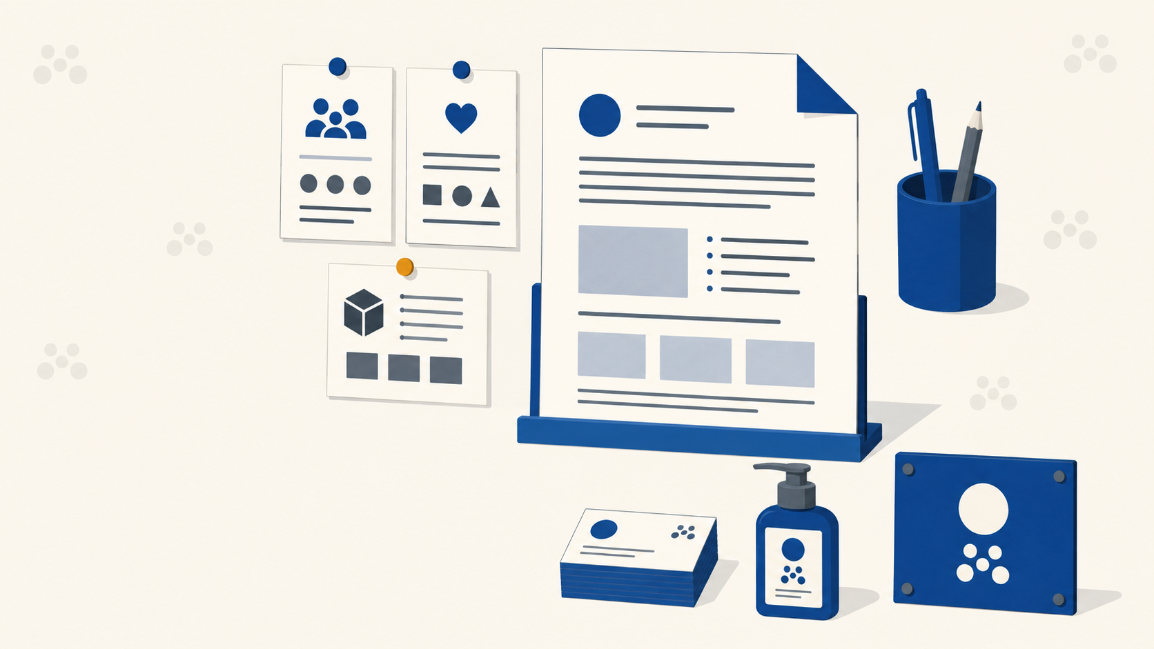
A brand identity is not a logo. It is the mood, the type, the sub-brand marks, the layout rules, and, crucially for anyone downstream of the designer, a set of files that need to reproduce faithfully across business cards, vehicle badging, signage, and print collateral.
What follows is a walkthrough of how a full automotive identity project came together, from a designer's account of the work, reframed here for designers who need their output to land cleanly in production. The end client was a premium vehicle modification specialist. The brief was modern, bold, precise. The output was a full identity system with two sub-brand marks. Along the way, every creative decision carried a print consequence, and that is where most identity projects come unstuck.
Start with archetype, not aesthetics
Before anyone touches a vector tool, the brand needs to be archetyped. That means defining the visual mood in words: is this minimal and restrained, retro and characterful, or flamboyant and expressive?
For this project, the keywords landed on:
- Engineering
- Precise
- Modern
- Luxurious
- Stable
- Minimal
These are not decorative words. They are the filter every design decision runs through. If a sketch does not answer to those keywords, it does not survive the round.
Why this matters for print: the archetype shapes substrate and finish decisions later. Words like luxurious and precise point toward different stock, finish and colour choices than playful or budget-conscious ones would. Getting the archetype signed off early means the print specification has a logic behind it rather than being decided at the last minute.
Mood boarding as creative alignment
Mood boards get dismissed as a soft stage. They are not. They are the cheapest place to fail.
Using an infinite whiteboard tool, the team pulled together textures, colours, fonts, layouts, and reference logos that matched the keywords. That mood board became a presentation walked through with the client on a live call.
The rule: get visual alignment before any sketching begins. Otherwise you burn two weeks designing in a direction the client will politely reject. Our guide to running a full brand identity workflow in Affinity covers the software side of building these boards and presentations.
Sketching: quantity, then restriction
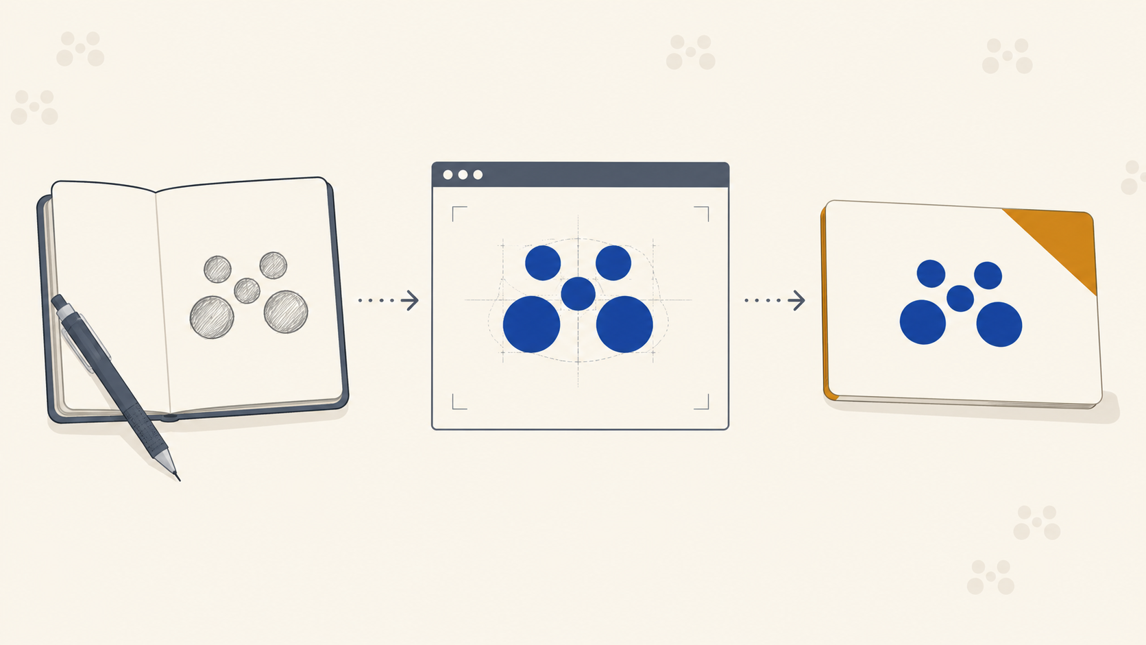
Once the direction was signed off, the letterform exploration began. Roughly a hundred sketches over two weeks, with graph paper for the geometric work and iPad for anything requiring speed.
Designers will sketch forever if you let them. You need a restriction. In this case, the restriction was the mood board itself: does this mark read as precise, elegant, minimal, with a sense of movement? If not, it is out.
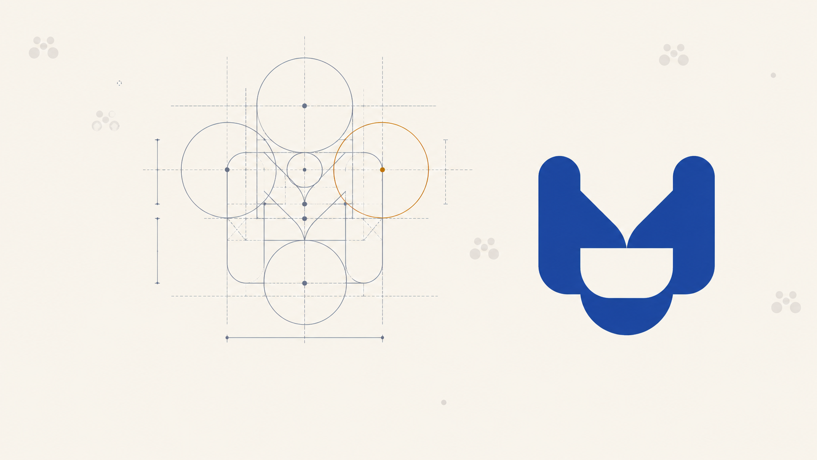
Print-production note on geometric marks: geometric logos live and die by their construction. A mark built on a proper grid with consistent stroke weights will hold up when it is etched onto a badge, cut from vinyl, or reversed out of a dark stock. A wonky freehand version will show every inconsistency at small size on a business card and again at three metres on signage. If your logo is geometric, build it geometric, not "close enough."
Concept presentation, not logo presentation
When the shortlist was ready, it was not presented as "here are three logos, pick one." It was presented as concepts: directions with mock-ups, icon variations, and typography pairings supporting each one.
This framing changes the conversation. The client is not picking a favourite drawing, they are endorsing a direction. That direction then gets refined into the final mark.
The winning concept suggested movement, with crossbars fanning out so the letterform read as dynamic rather than static. The brief called for something that would hold up for years, and static marks age faster in an environment where every touchpoint is animated or in motion.
Typography pairing and the custom glyph problem
The chosen typeface was Neue Haas Grotesk Display, a clean, minimal sans serif that matched the precise archetype. But the default letterform in the wordmark clashed with the custom icon. The fix was to slightly customise that glyph to echo the rounded geometry of the icon.
This is one of the most common issues designers hand to trade printers: a logo supplied as live type rather than outlined vectors, with a customised glyph that only exists on the designer's machine. If the printer does not have the font, or the custom letterform has not been converted to curves, the file will substitute and the identity breaks.
Rule for print handoff: outline all type in the master logo file. Supply the original editable version too, but the print-ready master should be curves only.
Sub-brands: the model-badge problem
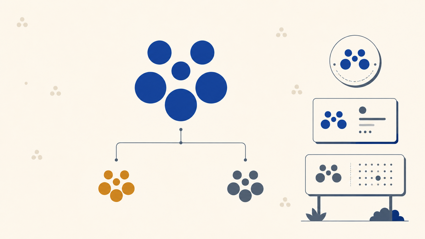
Beyond the master mark, two sub-brand identities were commissioned for different vehicle lines. One received an abstract flag mark echoing the parent icon's language. The other received a wide, panoramic icon suggesting a winding road, designed to sit in chrome on the rear of a vehicle.
Sub-brand marks introduce production challenges that master logos usually do not:
- Aspect ratio. A wide panoramic icon will not fit the same badge template as a square parent mark. Every application, whether badge, invoice header or social avatar, needs its own lockup.
- Material translation. A logo designed for chrome badging behaves differently when it is screen-printed onto packaging or die-cut into vinyl. Fine details that catch light beautifully in chrome disappear entirely at small sizes on a matte substrate.
- Minimum sizes. Every sub-brand mark needs a documented minimum reproduction size for each medium. What works on a badge will not necessarily work on a workshop swing tag.
AI mock-ups for concept sell-through
The team used AI image generation to show sub-brand marks in situ, superimposed onto vehicle renders in specific settings. Not for generating logos, which remains a poor idea for professional work, but for mock-up realism during client presentation.
The distinction matters. AI is useful for selling the idea and shortening the feedback loop. It is not useful for generating vector artwork that has to survive a print production pipeline. Every asset that goes to press still needs to be built properly in vector, in the correct colour space, with proper clear space and construction.
Brand guidelines: the production bible
The final deliverable was a brand guidelines document. This is where the identity becomes reproducible, where anyone downstream, whether the print shop, the sign fabricator or the merchandise supplier, can execute the brand without guessing.
A print-usable guidelines document should cover:
- Logo files in vector (SVG, EPS, AI) and raster (PNG at multiple sizes)
- Colour specifications in CMYK, Pantone, and hex, with the Pantone bridge value called out, because on-screen hex will not match uncoated stock
- Clear space rules, expressed as a proportion of the mark itself
- Minimum sizes for print and screen, per lockup
- Typography with foundry and licensing details
- Layout grids for common applications: business cards, letterheads, posters, signage
- Sub-brand lockups with rules for hierarchy and co-branding
The CMYK conversation. Brand colours defined only in RGB or hex will shift on press. A vivid on-screen orange might read muddy on uncoated stock, or convert unpredictably to CMYK. Every brand identity that expects to be printed at scale needs a Pantone reference and a coated and uncoated CMYK build tested against a real proof, not just an on-screen preview.
What this means when the identity hits production
Once the guidelines are locked, the brand starts landing across every printed touchpoint: business cards, workshop signage, vehicle graphics, product labels on rolls, event banners, and outdoor signage that has to survive the Australian sun for years.
Each of those has its own production quirks:
- Business cards expose thin strokes and small-size type problems immediately.
- Corflute site signage needs the logo built for outdoor readability at real viewing distance, often across a car park rather than across a desk.
- Vehicle graphics need vector files that scale to full wraps without artefacting.
- Labels need bleed, safe zones, and a colour build that survives the specific label stock and finish.
A well-built brand identity anticipates these. A poorly built one arrives at the printer as a raster file with no Pantone reference, and everything downstream becomes a compromise.
Frequently Asked Questions
What is a brand archetype and why start there? An archetype is the brand's visual mood expressed in words, such as precise, luxurious, minimal or playful. Defining it before any design work gives every later decision a filter to test against, from sketch selection through to substrate and finish. Without it, feedback rounds become taste arguments rather than judgements against an agreed direction.
Why present concepts rather than finished logos? Because clients endorse directions more comfortably than they choose favourites. A concept presented with mock-ups, icon variations and typography pairings invites the client to back a strategic direction, which then gets refined. Presenting three finished logos invites a preference vote with no reasoning behind it.
What breaks most often when a logo reaches the printer? Live type. If the wordmark has not been converted to outlines, or contains a customised glyph that only exists on the designer's machine, the printer's system will substitute a font and the identity changes. Outline all type in the print-ready master and keep an editable version archived separately.
Do sub-brand marks need their own rules? Yes. A sub-brand with a different aspect ratio will not drop into the parent mark's templates, and a mark designed for one material such as chrome badging can lose its detail entirely when screen-printed or cut from vinyl. Each needs its own lockups and documented minimum sizes per medium.
What should brand guidelines include for print? Vector and raster logo files, colour specified in CMYK, Pantone and hex, clear space rules, minimum sizes per lockup, typography with licensing details, layout grids for common applications, and sub-brand lockup rules. That set is what lets a printer, sign fabricator or merchandise supplier reproduce the brand without guessing.
Key Takeaways
- Archetype before aesthetics. Nail the keywords and mood before sketching, or you will burn weeks designing in the wrong direction.
- Sketch broad, then restrict. Explore hard, then filter ruthlessly against the mood board.
- Present concepts, not logos. Clients endorse directions more readily than they choose favourites.
- Build geometric marks geometrically. Grid construction survives scale, freehand does not.
- Outline all type in print-ready masters. Custom glyphs and unlicensed fonts break in production.
- Sub-brand marks need their own production rules: aspect ratios, minimum sizes, material behaviour.
- CMYK, Pantone and hex are not interchangeable. Every brand palette needs all three, proofed on real stock.
- Guidelines are the production bible. They turn an identity into something reproducible across every touchpoint.
Take the identity to press
The design work is where the brand comes alive. Production is where it either holds together or falls apart. Mediapoint handles trade printing for designers, resellers, and sign shops across Australia, reproducing brand identities faithfully across business cards, labels, banners, and signage while you focus on the creative work and the client relationship. Request a quote on your next identity rollout and we will match the spec.