Instagram makes brand identity look like a five-second reveal. The reality is weeks, often months, of briefs, mood boards, sketches, dead ends, and slow refinement. And almost none of it goes well if the first stage is rushed.
Nine times out of ten the client will not hand you a brief. You will get a rough idea and a deadline. Building the brief yourself, properly, is what stops a project drifting for a month before anyone admits it is off track. It is also where you decide, early, whether the identity is going to survive the printed products it will eventually live on.
Start with intelligence gathering, not design
The first call is a detective job. You are listening for patterns, priorities, and the gap between what the client says they want and what they actually want.
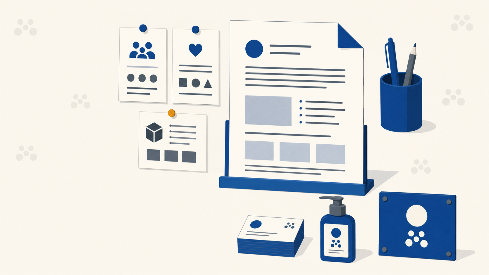
Record the calls with permission, then build the brief yourself afterwards. Tools like Milanote or FigJam work well for this because you can arrange modules visually, covering audience, values, mission and success measures, rather than writing a wall of text nobody rereads.
The brief should cover:
- Who they are and what they do, in plain language.
- Their audience, as specific personas rather than "everyone."
- Brand values and mission, with the understanding these may shift as the identity develops.
- Metrics of success, so you both know whether the project worked.
- Deliverables, including the logo, logotype, colour system, and every surface the logo needs to appear on.
The deliverables line is the one most briefs get wrong
That last point does more work than most briefs acknowledge, and it is the one that reaches all the way through to production.
If the mark is going onto vehicle signage, pull-up banners and small-format labels, those realities need to shape the design from day one rather than being discovered when files reach a press. A concept that leans on hairline strokes, ornate flourishes or tight negative space needs to be tested against the smallest application in that list before anyone falls in love with it.
Practical questions to answer in the brief, not after sign-off:
- What is the smallest size this mark will ever be reproduced at?
- Will it ever need to print in a single colour, for embroidery, engraving or one-colour label runs?
- Will it live outdoors, where Australian UV degrades some colours faster than others?
- Does it need to work reversed out of a dark background or over photography?
Answering those four upfront is the cheapest quality control available. Our guide to good logo design attributes covers how simplicity, legibility and appropriateness each behave once a mark is printed small.
Colour decisions belong in the brief too
Mood boards seed the palette, and most designers pull hex values straight from imagery. That is fine as a starting point, but those colours live in RGB and can shift noticeably once converted to CMYK.
A saturated forest green can flatten on uncoated stock. A vivid orange can go muddy on corflute. Build the palette with the CMYK conversion in mind rather than designing in RGB and hoping. Where a colour is genuinely brand-critical, note in the brief that it will need a Pantone reference and a proof on the actual stock before sign-off.
From brief to concepts
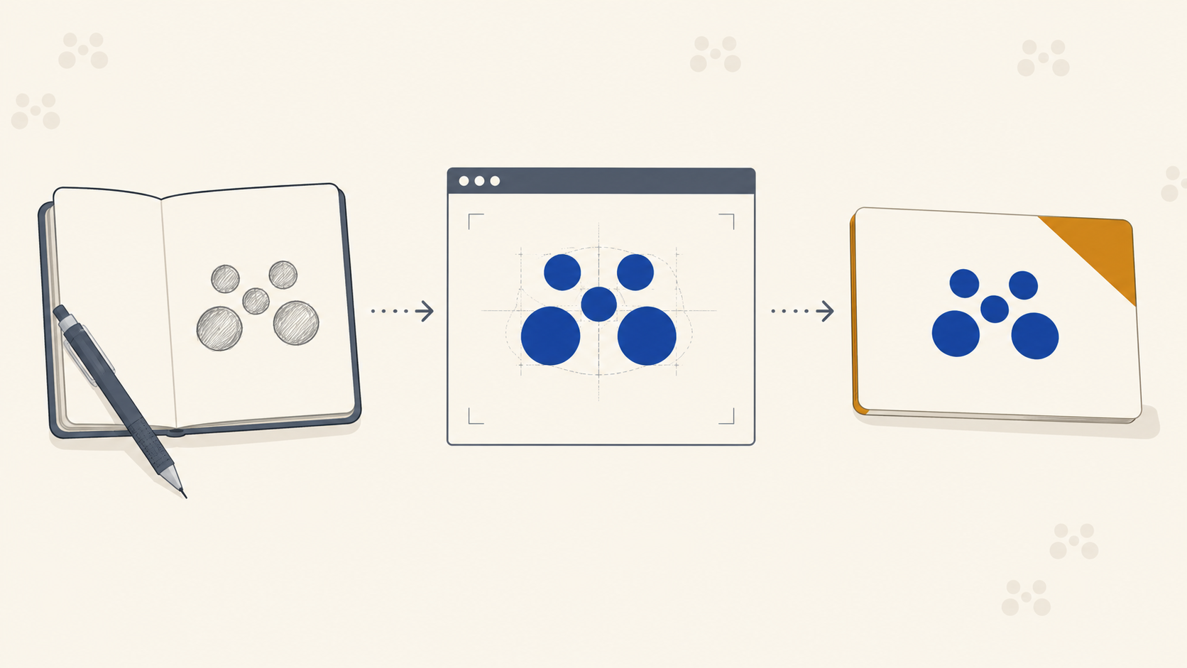
With the brief agreed, the work moves through the familiar stages: mood boarding to lock the visual direction, mind mapping to generate concepts, fast and ugly sketching to map the possibility space, and then refinement in vector, which typically consumes most of the project time.
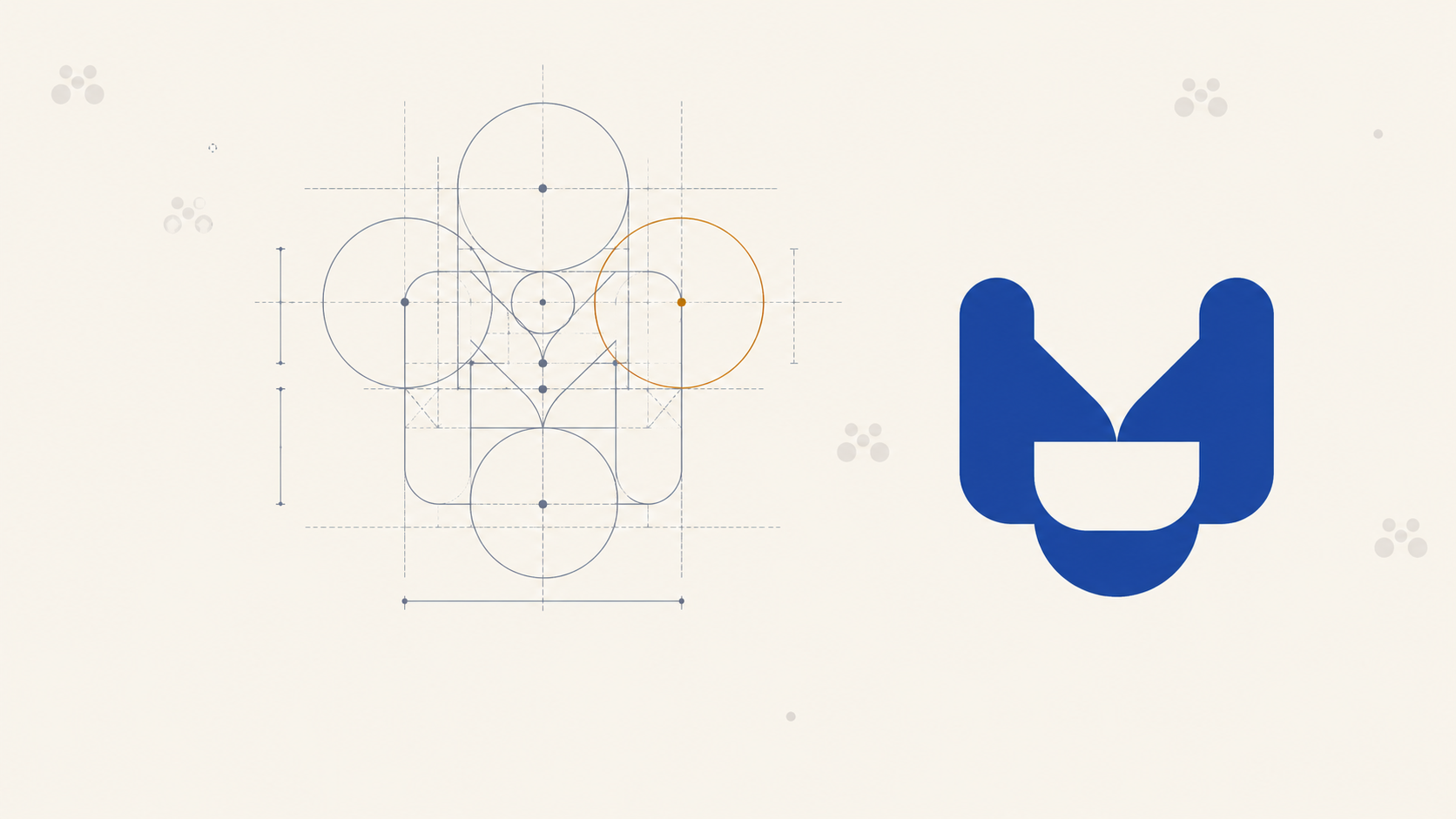
Refinement is where a logo actually gets made. Grid the artwork so stroke weights and offsets are consistent, because a gridded mark scales predictably. Test at both extremes, dropping it to around 20mm wide and blowing it up to signage scale. If detail dies at the small end, either simplify the mark or build a dedicated small-use variant.
For a fuller walkthrough of how these stages run on a real project, including concept presentation and sub-brand marks, see our brand identity case study.
Deliver a toolkit, not a single logo
Modern brand identity is not one lockup. It is a system: primary mark, secondary mark, logotype, icon-only version, small-use variant, monochrome version, and clear-space rules.
Why this matters for print:
- The primary lockup goes on hero pieces such as banners, storefront signage and brochure covers.
- The icon-only mark handles small-scale applications like labels on rolls, favicons and stamped packaging.
- The mono version handles single-colour print runs, foil stamps, and any situation where colour reproduction is limited or expensive.
Supplying a client with only a full-colour horizontal lockup sets them up to fail across half their touchpoints. Build the toolkit properly, hand over vector files (AI, EPS, SVG) plus flat exports, and include a short guidelines PDF documenting clear space, minimum sizes and colour specifications in CMYK, Pantone and hex.
Why agencies hire other designers to do their own logos
Worth noting, because it comes up often: agencies frequently outsource their own identity work. Designing for yourself is harder than designing for someone else. Too many opinions, too much second-guessing, no outside perspective.
The same principle applies to production. Designers and studios who try to run print production alongside client work usually end up compromising one or the other. Trade printing exists so the creative work stays with the creative team and the press work stays with people whose full-time job is hitting the spec.
Frequently Asked Questions
What should a brand identity brief include? At minimum: who the client is in plain language, a specific description of their audience, their values and mission, agreed measures of success, and a full list of deliverables including every surface the logo will appear on. That last item is the one most briefs under-specify and the one that causes the most trouble later.
What if the client does not have a brief? Write it yourself from the discovery call and send it back for sign-off. Record the call with permission so you can work from what was actually said rather than your memory of it. A brief you wrote and the client approved is far more useful than a vague email thread.
Why does the deliverables list affect the design? Because the smallest and roughest application sets the constraints. A mark destined for small labels, single-colour embroidery or outdoor signage cannot rely on hairline strokes, fine negative space or colours that shift badly in CMYK. Knowing the full list upfront means designing within those limits rather than retrofitting later.
What files should a client receive at the end of a project? A toolkit rather than a single file: primary and secondary lockups, an icon-only mark, a small-use variant and a monochrome version, supplied as vector plus flat exports, with a short guidelines document covering clear space, minimum sizes and colour values in CMYK, Pantone and hex.
How early should colour be tested for print? As soon as the palette is drafted. Colours pulled from mood board imagery are RGB and may not survive CMYK conversion cleanly. Deciding early which colours are brand-critical, and flagging that they will need a Pantone reference and a physical proof, avoids an awkward conversation after the client has emotionally committed to a screen version.
Key Takeaways
- Brief first, design second. If the client does not have a brief, build one from your discovery call and get it signed off.
- Specify every surface the logo will appear on. The smallest and roughest application sets the design constraints.
- Answer the four production questions early: smallest size, single-colour need, outdoor exposure, and reversed use.
- Build the palette with CMYK in mind. Screen colours pulled from imagery will not always survive conversion.
- Refinement is most of the project. Grid the artwork and test at both size extremes before sign-off.
- Deliver a toolkit, not a single logo, with vector files, flat exports and a short guidelines document.
Print production, handled
You do the identity work: the strategy, the sketching, the months of refinement to get a mark that actually represents the brand. Once it is signed off, the last thing you want is a production partner who shifts your carefully chosen colours or drops your hairlines on press. Mediapoint runs trade printing for designers, sign shops, and resellers across Australia, reproducing brand identities faithfully across every product a client needs. Have a look at the full product catalogue or get a quote on your next job.