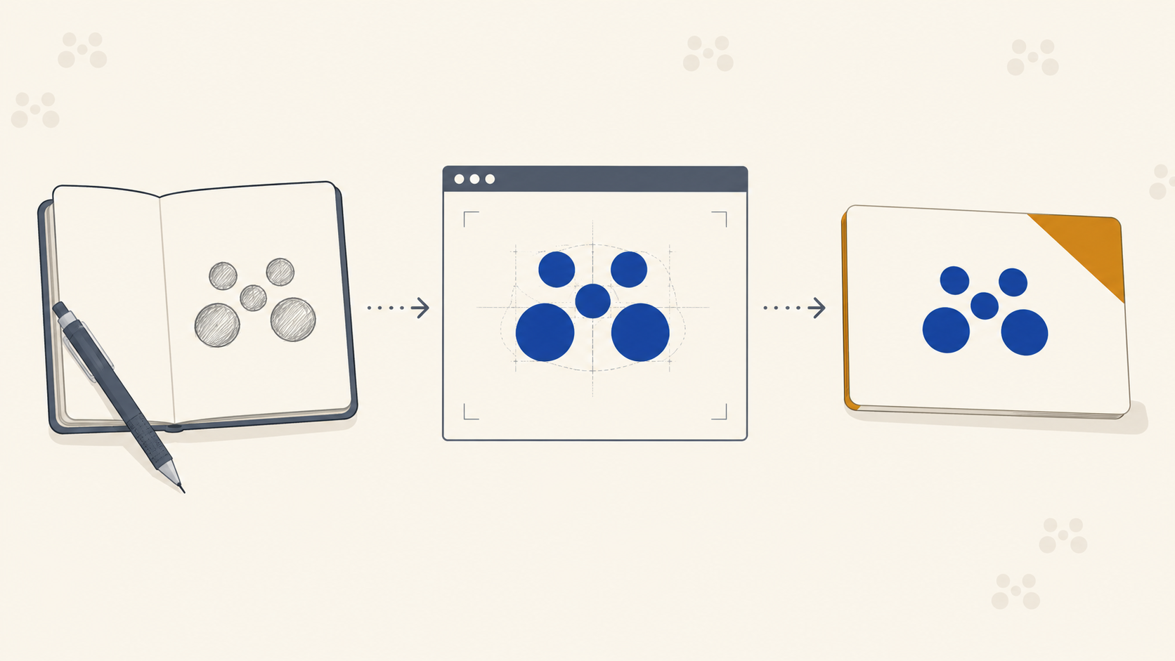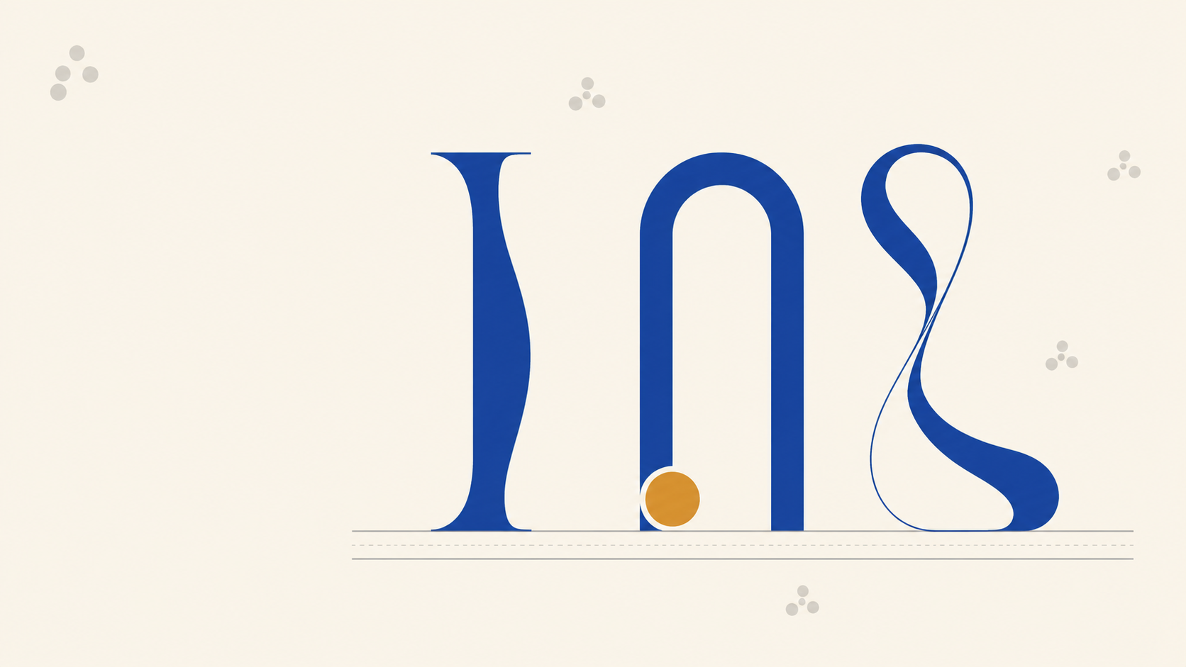
Font choice is one of the first real commitments a designer makes when building a brand identity. It sets the tone before anyone reads a word, but it also sets the technical constraints for every printed piece that follows. A typeface that sings on a Retina display can collapse on a business card, blur on a mesh banner, or lose its personality when reduced to a shipping label.
Below is a practical breakdown of the three main typeface categories, what each one communicates, and just as importantly, how each behaves once the file lands on a press.
The three type categories, and what they say about a brand
Every typeface a designer will pick for a brand falls broadly into one of three camps: serif, sans serif, or script. Each one carries its own emotional weight and its own production quirks.
Serif: history, authority, luxury
Serif typefaces are the ones with small terminating strokes at the end of each letterform. They usually carry a strong contrast between thick and thin strokes, which gives them their traditional, considered feel.
Serifs signal:
- Heritage and tradition
- Authority and reliability
- Luxury and craftsmanship
Think of brands like Sony, Volvo, or Pandora, companies that lean on longevity and quality. A serif tells the market that the business has been here a while and knows what it is doing.
Print-production reality: that thick-to-thin contrast is where serifs get you into trouble. The hairline strokes and delicate serifs can vanish when a logo is printed small, especially in single-colour or reversed-out applications. On a business card at 100% scale, a hairline can drop below the reliable reproduction threshold of the press. On uncoated stock, ink gain closes up the negative space inside letterforms, so an "e" can turn into a black blob.
Rules of thumb for serifs on press:
- Test your logo at the smallest size it will ever appear (business card monogram, label corner, garment tag) before signing off.
- Keep hairline strokes above roughly 0.25pt at final print size. Below that, you are gambling.
- For reversed-out serif logos on dark backgrounds, thicken the letterforms slightly, because ink spread on the dark plate will eat into the whites.
- On large format such as pull-up banners and Corflute®, serifs read beautifully because scale removes the risk. This is where a serif brand really pays off.
Sans serif: modern, clean, minimal
Sans serif means "without serifs." These are the workhorses of modern branding, used by the likes of Nike, Apple and Levi's. They read as contemporary, clean, and confident. They also tend to have more even weight distribution across the letterform, which makes them a safer bet across a wider range of sizes and substrates.
Sans serifs suit:
- Tech and app-based brands
- Medical, pharmaceutical, and clinical brands
- Any identity that leans minimalist or futuristic
Print-production reality: sans serifs are generally the most print-forgiving of the three categories, but weight selection matters more than most designers realise. A thin or hairline sans serif looks stunning on screen and often collapses on press. Small body text set in a light-weight sans is a legibility problem on coated stock and a disaster on uncoated or textured substrates.
Practical guidance:
- For body text under 8pt, use a Regular or Medium weight, never Light.
- Ultra-light sans serifs on vehicle wraps and outdoor signage lose fidelity at viewing distance. Bump the weight one step up from what you would use in print collateral.
- Very tightly tracked sans serifs at small sizes can fill in between characters on uncoated paper. Loosen the tracking slightly for print-only versions of the wordmark.
Script: personality, but handle with care
Script covers everything from formal copperplate calligraphy to loose brush lettering. It is expressive, personal, and when it works, memorable. It also carries the highest risk of any typeface category on press.
Scripts range from:
- Formal (copperplate, Spencerian): luxury, editorial, formalwear
- Casual (brush, monoline): craft beverages, boutiques, artisanal food
- Handwritten (rough brush, marker): youth brands, informal service brands
Print-production reality: script fonts live and die by their thinnest stroke. That elegant upstroke on a copperplate cap is often a fraction of a point at real-world print size. On a coated business card, it might hold. On a Corflute® site sign or a mesh banner viewed from ten metres, it is gone.
If you are designing a script logo that needs to work across the full range of brand collateral, build two versions:
- A print-primary master with strokes thickened for small-scale reproduction.
- A large-format version for signage where the delicate strokes can survive.
For hand-lettered work, always convert to outlined vectors before releasing to press. Live text in a script font opens the door to font substitution problems at the printer's end.
Matching the typeface to the brand, and to the substrate
The typographic decision does not end at "does it fit the brand?" It ends at "does it fit the brand across every surface the brand will ever appear on?" That is a bigger question, and it only gets answered when you consider how the identity will translate to the physical products that carry it.
A jewellery brand with a delicate serif wordmark needs to consider what happens when that mark is foil-stamped on a small gift box versus screen-printed on a shopfront window. A brewery with a rough brush script needs to know how that script will hold up on a wet-strength label on a roll versus a printed carton.
The best time to check this is during design development, not after client sign-off.
The CMYK conversation
Font choice ties directly into colour choice. A brand's typography and its palette are usually presented together in a screen-based mockup: RGB, backlit, saturated. What lands on press is CMYK, reflected light, and pigment. Two shifts happen simultaneously:
- Colours shift. Vibrant screen blues muddy out. Bright oranges dull. Deep blacks become slightly warm or slightly cool depending on the press profile.
- Contrast shifts. A pale grey subhead in a light sans serif that reads fine at 30% opacity on screen becomes near-invisible when converted to a 30% CMYK tint on uncoated stock.
The fix is boring but essential: proof in CMYK before final approval. Set your body copy at real print size, print it on the actual stock you will be using, and read it under normal office light. If the typeface holds, the brand is ready for production.
Type choice is a hierarchy decision too
Picking the right category is only the start. How you use weight, size and contrast across a layout is what makes the type actually work once it is printed, and that is a separate discipline worth understanding properly. Our guide to visual hierarchy in print design covers how to build the hook, secondary and finisher levels that turn a good typeface into a layout people actually read.
How this affects file prep for the printer
A few practical notes for designers handing files to a trade printer:
- Outline all fonts in your final production PDFs, or embed them fully. Missing fonts are one of the most common causes of print delays.
- Vector, not raster for logos. If your identity was drawn or lettered by hand, convert it to clean vector outlines before it goes to press.
- Check minimum stroke widths at final output size, not in Illustrator at 400% zoom.
- Supply the right file for the right product. A vehicle wrap and a business card use the same logo, but the artwork should be prepared at the appropriate scale, with appropriate stroke weights, for each.
Good typography for a brand is a decision that plays out across dozens of printed products, from stationery to rigid signs to labels and packaging. Getting the type right at the design stage saves a lot of production headaches later.
Frequently Asked Questions
Which font style is best for a brand: serif, sans serif or script? It depends on what the brand needs to communicate. Serifs suggest heritage, authority and luxury. Sans serifs read modern, clean and versatile. Scripts add personality and warmth. There is no universally best choice, but sans serifs are the most forgiving across the widest range of print applications, and scripts are the riskiest.
Why does my logo look muddy when printed small? Usually ink gain and hairline strokes. On uncoated stock especially, ink spreads slightly, which closes up the fine counters inside letterforms and thins out delicate serifs until they disappear. Test the mark at the smallest size it will ever be printed, and thicken the strokes if the detail is not holding.
What is the minimum stroke width that will print reliably? As a working rule of thumb, keep hairlines above roughly 0.25pt at final print size, and check that at output scale rather than zoomed in on screen. Below that you are relying on ideal conditions. Tolerances vary between presses and substrates, so if a mark is close to the limit, ask your printer before committing.
Do I need to outline fonts before sending files to a printer? Yes, in almost all cases. Outlining converts type to vector shapes so there is no risk of the printer's system substituting a font you have used, which is one of the most common causes of delays and errors. Confirm your printer's preference, but outlined production PDFs are the safe default.
Can I use the same wordmark on a business card and a banner? The same design, yes, but not always the same file. Stroke weights and tracking that work at business card scale can look clumsy at two metres, and delicate detail that survives on a banner can vanish on a card. For script and high-contrast serif marks especially, build a small-format and a large-format version.
Key takeaways
- Serif means tradition, authority and luxury. Watch hairline strokes at small print sizes.
- Sans serif means modern, clean and versatile. Choose weight based on final print size, not screen appearance.
- Script brings personality, but it is the most print-risky category. Build separate small-format and large-format versions where needed.
- Always test type at the smallest real-world print size before sign-off.
- Convert to outlines and CMYK before releasing files to a trade printer.
- Type decisions ripple across every printed item a brand will ever produce. Consider the full product range up front.
Ready to put the brand on paper?
Once the typography is locked in and the identity is signed off, the next step is making sure every printed piece reproduces it faithfully. Mediapoint is a trade-only printer working with resellers, designers, and sign shops across Australia. We handle the production so you can stay focused on the creative work and the client relationship. Request a quote on your next branded run and we will take it from there.