Affinity has earned its place in the brand identity workflow. It is capable, affordable, and it bundles vector, raster and layout into a single environment, which removes a lot of the friction of jumping between apps when you are moving from logotype sketches to social mock-ups to brand guidelines.
What follows is a practical workflow for designing a brand identity in Affinity, with an eye on what those decisions mean later, when the logo has to print clean on a business card, hold up across a three-metre pull-up banner, and reproduce reliably on labels, packaging and vehicle livery.
Mood boards in the layout workspace
Affinity's layout (Publisher) workspace is well-suited to mood boards because it gives you proper master pages and a grid system. Set a master page with the project name and section header, drop in a modular grid, and use the frame tool to lock images into consistent compositions.
A few practical notes:
- Build the mood board around colour, shape language and feeling, the same three elements that will dictate every printed touchpoint later.
- Pull keywords onto the page (playful, monolithic, vibrant, whatever fits the brief). These give the client a vocabulary to react to, which is faster than reacting to images alone.
- If you are sourcing inspiration in Canva or a whiteboard tool, bring it into Affinity for the client presentation. The polish matters.
Print-production note: when you are locking in mood-board colours, remember that bright, saturated screen colours, vivid purples, electric blues, neon greens, often shift noticeably in CMYK. If a brand is leaning into a hero colour, flag early that the printed version may need a spot colour (Pantone) to hold consistency across business cards, labels on rolls, and large-format signage.
Sketching and logotype ideation
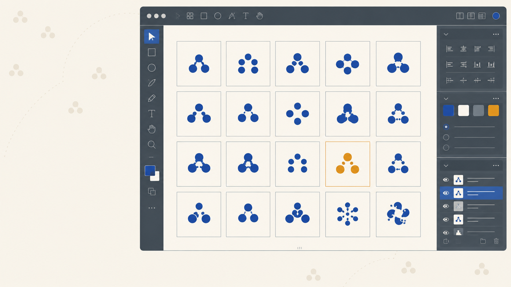
Sketching on paper or in Procreate is still the fastest way to get ideas out. The advantage of moving into Affinity early is the artboard system, you can duplicate, tweak and stage variations across one canvas without juggling files.
A workable approach:
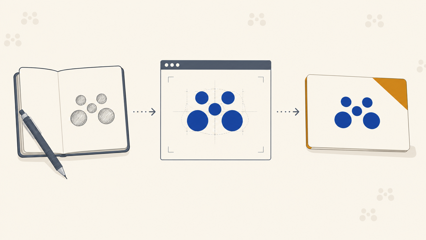
- Sketch broadly by hand or on iPad. Do not filter.
- Photograph or import sketches into Affinity Designer as reference layers.
- Rebuild the strongest directions in vector, typically starting from a base typeface (Space Grotesk, for example) and modifying letterforms.
- Duplicate the artboard for every variation. Keep them all visible.
The mess is the point. Work will look terrible before it looks good, and if your first pass already looks polished, you probably have not pushed far enough. For a closer look at how that ideation phase plays out on a real brand, our walkthrough on taking a logo from sketch to print-ready mark covers the same territory from the concept side.
Working with hand-drawn elements
If you have drawn letterforms with a parallel pen, brush, or any traditional tool, bring the scans into Affinity and rebuild them as vectors. For logo work, everything needs to be vector by the time it leaves your studio. Raster logotypes will fall apart the moment they are scaled up for signage or rasterised at the wrong resolution for a wrap.
When converting hand lettering:
- Trace cleanly. Do not auto-trace and walk away, you will inherit every wobble.
- Simplify nodes. Fewer, smarter points produce cleaner curves on RIP.
- Check the logo at 15mm wide (business card scale) and at 1,500mm wide (pull-up banner scale). If thin strokes vanish at the small end, thicken them. If a quirk looks charming at 50mm and grotesque at 2m, refine it.
Iteration: don't be precious with artboards
Affinity's artboards are cheap. Duplicate liberally. You should be looking at twenty or thirty variants per direction before settling.
Things worth exploring at this stage:
- Compressed versus elongated proportions
- Different terminal styles on key letters
- Stacked versus inline compositions
- Mark-plus-logotype combinations versus wordmark only
Print-production note: as you iterate, sanity-check the logo against the worst-case print scenarios it will need to survive:
- Single-colour reproduction for engraving, embossing, or one-colour merch.
- Reversed out of dark backgrounds. Does the logo still read?
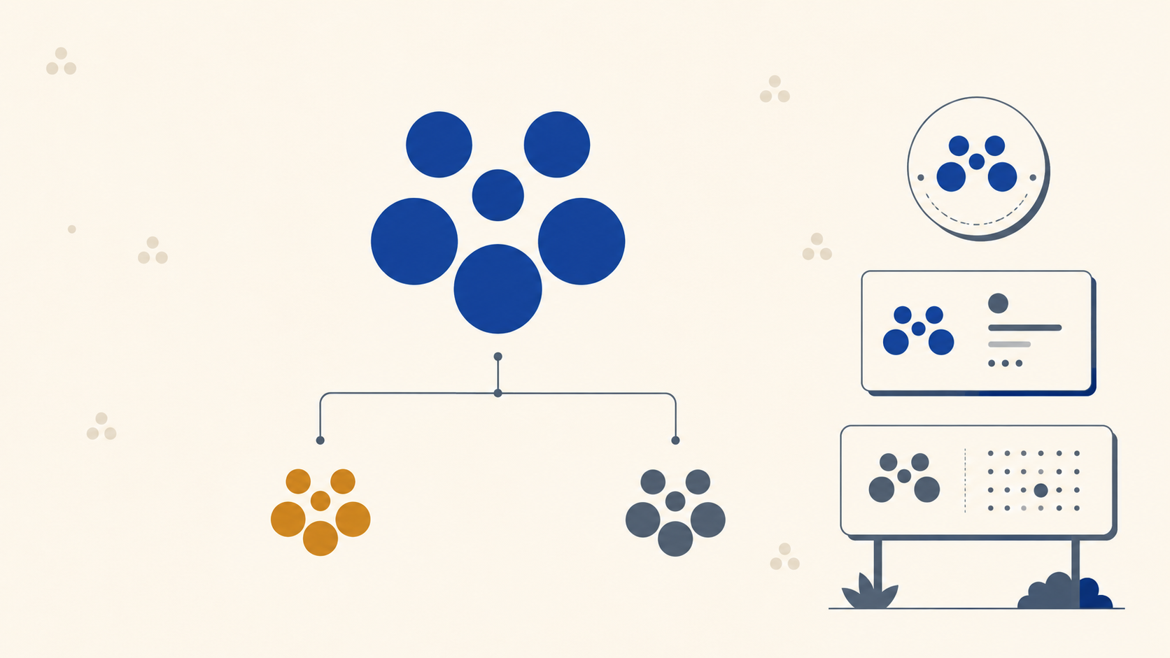
- At thumbnail size: favicon, social profile, the corner of an invoice.
- At signage scale: does a fine detail that reads as elegant on screen become a structural weak point when it is cut from vinyl?
A logo that survives all four of those tests will reproduce cleanly across every product in a brand's print catalogue.
Building the client presentation
Affinity lets you build the presentation deck in the same file ecosystem as the design work, which saves the constant round-tripping between Illustrator, InDesign and Keynote.
A clean presentation structure:
- Cover and intro
- Mood board recap
- Concept direction(s) with rationale
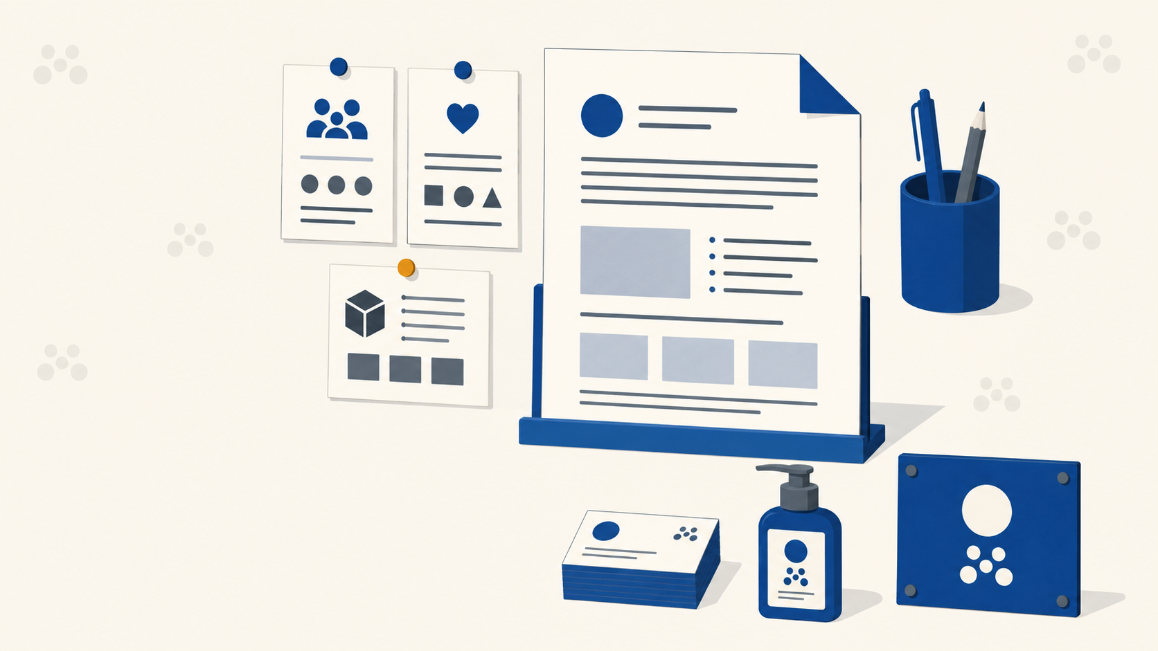
- Logo in context, on social, on signage, on packaging mock-ups
- Colour and type system
- Next-step recommendations
Set up a dark master and a light master so you can switch context throughout the deck. A modular grid keeps everything aligned without you having to think about it.
When you paste assets between Affinity documents, vector data is preserved, so you can keep editing typography or colour right inside the presentation file if a client wants a live tweak.
Social, signage and brand applications
Once a direction is locked, the next test is volume. A brand identity is not finished when the logo is approved. It is finished when the system holds up across every application.
Build artboards for:
- Social templates (square, story, banner ratios)
- Email signatures and document headers
- Business card front and back
- Signage mock-ups: shopfront, corflute, pull-up banners, vehicle livery
- Packaging and label artwork
- Merchandise
Print-production note for signage: when you are mocking up large-format applications, set up the artboard at the real output dimensions divided by ten (so a 2000 x 850mm pull-up banner becomes a 200 x 85mm artboard at 10x scale). Design at that ratio and export at 300dpi against the scaled dimension, and the RIP will handle the rest. This catches problems like illegibly fine type and hairline strokes long before production.
For outdoor applications under Australian sun, also think about contrast. A pale-on-pale palette that looks refined on a Behance case study will wash out on a shopfront banner in midday glare. Build the system with a high-contrast variant in mind.
Brand guidelines and clear space
Guidelines documents live in the layout workspace. Standard inclusions:
- Logo construction and clear space (rule of thirds works as a clean visualisation)
- Minimum size, specified in millimetres for print, pixels for digital
- Colour values across RGB, CMYK, Pantone and hex
- Typography hierarchy with size and tracking
- Misuse examples (do not stretch, do not recolour, do not add effects)
- Application examples
On minimum size: state it explicitly. A logo that has been approved at 40mm may not work at 12mm on a swing tag. The client, or whoever inherits the guidelines after you, needs a hard floor.
On colour values: always supply CMYK breakdowns alongside the RGB. If you only hand over hex, you have handed the printer a guess. Where a colour is brand-critical (a vivid hero purple, say), specify a Pantone reference so any printer running spot colour can match it consistently. This matters enormously when the same logo prints on business cards, banners, labels and vehicle livery, all on different substrates with different ink behaviour.
Handover and asset packaging
When the project lands, package the assets properly:
- Master vector files (AI, SVG, PDF)
- CMYK and RGB PDFs for the core logo lockups
- PNG exports at multiple resolutions for digital use
- Single-colour and reversed variants
- Source Affinity files for future editing
If the client uses Canva for in-house social, export key assets directly to Canva so their team has working files day one. Do not leave them to extract logos from a brand guidelines PDF.
For anything heading to a trade printer, supply outlined, CMYK-converted PDFs with bleed already added. It removes a layer of back-and-forth and ensures the file you signed off is the file that hits the press.
Frequently Asked Questions
Is Affinity good enough for professional brand identity work? Yes. It combines vector, raster and layout in one environment, which covers the full arc of an identity project from mood board to logo iteration to brand guidelines without app-switching. The lack of a subscription price does not reflect a lack of capability for logo and brand work.
How do I stop a logo colour shifting when it prints? Design or proof in CMYK rather than trusting an RGB screen preview, and for any brand-critical hero colour, specify a Pantone reference. Spot colour is how you hold a single consistent colour across business cards, banners, labels and vehicle livery, which all use different substrates and inks.
What sizes should I test a logo at before approval? Test at both extremes: around 15mm wide for business card and swing-tag scale, and at full signage scale such as 1,500mm on a pull-up banner. Fine strokes and small details that look elegant on screen are the first things to fail at the small end, and structural quirks show up at the large end.
How do I set up a large-format artboard in Affinity? A practical method is to work at the real output size divided by ten, so a 2000 x 850mm banner becomes a 200 x 85mm artboard at 10x scale, then export at 300dpi against the scaled dimension. It keeps file sizes manageable while still catching legibility and hairline-stroke problems before production.
What should a print-ready handover to a trade printer include? Supply outlined, CMYK-converted PDFs with bleed already added, alongside master vector files, single-colour and reversed variants, and a clear minimum-size rule. That package removes back-and-forth and ensures the file you approved is the file that reaches the press.
Key takeaways
- Affinity's combined vector, raster and layout workspace makes it well-suited to running a full brand identity from mood board to guidelines.
- Use artboards liberally during ideation. Duplicate, do not refine prematurely.
- Test every logo at business-card scale and signage scale before approval. What works at one end can fail at the other.
- Bright, screen-perfect colours often shift in CMYK. Specify Pantone references for hero brand colours that need to hold across print products.
- Always include CMYK values and minimum size rules in brand guidelines. RGB-only handovers cause production problems.
- Supply outlined, CMYK PDFs with bleed when handing files to a trade printer.
Take the brand to print
You have built the identity. The next step is reproducing it cleanly across every product the brand needs: business cards, signage, labels, packaging, vehicle livery. Mediapoint is the trade printing partner that handles that production side for designers, resellers and sign shops across Australia, so the brand you designed shows up consistently wherever it lands. Browse the full product catalogue or send through a quote request when the next job is ready to go.