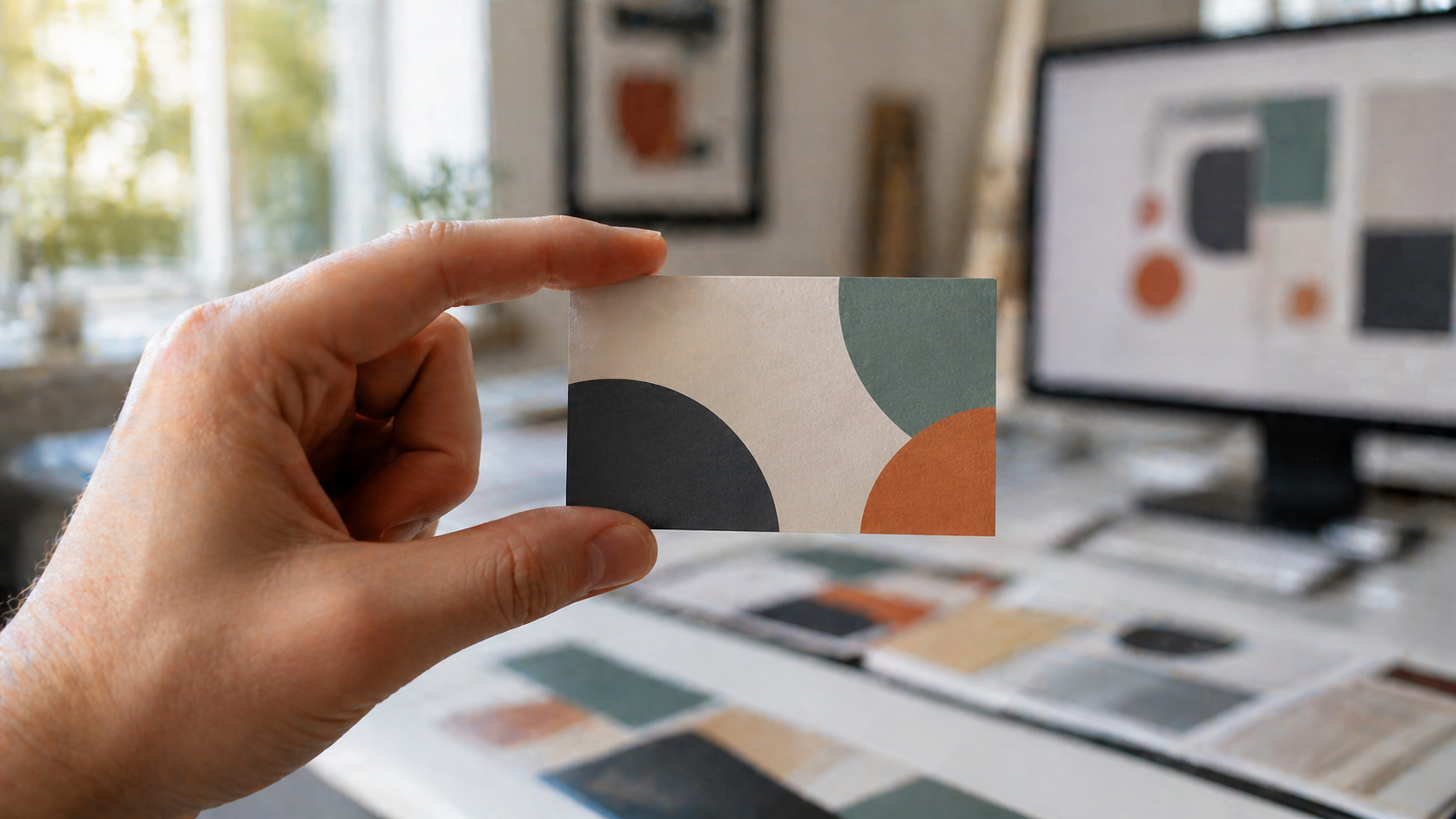
Gradient logo icons are everywhere right now: abstract, geometric, often built from a single letterform with a smooth colour transition running through it. They look fantastic on a Behance feed. They are also one of the easier ways to disappoint a client when the printed business cards turn up looking nothing like the mockup.
If you are designing identity work that will end up on stationery, signage, vehicle graphics, or packaging, the gradient is where screen and press part ways. This walkthrough covers how to build a clean gradient icon in Illustrator using a letterform as the base, and just as importantly, how to prepare it so a trade printer can reproduce it faithfully across every product the brand will need.
Setting up the document
Start with a standard 1920 x 1080 artboard. It is not a print size, but it is a comfortable working canvas for icon development before you scale into final lockups.
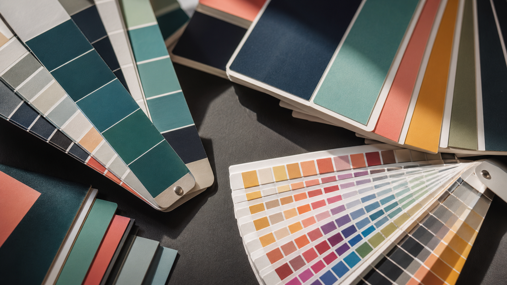
Before you draw anything, decide on your colour palette. Build a custom swatch library with the two or three colours that will form the gradient, and save it. Working from a defined swatch set, rather than picking colours by eye as you go, makes it dramatically easier to keep the brand consistent later, especially when you are handing files off for production.
A note on colour from the outset: pick gradient colours that you have checked in CMYK preview (View > Proof Setup > Working CMYK in Illustrator). Bright cyans, electric blues, and saturated purples are the worst offenders. They shift hard on a CMYK press and even harder on substrates like uncoated stock or corflute. If the gradient relies on a colour that does not exist in CMYK gamut, the printed version will look muddy compared to the screen. Our guide to colour theory for print designers goes deeper on why these shifts happen and how to design around them.
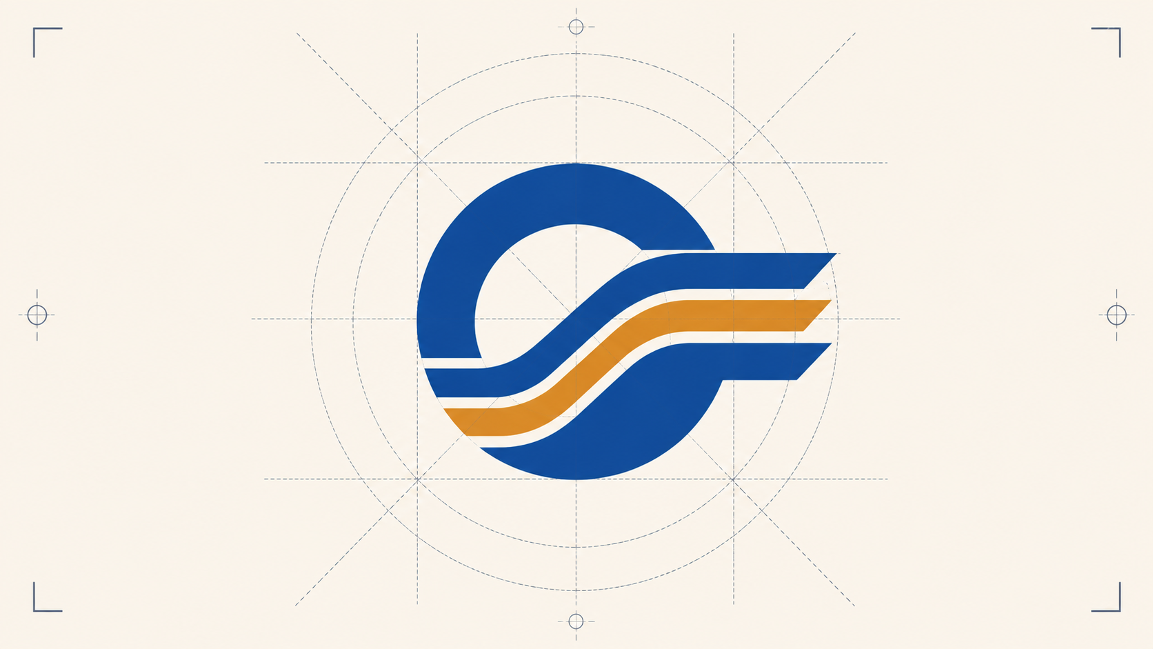
Building the letterform
The technique works with any letter, but a "D" is a clean starting point because it has one straight side and one curve.
- Draw a square with the rectangle tool, filled in your darker brand colour.
- With the Direct Selection tool (A), grab the two right-hand anchor points and use the Live Corners widget to round them into a half-circle. You now have a "D" shape.
- Copy and paste in front (Cmd+C, Cmd+F) and fill the duplicate with your lighter accent colour so you can see what you are doing.
That top "D" is your working surface. The gradient effect comes from carving rounded rectangles out of it to create offset, parallel bands that suggest movement through the letterform.
Carving the bands
Draw a rectangle that spans the width of the D. Round the corners. Then duplicate it (Alt-drag) several times down the height of the letter, varying the width and horizontal offset of each band so they are not uniform.
Once the bands are placed, use the Shape Builder tool (Shift+M) with Alt held down to subtract, clicking each band area you want removed from the lighter top layer. What you are left with is the dark base D showing through in strips, with the lighter colour forming the in-between bands.
This is where a lot of designers run into trouble at the edges. If a band does not terminate cleanly at the D's outline, you will get awkward slivers. Object > Flatten Transparency lets you manipulate the resulting shapes directly so you can clean up any rough edges before applying the gradient.
When you are happy with the geometry, select everything and use Shape Builder again, this time additively, to merge the dark sections into one compound path and the light sections into another. You should end up with exactly two shapes that interlock like a key.
Applying the gradient
Select the lighter compound shape and apply a linear gradient (Window > Gradient, or hit G). Drag the gradient direction from top to bottom for a vertical fade. Add a few extra rounded rectangles or circles in the same gradient as accent "speckles" to suggest depth.
Group everything (Cmd+G) once the icon is reading the way you want.
If you want to test colour variations, select the icon and use Recolor Artwork. Lock the harmony so all colours shift together when you drag the hue slider. This lets you audition palettes quickly without rebuilding the gradient maths from scratch.
Where gradients break in print
Now the part that matters once the logo leaves your screen.
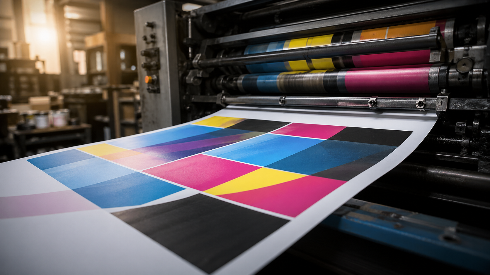
CMYK shift. The RGB gradient you have just built lives in a colour space your monitor can show but a four-colour press cannot fully reproduce. Soft proof in CMYK before you sign off. If the gradient flattens or shifts toward grey in proof, adjust the stops until the CMYK version still reads as a gradient, not as a smudge.
Banding on large formats. A subtle gradient that looks smooth on a 50mm business card icon can show visible banding when blown up to a pull-up banner or vehicle decal. The wider the gradient travels physically, the more obvious any tonal stepping becomes. For large-format work, push the contrast between your gradient stops slightly so the transition holds together, and avoid gradients that try to fade to near-white at one end.
Substrate matters. The same gradient prints differently on coated card, uncoated stock, corflute, vinyl, and fabric. Coated stocks hold gradient detail best. Uncoated absorbs ink and softens transitions. Corflute and mesh banner substrates have texture that breaks up subtle tonal changes. If the brand identity is going to live across all of these, and most do, test a small range early so you know what compromises are coming.
Spot colour fallback. Build a one or two colour flat version of the icon at the same time you build the gradient version. You will need it for single-colour printing (embroidery, foil stamping, engraving, single-colour vinyl). A logo that only works as a gradient is a logo that fails on half the products the brand will ever produce.
Pairing typography that prints
The walkthrough finishes with a wordmark beneath the icon, in this case set in a rounded geometric typeface, tracked tight, with manual kerning corrections. Two production notes worth flagging:
- Outline the type before sending to print. Cmd+Shift+O converts editable text into vector outlines. This eliminates the risk of font substitution on the printer's end. Always send outlined files unless your trade printer specifically asks for live text.
- Watch stroke weights at small sizes. A wordmark that sits comfortably under the icon at 80mm wide on a letterhead may lose its thinnest strokes when reproduced at 25mm on a business card. Test the lockup at its smallest intended print size before signing off. If strokes are disappearing, the type needs to be heavier, or the minimum size needs to be defined in the brand guidelines.
Delivering print-ready files
Once the mark is locked, the handover to production needs to include:
- Vector master file (AI or EPS) with all gradients live and editable, fonts outlined.
- CMYK version with gradient stops adjusted for press, separate from any RGB screen master.
- Pantone equivalents for the dominant brand colours where exact match is critical (signage, packaging).
- Single-colour version (black, and reversed white) for the products where gradients cannot be used.
- Minimum size specification in the brand guidelines, based on actual print testing.
Getting the file itself clean matters just as much as the artwork. Our guide to bleed and crop marks for print designers covers the setup that keeps a print-ready logo from tripping up at production.
Frequently Asked Questions
Why does my gradient logo look different when printed? Most gradient logos are built in RGB, the colour space your screen uses, which can display colours a four-colour CMYK press cannot reproduce. Saturated blues, cyans and purples are the usual culprits and tend to shift or dull on press. Soft proofing in CMYK before sign-off shows you the realistic printed result and lets you adjust the gradient stops while you still can.
What causes banding in a printed gradient? Banding is visible stepping between tones, and it gets worse the larger the gradient is printed. A transition that looks seamless on a business card can show distinct bands on a pull-up banner or vehicle wrap. Pushing the contrast between gradient stops slightly and avoiding fades to near-white helps the transition hold together at large sizes.
Do I need a single-colour version of a gradient logo? Yes. A surprising share of brand applications cannot reproduce gradients at all, including embroidery, foil stamping, engraving and single-colour vinyl. Build a flat one or two colour version alongside the gradient master so the mark works everywhere, not just on full-colour print.
Should I outline fonts before sending a logo to print? In almost all cases, yes. Outlining type (Cmd+Shift+O in Illustrator) converts it to vector shapes and removes any risk of font substitution at the printer's end. The exception is when your trade printer specifically asks for live text, so it is worth confirming their preference.
What files should I supply to a trade printer for a logo? A complete handover is a vector master (AI or EPS) with fonts outlined, a press-ready CMYK version, Pantone equivalents for critical colours, a single-colour fallback, and a defined minimum print size. That set covers every reproduction scenario from business cards to large-format signage.
Key Takeaways
- Gradient icons built from a letterform are a clean, modern approach, but they are built on optical illusion, so geometry needs to be precise before you apply colour.
- Build with a custom swatch library from the start. It saves rework when the palette inevitably changes.
- Soft proof in CMYK early. RGB gradients that look brilliant on screen routinely flatten or shift on press.
- Always build a flat single-colour fallback alongside the gradient master. Half the products a brand needs (embroidery, foil, single-colour vinyl) cannot reproduce gradients.
- Outline fonts and supply CMYK vector files to the printer. Test the wordmark at its smallest print size before sign-off.
- Watch for banding on large-format reproductions. Push gradient contrast slightly for big jobs.
Hand the production over
Designing a brand identity is one job. Reproducing it cleanly across business cards, pull-up banners, corflute signage, vehicle decals, and packaging is another, and it is where gradient marks live or die. Mediapoint runs trade printing for designers, resellers, and sign shops across Australia, so once the identity is locked you have got a production partner who will hold the file to spec on every product the brand needs. Request a quote on your next job and we will take it from artwork to delivery.