Colour decisions on a screen can feel abstract until the job comes off the press and the client says it looks "off". For designers preparing artwork for trade printing, colour isn't just an aesthetic call — it's a technical and psychological one that has to survive CMYK conversion, substrate variation and Australian outdoor conditions.
This guide pulls together the colour theory that matters when you're sending artwork to a trade printer: how to choose palettes that suit the message, how harmony schemes behave in print, and the small Illustrator and Photoshop habits that save reprints.
Start with the message, not the swatch
Before you open Adobe Color, write down two short lists: how you want the viewer to feel, and the personality of the design itself. Words like calm, premium, urgent, friendly, rugged are more useful at this stage than hex codes.
A gym poster pushing lifestyle change leans into oranges and reds — energy, action, stimulation. A skincare ad printed on a satin stock wants pastel skin tones and low saturation — pastels read as open, soft and peaceful, which is why they dominate the beauty category. A financial services brochure leans blue, low saturation, weak contrast — calm, safe, trustworthy.
The principle: it isn't only the hue that carries the feeling, it's the saturation, brightness and contrast.
- High saturation + strong contrast = active, urgent, attention-grabbing
- Low saturation + weak contrast = calm, premium, considered
- Pastels (high brightness, low saturation) = soft, approachable, gentle
Get this wrong on a printed piece and the message fights the palette. A "calming" yoga studio flyer printed at 100% saturated cyan will read as aggressive, no matter how good the typography is.
Colour psychology, briefly and honestly
Colour psychology gets dismissed in some corners of the internet as marketing fluff. It isn't. There's measurable physiological response — Jacobs (1974) and Küller (1981) both showed colour influences heart rate, EEG readings and emotional perception. Red genuinely stimulates more than green, green more than blue. That's why high-stimulation colours create stronger memory recall, and why brands like Coca-Cola, CNN and Target lean on red.
A quick working summary for print briefs:
- Red — passion, urgency, warning. Demands attention. Use carefully on signage where it can dominate other elements.
- Orange — energy, action, change. Strong call-to-action colour.
- Yellow — cheerful, energetic, optimistic. Loud at high saturation; risky on small text.
- Green — natural, healthy, growth. Versatile across sectors.
- Blue — trust, security, maturity. The default for finance, tech, healthcare.
- Purple — luxury, sophistication, feminine. Cadbury's whole brand is built on it.
- Pink — playful, modern, gendered in Western contexts.
- Brown — rugged, masculine, earthy. Rare in logos for a reason.
- Black — high-end, premium, authoritative. Pairs with quality stocks like uncoated textured papers or soft-touch laminates.
Caveat: culture matters. White reads as pure and clean in Australia; in parts of East Asia it's associated with mourning. Red is love in the West, anger in some Japanese contexts. If your client exports or targets a specific demographic, factor that in.
Age and gender averages also shift preferences — broadly, softer palettes skew female-preferred, bolder palettes skew male-preferred. Averages, not rules. Know the target audience before you commit.
Harmony schemes and how they behave in print
Once you've nailed the feeling, choose a colour relationship that supports it. Each scheme has print scenarios where it shines and others where it falls flat.
Monochromatic
One hue, varied with tints (add white), tones (add grey) and shades (add black). Smooth, calming, low contrast. Works beautifully for digital art, premium logos, editorial layouts and luxury packaging.
Where it struggles in print: outdoor signage and anything that needs to grab attention from 10+ metres. A monochrome corflute sign at a building site will get ignored.
Complementary
Two hues directly opposite on the wheel. Maximum contrast, maximum impact. Firefox and Fanta are classic examples.
Print tip: straight-up saturated complements (vibrant red against vibrant green, for example) can vibrate uncomfortably, especially under fluorescent retail lighting. Soften one side — drop the red to a dusty pink, knock the green back with a touch of grey. You keep the contrast without the eye strain. This is gold for retail signage, event posters and pull up banners where you need the design to read across a room.
Analogous
Base colour plus one or two neighbours either side of the wheel. Harmonious, low-contrast, easy on the eye. Great for soft branding, wellness, hospitality and editorial work.
Not the right call for a "FOR SALE" real estate sign or anything that needs urgency.
Triadic
Three colours evenly spaced around the wheel — four positions apart. High contrast, high energy. Burger King's palette is the textbook example.
Triadic schemes can overpower printed material if all three are at full saturation. For infographics, charts and packaging where you need clear category separation, knock at least two of the three back to tints or shades so the hierarchy still reads. Watch fine type carefully — high-contrast triads can cause legibility issues at small sizes.
Split complementary
Pick a base, then take the two colours flanking its direct opposite. Sophisticated but tricky to balance. Worth experimenting with for editorial and web work; less forgiving on large-format print where any imbalance gets magnified.
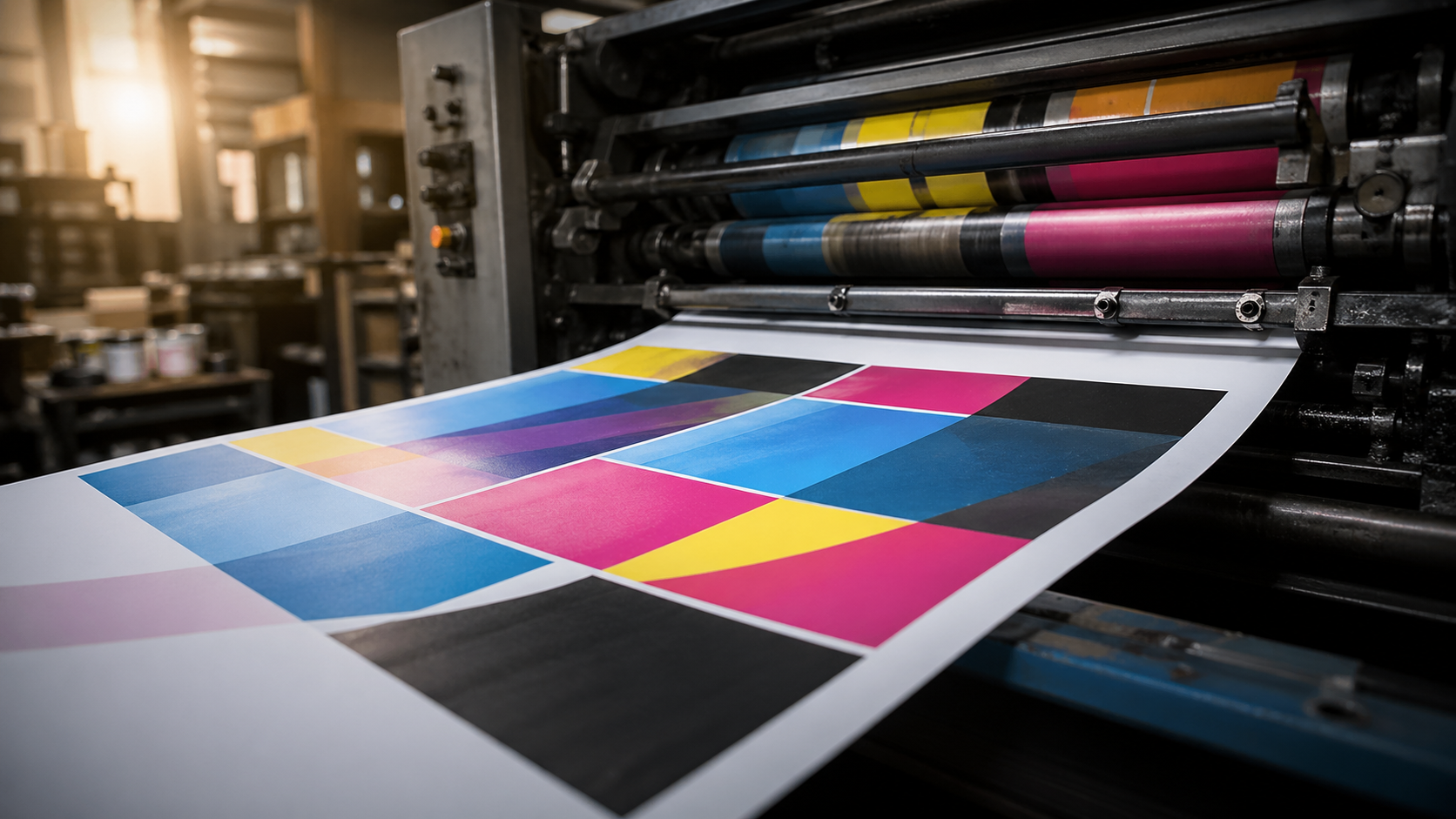
CMYK realities every designer should plan for
This is where screen-to-print breaks down for a lot of designers. A few things to bake into your process:
- Design in CMYK from the start for anything heading to a trade printer. RGB-to-CMYK conversion at the end is where vibrant blues turn purple and electric greens go muddy.
- Avoid 100% saturated RGB primaries if you need them to print accurately. Pure RGB blue (#0000FF) has no CMYK equivalent — it'll always shift.
- Watch total ink coverage. Keep TIC under 300% for most stocks; lower for uncoated or absorbent substrates. Rich blacks should be built carefully (a common recipe: C60 M40 Y40 K100) rather than dumped at 100% across all four channels.
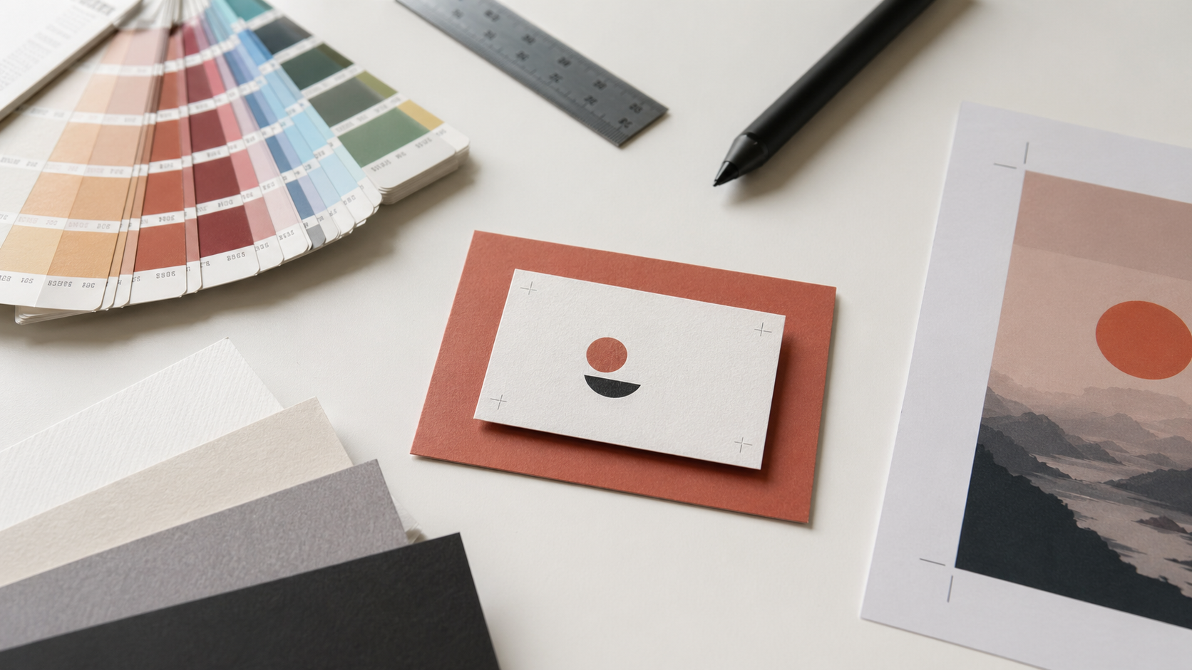
- Pantone for brand-critical work. If a client's brand depends on an exact colour — think a corporate blue across stationery, signage and labels — spec the Pantone and confirm whether your trade printer can match it on the chosen substrate.
- Substrate changes everything. The same CMYK build prints differently on gloss coated stock, uncoated, corflute, mesh banner vinyl and self-adhesive label material. If colour fidelity is critical across multiple products, ask for a hard proof.
For outdoor work especially, factor in Australian UV exposure. Bright reds and magentas fade faster than blues and blacks under harsh sun. For long-term outdoor signage, talk to your printer about UV-resistant inks and laminates — particularly relevant for corflute signage and mesh banners that live outdoors year-round.
Tools worth keeping in the workflow
A handful of practical tools that earn their place:
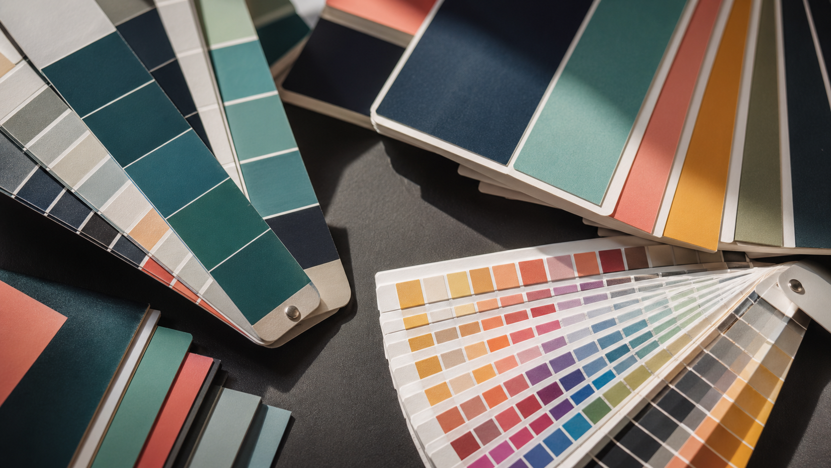
- Adobe Color — free, and the Explore tab lets you search by keyword (e.g. "modern tech startup", "organic skincare") to pull palettes other designers have built and saved. Useful starting point, not a final answer.
- Sessions College Color Calculator — pick a base colour, cycle through every harmony scheme on one page. Faster than rebuilding palettes manually.
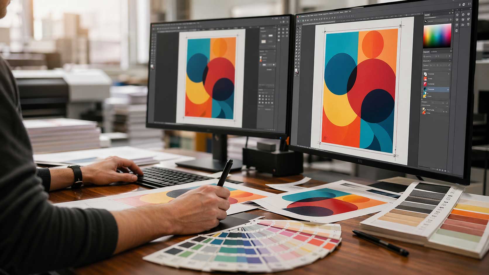
- Illustrator's Recolor Artwork — under Edit Colors. With the link icon checked, you can shift an entire design's palette with one slider. Brilliant for client variations.
- Global swatches in Illustrator — define a colour as Global (tick the box when creating the swatch) and any change to that swatch updates everywhere it's used in the file. Saves enormous amounts of time on logo or brand system work.
- Hue/Saturation adjustment + targeted colour picker in Photoshop — change the colour of a specific object in a photograph without masking. Click the targeted adjustment tool, sample the colour, drag the hue slider.
- A physical colour wheel — ten dollars on Amazon, shows tints, tones and shades alongside harmony relationships. Genuinely useful when you're working out colour for printed pieces and want to see relationships in a non-screen context.
Brand colour decisions that survive scale
When you're picking colours for a brand that'll appear across business cards, labels on rolls, pull up banners and vehicle signage, the brief is different to a one-off poster.
A few rules worth following:
- One or two colours is safer for recognition. Coca-Cola red. Cadbury purple. Snapchat yellow in a sea of blue social apps. Multi-colour brand systems (Google, Microsoft) work but require disciplined application.
- Test the palette across substrates before locking it in. A brand colour that looks premium on a coated business card might look washed out on a corflute sign or oversaturated on a mesh banner.
- Specify both Pantone and CMYK builds. Give your trade printer the spot reference and the closest CMYK approximation. Document which one to use on which product.
- Consider the competitive landscape. If every competitor uses blue, going yellow or green is a strategic choice, not just a creative one.
Key Takeaways
- Start with the feeling and the brand personality before picking colours. Hue alone doesn't carry the message — saturation, brightness and contrast do most of the work.
- Match the harmony scheme to the job: monochromatic and analogous for calm and premium, complementary and triadic for attention and urgency.
- Design in CMYK from the start for print work. Watch total ink coverage and avoid pure RGB primaries that won't convert cleanly.
- Substrate changes how colour reads. Coated, uncoated, corflute, mesh and label stocks all behave differently — proof if it matters.
- For outdoor signage in Australian conditions, factor in UV fade. Reds and magentas suffer first.
- Use global swatches and Recolor Artwork to keep brand colour systems consistent and editable.
- Culture, age and gender shift colour perception. Know the target audience before you commit.
Send the file, we'll handle the press
Getting the colour right in the artwork is the designer's craft. Holding that colour across stocks, sizes and runs is the printer's job. Mediapoint runs trade print production for designers, resellers and sign shops across Australia — from short-run labels to large-format outdoor signage — so you can focus on the creative call while we manage the CMYK reality. Browse the full product catalogue or send through your next job for a quote.