Trusted by 1,000+ Australian Print Resellers

Reliable Lead Times & Delivery Dates

Blind Shipped or White-Labelled

envelopeenvelope-active
notificationnotifications
cartcart
useruser

From Logo Sketch to Print: Designing Marks That Reproduce

From Logo Sketch to Print: Designing Marks That Reproduce

Watching a designer build a logo from scratch is one thing. Translating that mark into something that prints cleanly across business cards, pull-up banners, vehicle wraps and label rolls is another. The decisions made in the ideation stage, corner radius, line weight, custom letterforms, negative space, all have downstream consequences once the file leaves Illustrator and lands on a press.

Below is a breakdown of a real logo ideation process for an AI content brand, reframed through the lens of trade print production. If you design identities for clients who will need those identities applied across signage, packaging and print collateral, the choices you make in the first hour of sketching matter more than you might think.

Start with words, not shapes

Before any vector work, the process began with a mind map. The brief called for something "seriously playful," modern, friendly, not dystopian, sitting somewhere between Canva, Adobe and Framer in tone. Words like wand, stars, flash, aura, energy and power anchored the visual direction.

This step matters for print because it forces specificity early. A logo built around a clear conceptual anchor (in this case, the star as a symbol of AI-generated "magic") tends to hold up better when it is scaled down to a 3mm label icon or blown up to a 3m mesh banner. Vague concepts produce vague shapes, and vague shapes are the ones that fall apart at the extremes of reproduction.

The star as a building block

The first visual exploration centred on stars, but not generic five-pointed ones. Using Illustrator's radial repeat features, the designer played with distorted star shapes, then combined three stars in a triangular arrangement. The clever bit: the negative space between them suggested a hidden "M," perfect for a brand called Magic.

This is a textbook example of using negative space to do the work, and it is a technique that rewards careful production. When you are relying on inverted space to carry meaning, you need:

  • Clean vector geometry with no stray nodes or overlapping paths
  • Sufficient contrast between the mark and whatever it sits on
  • A minimum reproduction size below which the negative shape collapses

That last point is critical. A negative-space "M" formed by three star polygons might read perfectly at 40mm on a business card but disappear entirely at 8mm on a label or hang tag. Always test your mark at its smallest intended print size before signing off.

Rounded corners: friendly on screen, fiddly in production

A core design decision was rounding the corners of the star and surrounding shapes. Sharp angles read as serious and corporate. Rounded corners read as friendly, approachable, almost childlike. For a consumer-facing AI brand, that was the right call.

For production, rounded corners are generally a friend:

  • They survive die-cutting better than sharp points, which can tear or chip
  • They handle vinyl cutting cleanly without weeding issues at the tips
  • They reproduce more reliably at small sizes, where sharp star points can blur or fill in on uncoated stock

If your logo lives on labels, packaging or any cut-vinyl signage, a 1 to 2pt corner radius on what looks like a sharp point can save a lot of production grief without changing the visual feel.

Custom typography: beautiful, but plan for print

The designer built a custom typeface ("Funky") specifically for this concept, rather than pairing the icon with an existing font. The reasoning: bespoke letterforms distil the shapes of the brand into the wordmark itself, creating tighter visual cohesion.

It is a legitimate approach, and one we see more often in considered identity work. But custom type comes with print-production responsibilities:

  • Outline all type before sending to print. Custom fonts will not be installed on the printer's RIP. Always convert to outlines.
  • Check stroke weights at the smallest intended size. Letterforms with delicate joins or thin terminals can break apart under 8pt on offset or digital presses, especially on absorbent uncoated stock.
  • Watch the kerning. Custom type often has spacing quirks that are invisible at presentation size but ugly at billboard scale.

The wordmark was eventually paired with a more neutral grotesque (Neue Haas Grotesk style) for body applications, a smart move. A custom display face for the logo plus a workhorse text face for everything else is a combination that prints reliably across every product in a brand's print rollout.

Designing for 3D and tactile applications

Part of the brief required the logo to work in 3D: buttons, animated states, dimensional treatments. The designer used Illustrator's 3D effects to preview how the mark would extrude and catch light.

This matters for print resellers and sign shops because "3D-ready" logos are often the same logos that need to translate to:

  • Embossed or debossed business cards
  • Cut and raised acrylic signage
  • Vehicle wraps where the logo wraps around compound curves
  • Pull-up banner graphics with depth and dimensionality

If a logo only works flat, you will discover that the first time a client asks for raised lettering on a reception sign. Designing with dimensionality in mind from day one saves rework later.

CMYK realities for "magical" colour

The brief called for an aura of wonder, the kind of brand that often leans on gradients, glows and vivid digital colours. This is where designers and print partners need to have an honest conversation.

Bright purples, electric blues and saturated magentas that glow on a backlit screen often shift noticeably when reproduced in CMYK. Some specific things to watch:

  • RGB neon purples typically shift duller and more blue on CMYK presses
  • Vibrant gradients can band on large-format prints, particularly on corflute and rigid boards where the substrate does not absorb ink the same way as paper. Our guide to designing gradient logos for print goes deep on how to stop a gradient mark falling apart on press.
  • Spot colours (Pantone) give you more consistency across substrates if a brand colour is non-negotiable

Build a brand palette in CMYK from the start, or at minimum define CMYK and spot equivalents for every primary colour. The handoff between "looks great on a Behance presentation" and "looks great on a printed label" is exactly where this work gets done.

Stars, line weights and small-scale reproduction

The final icon direction used three stars to form an implied "M." Clever, but each of those stars has fine points, and the shape relationships rely on tight tolerances.

A few things to stress-test before sending this kind of mark to print:

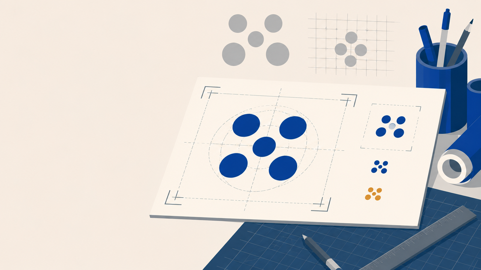
  1. Print it at 10mm wide on uncoated stock. If the star points fill in or the negative M collapses, increase corner radius or thicken the elements.
  2. Print it reversed (white logo on a dark background). Ink gain often makes negative-space marks lose their internal shapes.
  3. Cut it in vinyl at the smallest intended size. If a weeder cannot pull the negative shapes out cleanly, the design needs simplifying for that application.

A mark that works beautifully on a 1920 x 1080 presentation slide can fail completely on a 25mm round sticker. Designing for the worst-case reproduction scenario protects the brand across every touchpoint.

From concept to brand application

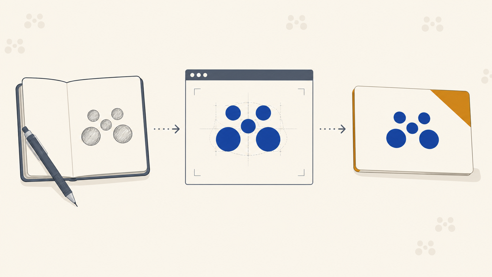
The next step in this process, once a direction is chosen, is fleshing the identity out across applications: stationery, packaging, signage, social. This is where the relationship between identity designer and print partner becomes practical.

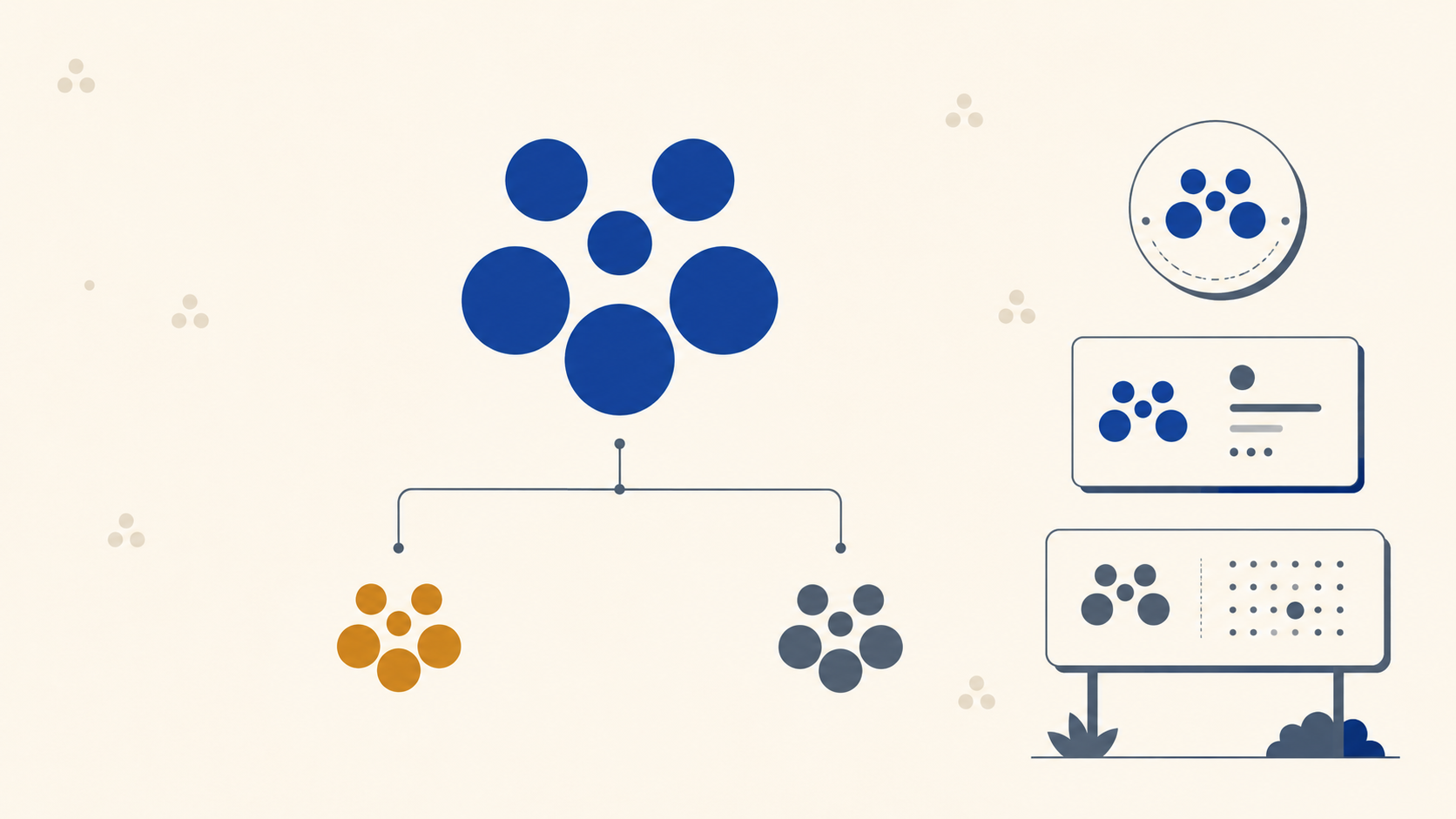
A well-designed identity needs faithful reproduction across business cards, labels on rolls, pull-up banners, vehicle signage and packaging. That is the production side of the work, making sure the mark you spent weeks crafting actually shows up in the world looking like it did in your presentation.

Frequently Asked Questions

Why does my logo look different when printed? The usual culprit is colour space. Logos designed on screen live in RGB, which can show vivid colours a CMYK press cannot reproduce, so bright purples, blues and magentas tend to shift or dull in print. Designing or at least proofing in CMYK, and defining spot-colour equivalents for critical brand colours, closes most of that gap before it reaches a client.

What is the smallest size a logo should be tested at? Test at the smallest size the mark will actually be reproduced, which is often around 8 to 10mm for a label icon, a favicon-scale sticker or a hang tag. Negative-space details and fine points are the first things to collapse at small sizes, so printing a physical proof at that scale is the only reliable check.

Are rounded corners better for print than sharp ones? For most print and cut applications, yes. Rounded corners survive die-cutting and vinyl weeding far better than sharp points, which can tear, chip or fill in at small sizes. A subtle 1 to 2pt radius usually keeps the intended look while removing a lot of production risk.

Do I need to outline fonts in a logo before printing? Almost always. Outlining converts type to vector shapes so the printer's RIP does not substitute a missing font, which is especially important for custom or bespoke typefaces that will not exist on the printer's system. Confirm with your trade printer, but outlined files are the safe default.

Should a logo be designed in CMYK from the start? If the brand will live in print, yes, or at least define CMYK and Pantone equivalents alongside the RGB version early. Building the palette with print in mind from day one avoids the disappointment of a screen-vivid identity that dulls the first time it is reproduced on a press or a substrate.

Key Takeaways

  • Start with words. Specific conceptual anchors produce marks that hold up at all reproduction sizes.
  • Negative space is powerful but fragile. Test inverted marks at minimum print size before committing.
  • Round your corners. Friendlier on screen, more forgiving in die-cut, vinyl and small-format print.
  • Custom type is fine, but outline it. And stress-test stroke weights at the smallest intended size.
  • Design in CMYK from day one if the brand will live in print. Vivid screen colours often shift on press.
  • Test the worst case. Print at the smallest size, reverse out the logo, cut it in vinyl. Find the failures before the client does.

Bringing the identity to print

Designing the mark is the creative work. Reproducing it faithfully across every product the brand needs is ours. Mediapoint is a trade printer working with designers, resellers and sign shops across Australia, handling production on business cards, labels, banners, corflute and the rest, so you can focus on the brand and the client. When your next identity is ready to roll out, get a quote and we will handle the press side.