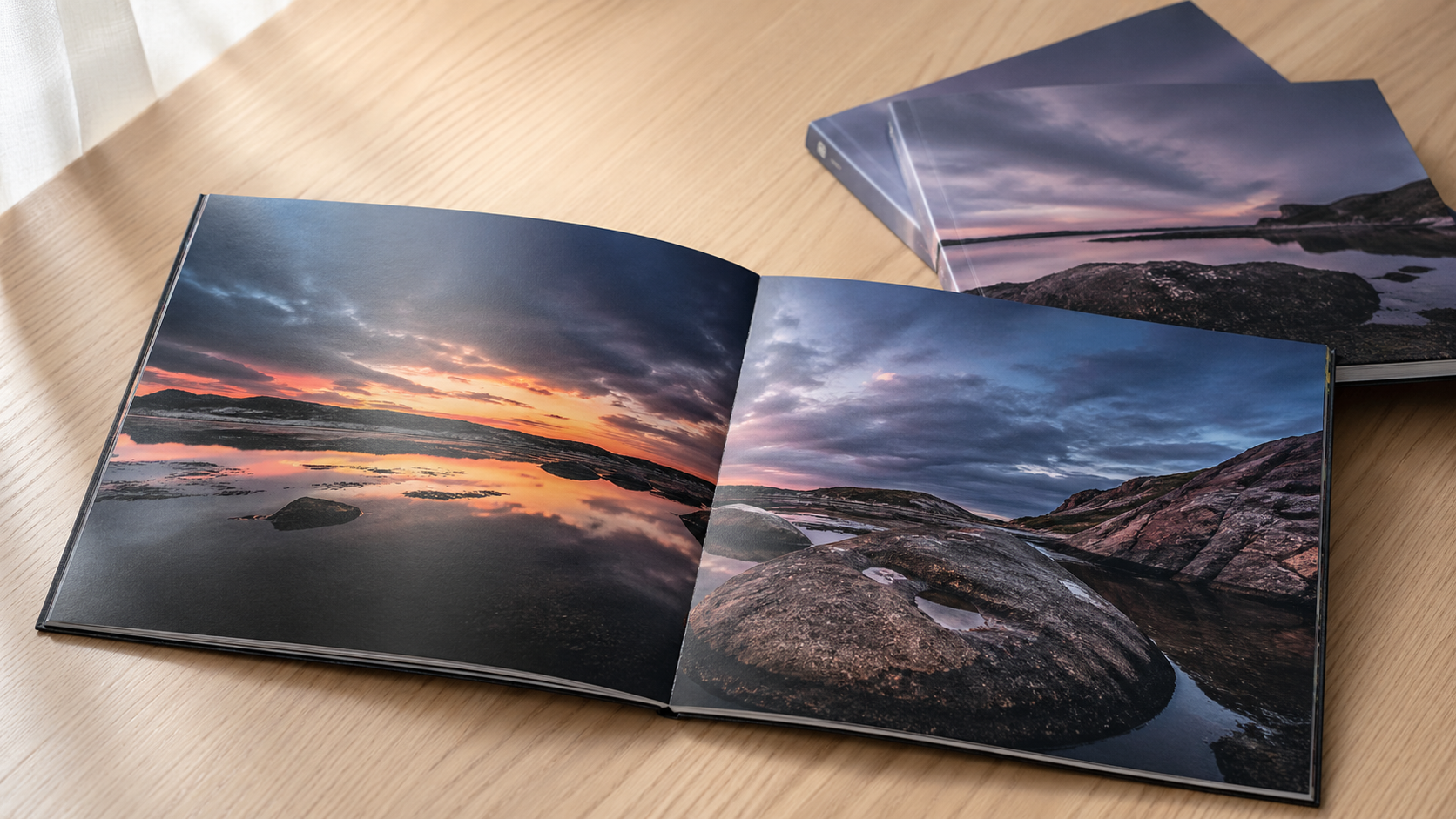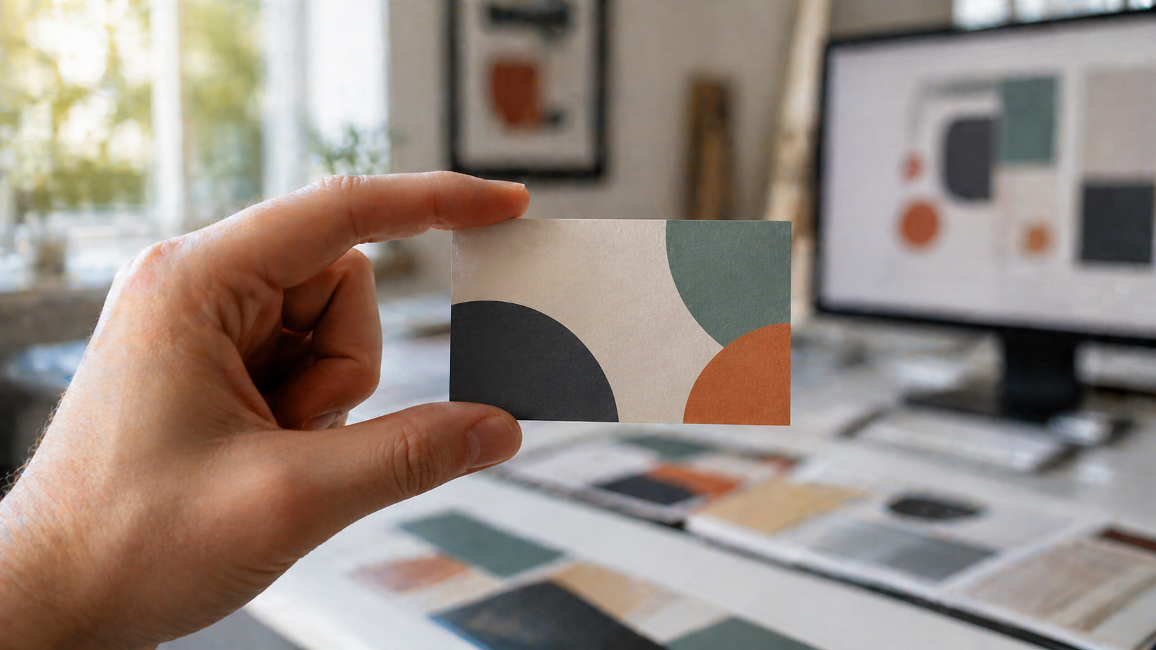
Business cards are one of the most common jobs that land on a trade printer's press, and they're also one of the most common jobs that arrive with file problems. Wrong colour mode, missing bleed, live text not outlined, RGB images dropped in at the last minute — small oversights that cost time and create reprints.
This guide walks through the Illustrator setup we'd recommend if you're producing business cards for clients and sending the artwork to a trade printer. It assumes you know your way around Illustrator. The focus here is on getting the file right for press, not on design theory.
Honest note up front: Mediapoint doesn't print business cards ourselves — we focus on large format work, signage, labels and the print products that don't fit a standard sheet press. But the file setup principles in this guide apply across most print products you'll send to any trade printer in Australia, and designers we work with on signage and large format jobs often need this guidance for their stationery work too. So we wrote it.
Document setup: size, bleed, and colour mode
Australian standard business card size is 90 x 55 mm, though plenty of designers and clients still work to the international 85 x 55 mm. Both are common, and either will print fine — just confirm the size with your printer and your client before you start. If your client has existing stationery, match what they've already got.
When you create the new document in Illustrator, set the intent to Print. This forces sensible defaults: CMYK colour mode, 300 ppi raster effects, and the option to add bleed.
The non-negotiables:
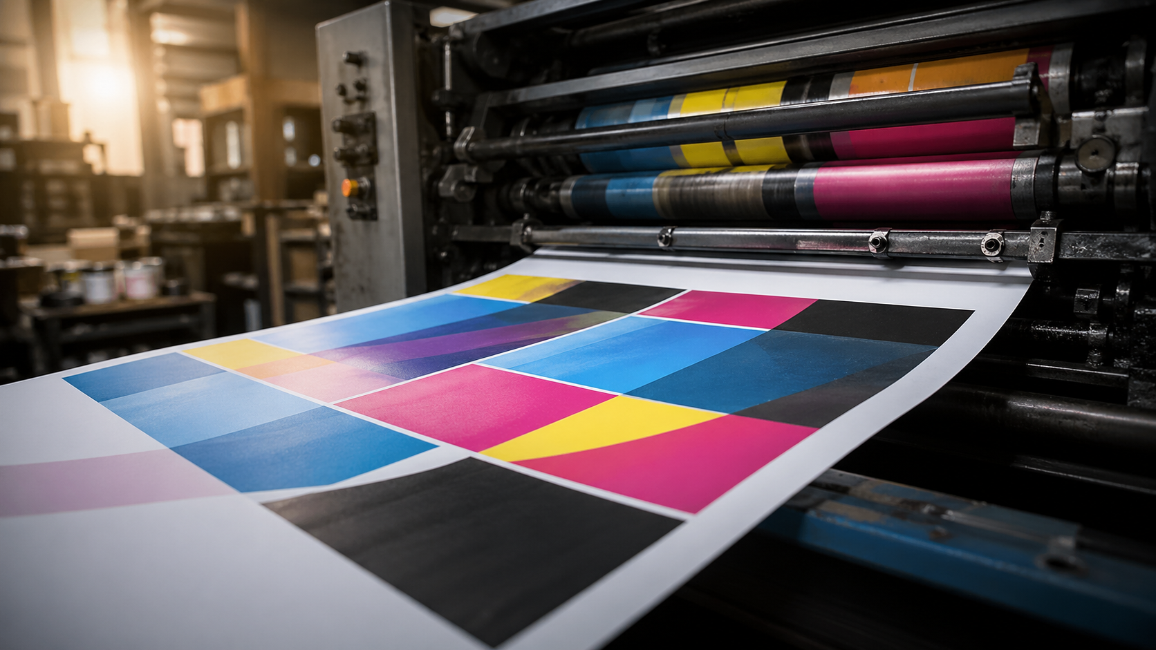
- Colour mode: CMYK. RGB files will get converted at the printer's end, and the colours you see on screen are not the colours you'll get on paper. Design in CMYK from the start so there are no surprises. For more on choosing colours that translate well from screen to print, see our colour theory guide for print designers.
- Bleed: 3 mm on all sides. This is the standard across Australian trade printing. Anything that runs to the edge of the card needs to extend into that 3 mm bleed area. Once the cards are guillotined, slight movement on the cut means a card without bleed shows white edges. For a deeper explanation of why bleed and trim marks matter across all print formats, see our bleed and crop marks guide for designers.
- Two artboards. One for the front, one for the back. Keep them on the same document so the file stays tidy and any colour swatches or symbols are shared.
Bleed shows up as the red line around your artboard. The space between the trim edge (the artboard edge) and the bleed line is what gets cut away. Anything important — text, logos, key graphics — should sit at least 3–4 mm inside the trim, not right on the edge. That's your safe zone.
Building the artwork
For the design itself, work in vector wherever possible. Logos, icons, decorative shapes — keep them as vectors so they print sharp at any size. Business cards are small but they're held close to the eye, so any pixelation or fuzzy edges will be obvious.
A few practical points worth flagging:
- Strokes. If you're using stroked shapes as design elements, outline the strokes before you export (Object > Path > Outline Stroke). This locks the appearance and avoids any reflow or weight changes when the file is processed.
- Pathfinder cleanup. If your design has overlapping shapes that extend beyond the card edge, use the Pathfinder Minus Front tool with a rectangle the size of your trim area to clean them up. This keeps the file lean and avoids any rendering oddities at the edge.
- Image trace for icons. If you're pulling in a raster icon (social media glyphs, for instance), run it through Image Trace with "Ignore White" enabled, then expand to vector. Illustrator's built-in symbol library also has clean vector icons for web, email, and phone — worth checking before you go hunting online.
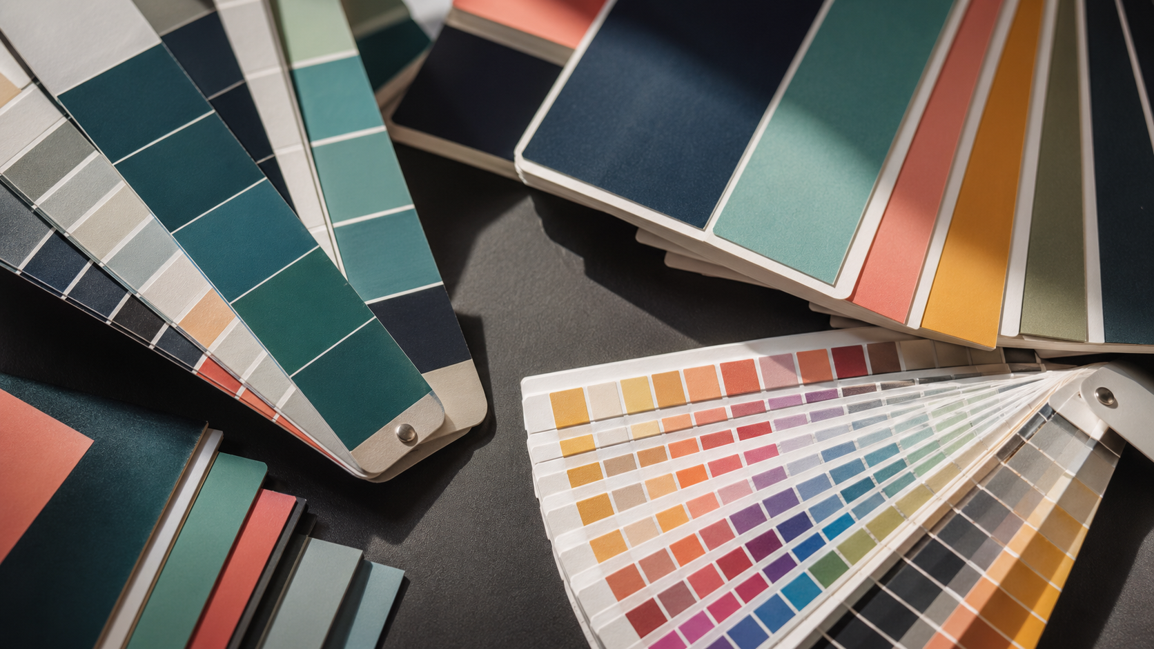
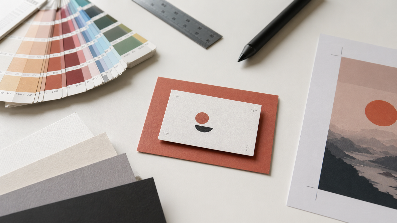
For colour, stick to a tight palette. Three colours is plenty for a business card. Black, white, and a single accent (a metallic-look gold, a brand colour) usually reads better than something more complex at this scale.
Typography at business card scale
Type on a business card has to work at small sizes, often 7–9 pt for contact details. That means:
- Avoid hairline weights. Ultra-thin fonts can break up or disappear on press, especially on uncoated stocks where ink absorbs into the fibre.
- Watch your contrast. Light grey type on white might look elegant on screen but it can vanish in print. If you're using a tint of black for body copy, don't go below about 70%.
- Mind your minimum sizes. Most trade printers will recommend a minimum type size of around 6 pt, and minimum line weight of 0.25 pt. Anything finer is a gamble.
- Outline all type before export. This is the single biggest cause of "why does this look different?" problems with PDFs. Outlining type (Type > Create Outlines) converts every character to a vector shape, locking the appearance regardless of whether the printer has the font.
Save a working version of the file with live type before you outline anything. Once type is outlined, you can't edit it as text. Two files: one editable master, one print-ready with outlines.
Aligning the layout
Use guides and the Align panel rather than eyeballing. Pull guides from the rulers (Ctrl/Cmd+R to toggle) and snap your contact block, logo, and any decorative elements to a consistent grid. On a card this small, even 0.5 mm of misalignment is visible.
If you're producing cards for multiple staff at the same business — common for corporate jobs — build the layout once with placeholder details, then duplicate the artboard for each person and swap the text. Keeps the design consistent across the run.
Exporting the print-ready PDF
Once the artwork is locked down and type is outlined, save out the PDF.
- File > Save As, choose Adobe PDF.
- Use the PDF/X-1a:2001 preset, or your printer's supplied preset if they've given you one. PDF/X-1a flattens transparency, embeds fonts (or in your case, doesn't need to because you've outlined them), and forces CMYK.
- Under the Marks and Bleeds tab, enable Trim Marks and tick Use Document Bleed Settings. This bakes the 3 mm bleed into the exported PDF.
- Don't downsample images aggressively. Keep raster content at 300 ppi at final size.
- Tick View PDF after saving so you can immediately check the export.
When the PDF opens, look for: bleed extending past the trim marks, type that's crisp and not shifted, colours that look right, and no missing elements. If anything looks off, fix it in the Illustrator file and re-export. Don't try to patch the PDF.
Common file mistakes that delay print jobs
A quick checklist before you send anything to your trade printer:
- Document is CMYK, not RGB
- 3 mm bleed on all sides, with artwork extending into it
- Important content is at least 3–4 mm inside the trim edge
- All type is outlined
- All strokes are outlined or set to a sensible weight
- Images are 300 ppi at final size and embedded (not linked)
- File exported as PDF/X-1a with trim marks and bleed
Get those right and your job moves through prepress without back-and-forth. Get one wrong and you're waiting for a corrected file before anything goes on press.
Frequently asked questions
What is the standard business card size in Australia?
Australian standard business card size is 90 × 55 mm. The international 85 × 55 mm size is also common and prints fine — the key is consistency with your client's existing stationery and confirmation with your chosen printer before starting.
Do I need bleed for business cards?
Yes. 3 mm bleed on all sides is the Australian trade printing standard. Without bleed, slight movement during cutting can leave white edges on cards where artwork was meant to run to the edge.
What file format should I send to my trade printer?
PDF/X-1a is the safest choice for business cards. It flattens transparency, embeds fonts, and forces CMYK colour space — all things that prevent press surprises. Most Australian trade printers accept this format as standard.
Should I outline fonts before sending to print?
Yes. Outlining fonts converts them to vector shapes and removes any risk of font substitution at the press. Save a separate editable master before outlining so you can edit text later if needed.
What's the smallest text size I can use on business cards?
Most trade printers recommend 6 pt as the absolute minimum, with 0.25 pt as the minimum line weight. For body copy and contact details, 7–9 pt with at least 70% black gives reliable readability across most stock types.
Key takeaways
- Set up Illustrator documents as Print intent, CMYK, with 3 mm bleed from the start — don't try to add bleed retrospectively.
- Standard Australian business card size is 90 x 55 mm, but confirm with your client and printer before starting.
- Keep important content 3–4 mm inside the trim edge to allow for cutting tolerance.
- Outline all type and strokes before exporting the print-ready PDF, but keep an editable master file.
- Export as PDF/X-1a with trim marks and document bleed enabled.
- A clean, well-prepared file is the difference between a smooth print run and a reprint.
When you're ready for the bigger print work
The file setup principles for business cards transfer to most print products you'll work on as a designer. Bleed, CMYK, outlined type, PDF/X-1a — same standards across signage, large format banners, posters, labels and rigid signage.
Mediapoint doesn't print business cards, but we do produce the wide format and signage work designers need alongside their stationery jobs. If you're working on something bigger than a business card — outdoor signs, retractable banners, posters, labels, or any large format print — have a look at our full product catalogue or get in touch for a quote. The file setup principles in this guide will get you through prepress on those jobs too.
The press-readiness specifications, Australian trade printing standards, and prepress workflow guidance throughout are based on Mediapoint's production standards.