Trusted by 1,000+ Australian Print Resellers

Reliable Lead Times & Delivery Dates

Blind Shipped or White-Labelled

envelopeenvelope-active
notificationnotifications
cartcart
useruser

Vector Character Design for Print: A Trade Printer's Guide

Vector Character Design for Print: A Trade Printer's Guide

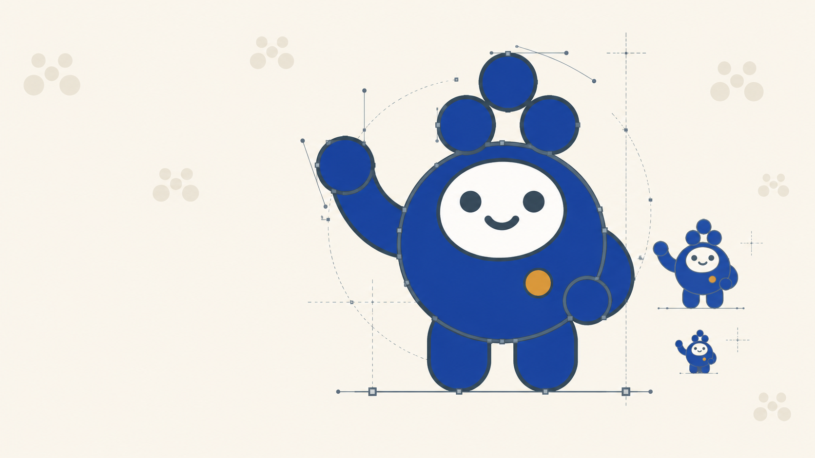
Vector illustration has quietly become one of the most versatile assets in a brand identity kit. A well-built character can land on a business card, a corflute sign, a vehicle wrap, a product label, and a pull-up banner, and if the file is built properly, it holds up at every size without redraws.

The catch is that "built properly" means something specific when the artwork is heading to a trade printer. Stroke alignment, node cleanliness, colour choices and export settings all affect what comes off the press. Here is how to work through a simple vector character build in Affinity Designer with print production in mind from the first shape.

Start with an artboard, not a page

Set up your document using an artboard rather than a fixed page. In Affinity Designer, hit the artboard tool and drop one in at your working size (a 144mm square is a comfortable canvas for character work).

Artboards let you resize the working area without diving back into File > Document Setup, and they make selective export much cleaner later on. That matters because a character built once will often be re-exported at multiple sizes for multiple printed products. If you are running full identity projects in Affinity, our brand identity workflow guide covers how artboards carry through the whole process from mood board to handover.

Build the silhouette with primitive shapes

Start with the body. Two overlapping ellipses, one for the head, one for the body, merged with the Add boolean operation give you a clean single silhouette. Hold Shift while dragging to constrain proportions.

A few things worth locking in from the start:

  • Fill first, stroke second. Set your fill (white for now) before enabling the stroke. It saves fiddling later.
  • Stroke weight around 3pt is a sensible starting point for a character that will be reproduced at business card size and larger. Anything thinner risks disappearing when the artwork is reduced to fit a 90 x 55mm card.
  • Merge shapes with boolean operations rather than leaving them stacked. A single merged path prints more predictably than overlapping fills, especially when the file passes through a RIP.

Stroke alignment is a print decision

This is the one most designers skip past, and it causes the most problems downstream.

The Stroke panel in Affinity gives you three alignment options: centre, inside, and outside. Outside alignment gives the boldest, most consistent look for illustrated characters, because the shape stays true to its silhouette and the stroke sits cleanly around it.

Why it matters for print: if you scale a character down for a small application (a label, a business card) and your strokes are set to centre alignment, half the stroke weight eats into your fill area. On press, that can make small features look muddy or close up entirely. Outside alignment keeps the internal shapes clean at any size.

Pick one alignment approach and stay consistent across the whole illustration. Mixed alignments are a nightmare to correct once the file is layered up.

Duplicating and mirroring for symmetry

For symmetrical features like eyes, cheeks and highlights, build one, then duplicate with Alt+Shift+drag to constrain to the horizontal axis. For a proper mirror, use Flip Horizontal on the duplicate.

The Transform Objects Separately toggle is worth knowing. With it enabled, scaling a group of duplicated shapes transforms each one around its own centre instead of the group's shared centre. Handy for scaling pairs of eyes inward without them drifting apart.

Curves, nodes, and the Contour Tool

Once your primitives are placed, convert them to curves (top toolbar) to unlock node editing with the Node Tool (A). Push nodes around to break the perfect-circle look and give the character personality: a squashed top on the head, a slight lift on a cheek.

The Contour Tool is the sleeper feature here. It offsets a path outward or inward by a set amount, which lets you thicken silhouettes without redrawing them. For character work aimed at print, a positive contour on the outer silhouette gives you that chunky, confident line that reads well at distance, useful if the same character is going onto corflute signage or a pull-up banner where viewing distance is measured in metres, not centimetres.

Line work with the Pencil Tool

For mouths, eyebrows and organic details, switch to the Pencil Tool. Set the stabiliser (the smoothing option in the tool settings) to a higher value, around 20, which gives you a much cleaner curve than freehand.

Draw inside the parent shape by selecting the shape first, so your line is nested and clips correctly. Clean up excess nodes with the Node Tool after each stroke, since fewer nodes means smoother reproduction and smaller file sizes when the artwork is placed into larger layouts.

For symmetrical line work like a smile, draw one half, duplicate, flip horizontal, and align. Then match the stroke widths exactly. Inconsistent stroke weights on mirrored elements are one of the first things a good pre-press check picks up.

Colour choices: what looks good on screen versus on press

The bright oranges, yellows and cyans that make character illustrations pop on screen are exactly the colours that shift most dramatically in CMYK.

A few things to watch:

  • Neon or fluoro brights do not exist in standard CMYK. If your character depends on a hot pink or electric orange, that colour will land duller on press. Either accept the shift or specify a spot colour, which adds cost.
  • Rich black versus 100K black. For small elements like eye pupils and thin lines, use 100% K only. Rich black (a CMYK mix) on tiny features can look muddy and register poorly if there is any misalignment on press.
  • Test yellows against your background. Yellow on white has almost no contrast in print. What looks fine on a backlit monitor can disappear on paper stock.

If the character will end up printed on multiple substrates (paper, vinyl, corflute, fabric), request a proof on the actual stock. Colour behaves differently on coated versus uncoated, and dramatically differently on textile.

Highlights and secondary detail

Add highlights last, using the Pencil Tool with a white fill and no stroke. Keep them shape-based rather than stroke-based, because a filled highlight scales predictably and a stroked one can look weedy when the illustration is scaled down for a label.

Same logic applies to shadows and any subtle secondary colour work. Filled shapes reproduce more consistently across print processes than thin strokes.

Group ruthlessly

Vector illustrations get messy fast. By the time you have built eyes, mouth, highlights, secondary body colour and background, you are looking at 30 or more layers.

Group by logical element:

  • Head group (silhouette plus facial features)
  • Body group (silhouette plus secondary shapes)
  • Highlights group
  • Background group

Name every group. If the file ever needs to be revised, a new colour variant or a different expression for a seasonal campaign, you will save an hour of hunting.

Grouping also matters if the character will ever be animated or exported as separate assets. Anything you might want to isolate later should be its own group now.

Exporting for print

Two export scenarios worth knowing:

Full artboard export. File > Export exports everything within the artboard bounds, including the background. Use this when the character sits on a coloured background that is part of the final printed piece.

Selection-only export. Select the character group, go to File > Export, and choose "Selection Only." This exports the character on a transparent background, essential when the character is being placed into a larger layout by someone else, or when it needs to sit on different backgrounds across different printed products.

For print production, export as PDF with vectors preserved, or high-resolution PNG at minimum 300dpi at final print size. If the character is heading onto large-format work like a banner or vehicle wrap, keep it vector. Never rasterise a hero illustration before it goes to the printer.

Building for multiple print products from one file

The reason to build character illustrations properly in vector, with clean paths, outside stroke alignment, sensible grouping and CMYK-aware colour, is that one well-built file becomes the source of truth across every printed application.

The same character might appear on:

  • Business cards (90 x 55mm, tight detail)
  • Labels on rolls for product packaging
  • Pull-up banners (2m tall, viewed from 3m away)
  • Corflute site signage
  • Vehicle graphics

Each of those has different demands on stroke weight, colour saturation and detail level. A properly built vector file scales into all of them without redraws. A hastily built one needs rework for every product.

Frequently Asked Questions

What stroke alignment should I use for vector characters going to print? Outside alignment is the safest default. With centre alignment, half the stroke weight eats into the fill, so when the character is scaled down for a label or business card, small internal features can close up or look muddy on press. Whichever you choose, stay consistent across the whole illustration, because mixed alignments are painful to fix later.

Why does my character illustration look duller when printed? Standard CMYK cannot reproduce neon and fluoro brights, so hot pinks, electric oranges and vivid cyans land duller on press than they appear on a backlit screen. You can either design within the CMYK gamut, accept the shift, or specify a spot colour for a critical brand colour at additional cost.

Should I use rich black or 100% K for small details? Use 100% K for small elements like pupils and thin lines. Rich black is a mix of multiple inks, so any slight misregistration on press shows up on tiny features as a muddy or fringed edge. Save rich black for large solid areas where the extra density actually helps.

How do I export a character with a transparent background in Affinity? Select the character group, then use File > Export and tick "Selection Only." That exports just the selection without the artboard background, which is what you need when the illustration will be placed into someone else's layout or used across products with different background colours.

Can one vector file work across business cards and large-format signage? Yes, if it is built properly. Clean merged paths, consistent outside stroke alignment, filled highlights rather than thin strokes, and CMYK-aware colour let a single file scale from a 90 x 55mm card to a vehicle wrap without redraws. Keep it vector all the way to the printer rather than rasterising it first.

Key Takeaways

  • Set stroke alignment to outside and keep it consistent across the illustration. It holds up better at small print sizes.
  • Use booleans (Add, Subtract) to merge shapes into single clean paths rather than leaving overlapping fills.
  • Neon or fluoro brights do not reproduce in standard CMYK. Expect colour shift or specify a spot colour.
  • Use 100% K black for small features, not rich black. It reproduces more cleanly on press.
  • Build highlights and shadows as filled shapes, not strokes. They scale more predictably.
  • Group and name every logical element for easy revision and multi-product exports.
  • Export as vector PDF or 300dpi or higher PNG at final print size, and never rasterise before large-format print.

Handing Off to Production

Once the character file is clean, layered and export-ready, the print production side should be the easy part. Mediapoint is a trade-only printer working behind the scenes for designers, sign shops and resellers across Australia, reproducing brand illustrations faithfully across business cards, labels, banners and rigid signage. If you have got a character-led brand identity heading into production, request a quote and we will handle the press side while you focus on the design.