Trusted by 1,000+ Australian Print Resellers

Reliable Lead Times & Delivery Dates

Blind Shipped or White-Labelled

envelopeenvelope-active
notificationnotifications
cartcart
useruser

Composition, Grids & Flow: Print Design Layout Guide

Composition, Grids & Flow: Print Design Layout Guide

Composition and layout are where a print job is won or lost. You can pick the right stock, nail the CMYK build, and dial in bleed perfectly, but if the eye does not know where to go on an A1 poster or a pull-up banner, none of that production work matters.

This guide walks through the layers of movement and flow, the grid systems that hold artwork together, and the leverage points that make a printed piece land. It is written for designers who hand files to trade printers and need their layouts to hold up at scale, on real substrates, viewed at real distances.

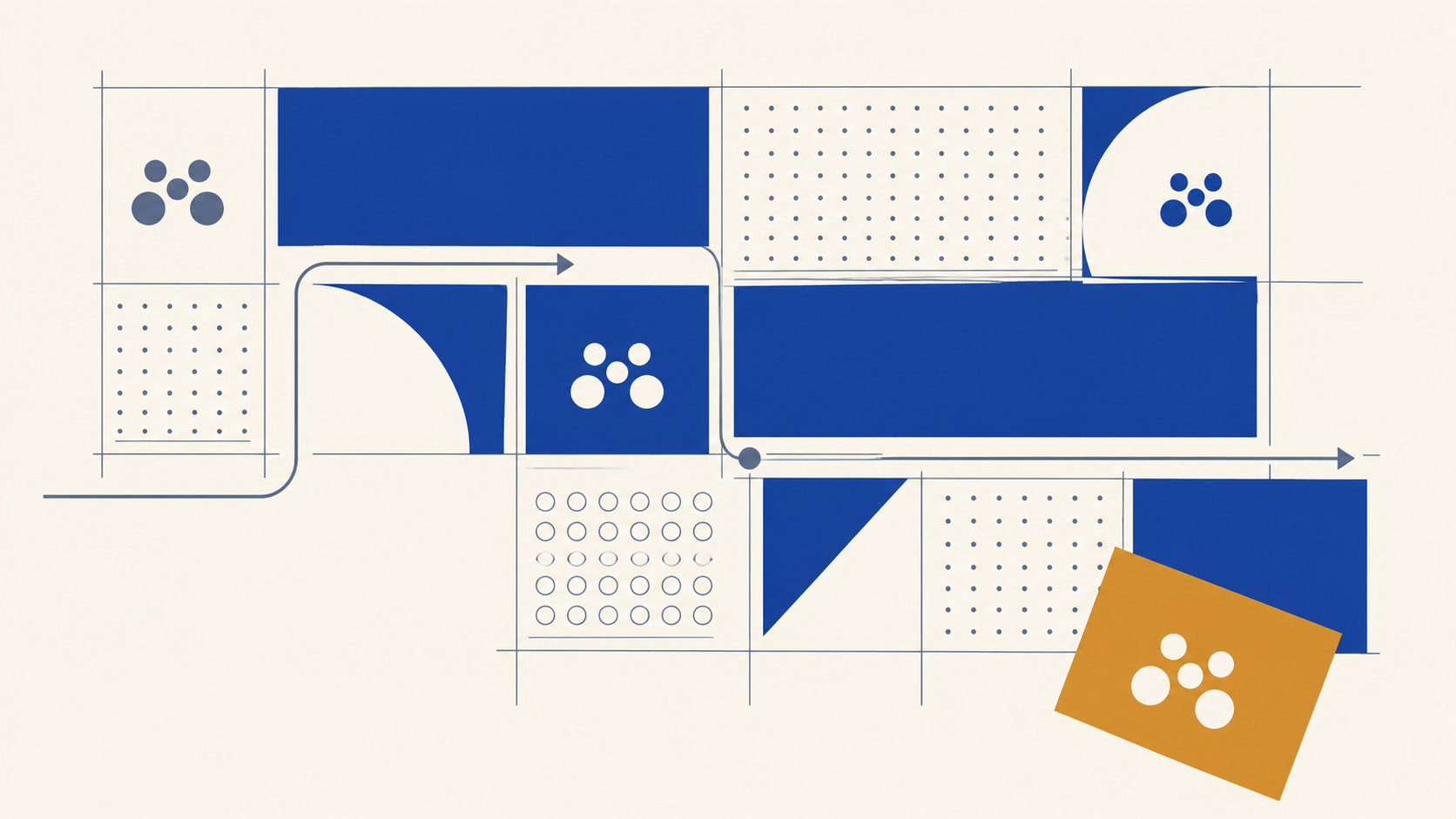
The six levels of movement and flow

Movement is not decorative. It is how you control where the viewer looks first, second, and last. On a printed piece, you usually only get a few seconds. Here is how to earn them.

1. Direct visual guidance. The most literal form: an arrow, a line, a gaze, a hand pointing. Think wayfinding signage at airports, or a sports poster where the athlete's body angle leads straight to the logo. It works because the eye instinctively follows directional cues. Use it when clarity matters more than subtlety: retail corflute signs, event wayfinding, anything read at a glance from 3 metres or more.

2. Hierarchy-driven flow. Skip the arrows. Use size, weight, and contrast so the eye steps from headline to subhead to detail naturally. Larger and bolder elements get seen first, medium next, small last. This is the workhorse of editorial layouts and minimal posters, where the composition itself becomes an invisible arrow. It is worth understanding in its own right, so if this is the level you lean on most, our guide to visual hierarchy in print breaks it down in full.

3. Layered paths. A main route plus smaller micro-routes. Secondary type blocks pull the eye into a short loop before reconnecting to the main path. This buys you time on a design, but the secondary flows cannot overpower the primary one or the piece reads as chaos. Useful on detail-heavy pieces like product brochures or info-rich pull-up banners.

4. Implied motion. Repetition, progressive scaling, blur, or directional patterns make a static design feel like it is moving. A gradient that tapers, a pattern that tightens at one edge, a frozen action shot, the brain reads it as acceleration. Particularly powerful for print because you are faking energy without animation.

5. Flow disruption. A rotated block, a colour clash, a deliberate break across the main path. The eye hits it, pauses, and has to re-engage to navigate around. The brain does not like unresolved paths, so disruption forces attention back onto the page. Use it sparingly and deliberately, at a key message, not at random.

6. Temporal flow. Controlling how long the eye lingers and when it accelerates. Think of a luxury fashion spread: full-bleed model image (fast hit), layered detail copy in fine serifs (linger), then a stark white space with a single logo (pulse). Punch, slow, pulse, release. Most designers never think about this. Once you do, your layouts start to feel like a designed experience rather than a static page.

Why grids matter for print

Grids go back to manuscript design and early printing presses, and they are still the structural skeleton behind every clean layout. For print specifically, they do five things really well:

  • Lock down hierarchy. Stretch an important element across multiple columns to give it dominance. A six-column grid gives you more control than a three-column one when you are laying out an A2 poster or a multi-page brochure.
  • Create deliberate impact when you break them. Keep most elements aligned to the grid, then push one element off it. The contrast does the work.
  • Work across every format. Grids are not just for editorial. Use them for logos, posters, packaging, labels, large-format banners, anywhere structure matters.
  • Generate white space. Decide upfront which rows and columns stay empty. For micro white space (the gaps between lines and tightly grouped elements), subdivide your columns and rows further.
  • Guide the eye through dense content. Long text lines fatigue readers, and chaotic layouts lose them. A grid keeps line length comfortable and groups information into digestible chunks.

Grid systems worth knowing

Different jobs need different grids. Picking the right one upfront saves rework later.

Baseline grid. Aligns body copy, headlines, and captions across columns. Set headline sizes as multiples of your base leading, so if body is 14pt, try 28pt headlines. Critical for any multi-page print work where consistent vertical rhythm matters.

Column grid. The magazine and newspaper standard. Divide the page into equal vertical sections, then overlap images or text across multiple columns for visual interest. A featured image spanning three columns next to body copy flowing through one still feels controlled.

Modular grid. Each element gets its own cell: image, title, description, price. Common in catalogues and e-commerce layouts. Vary module sizes to highlight bestsellers or feature items.

Manuscript grid. Single column. Used in books and long-form print where reading flow matters more than visual variety.

Hierarchical grid. Modules of different sizes built around content importance. Large blocks for hero images and headlines, smaller modules for supporting information.

Asymmetric grid. Breaks symmetry deliberately. The hero image or headline takes more space, with smaller columns handling secondary content. Adds energy without losing structure.

Square grid. Uniform tiles. Perfect for gallery-style layouts, social-friendly print pieces, and anything that needs an obvious order.

Rule of thirds. Two horizontal and two vertical lines dividing the design into nine. Useful for positioning hero elements and photography crops. Break it occasionally for dramatic effect.

Compound grid. Combine grid types, column for listings, modular for product details. Keep generous white space between zones or the layout cramps.

Isometric, circular, and triangular grids. Specialty grids for 3D illustrations, logo symmetry work, and geometric packaging design. Use when the brief calls for them, not as a default.

Leverage points: making sure something gets seen first

A leverage point is the single most important element on the layout, the thing the viewer should see before anything else. On a printed piece, this is often the difference between a poster that pulls people in from across a room and one that gets ignored.

You build leverage points with:

  • Scale. Make the focal element dominate the frame.
  • Contrast. Bright against muted, sharp against soft, hot against cool.
  • Isolation. Strip away anything that competes.
  • Positioning. Centre it, or place it where the natural reading path lands.

A design can have multiple leverage points if the brief demands it, a primary one for the hero message, secondary ones for a CTA or logo. Just make sure they do not fight each other. Everything else on the page should support the leverage point, not compete with it.

Internal rhythm, friction and flow

Once a leverage point is set, you need to choreograph the eye through the rest of the layout. Consistent spacing, predictable alignment, and deliberate contrast create a controlled path. Predictable spacing builds trust, the brain relaxes when margins and gutters are consistent, and a well-placed disruption (a glowing CTA, an oversized graphic) re-engages attention.

Friction is the deliberate use of tight leading, jarring objects, or uncomfortable typography to grab the eye. Done well, it is a feature. Done badly, it just creates discomfort and loses the message. Use friction at moments that demand attention, then give the viewer flow zones, clean reading sections, to recover.

Ask yourself on every layout:

  • Is this element adding clarity, or just visual noise?
  • Are there too many fonts or competing focal points?
  • Where should spacing tighten, and where should it open up?

Designing for transferability across print formats

The piece you design for an A1 poster will probably also end up as a pull-up banner, a corflute sign, a social tile, and a roll label. If the composition only works at one size, on one substrate, it is not a system, it is a one-off.

Test scalability while you design:

  • Shrink the artwork to thumbnail size. Does the hierarchy still hold? Can you read the headline?
  • Move it from a light background to a dark one. Does the contrast survive?
  • Reformat for portrait, landscape, and square. Do the leverage points still dominate?
  • Check legibility at intended viewing distance. A banner viewed from 5 metres needs different type sizing than a brochure read at arm's length.

For outdoor work in the Australian climate, transferability also means thinking about how the design behaves under harsh sun and high contrast. Colours wash out, fine detail disappears, and thin type can shimmer or fade. Build in margin, weight, and contrast accordingly, especially on mesh banners and corflute that live outdoors for weeks or months.

Frequently Asked Questions

What is the difference between composition and hierarchy? Composition is the overall arrangement of every element on the page, including grids, movement, spacing and balance. Hierarchy is one part of that: the ordering of elements by importance so the eye knows what to read first. You use hierarchy as a tool within a composition, alongside grids, leverage points and flow.

Which grid system should I use for a poster? For a single poster, a column grid or a hierarchical grid usually works best, because both let you give a hero element real dominance while keeping supporting content aligned. Multi-page work leans on a baseline grid for vertical rhythm, and catalogues favour a modular grid. Match the grid to the job rather than defaulting to one.

What is a leverage point in layout design? It is the single element you want a viewer to see before anything else, built through scale, contrast, isolation and positioning. On a printed piece it is what pulls attention from across a room. A layout can carry a secondary leverage point for a CTA or logo, as long as it clearly sits below the primary one.

How do I know if my layout will work across different print formats? Test it before sign-off. Shrink it to thumbnail size to check the hierarchy holds, flip it between light and dark backgrounds, reformat it to portrait, landscape and square, and check legibility at the real viewing distance. A composition that survives all four is a system, not a one-off.

Do grids limit creativity? No, they support it. A grid gives you a consistent structure to align against, which makes deliberate rule-breaking read as intentional rather than accidental. The most striking layouts usually keep most elements on the grid and push one element off it, so the contrast does the work.

Key takeaways

  • Movement in layout runs from literal direction to temporal flow. Use the right level for the brief, since a corflute sale sign needs different choreography than a luxury brochure.
  • Grids are not restrictive, they are the structure that makes hierarchy, white space, and disruption work.
  • Pick the grid that fits the job: baseline for typographic consistency, modular for catalogues, asymmetric for energy, hierarchical for mixed content.
  • Establish a clear leverage point on every layout. Scale, contrast, isolation, and positioning are your tools.
  • Friction grabs the eye, flow keeps it moving. Use both, but keep friction intentional.
  • Test transferability across formats and substrates before sign-off. A design that only works at one size is not finished.

Get your layout to press with a trade partner that respects the file

Once the composition, hierarchy, and grid work are locked in, the next job is making sure production does not undo any of it. Mediapoint handles trade printing for resellers, sign shops, and designers across Australia, from posters and banners through to rigid signage and labels. Browse the full product range or send us your artwork for a quote, and we will keep the layout you built looking the way you intended.