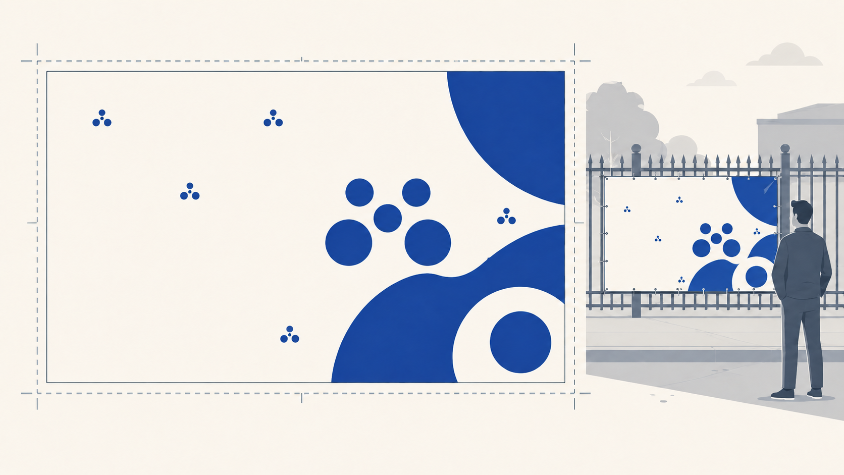
Banner artwork is the most forgiving file type in large format, and that is exactly why it goes wrong. Designers assume a big rectangle cannot fail preflight, then the file arrives with live fonts, no bleed, or a headline sized for a screen instead of a street. The fixes take minutes; the reprints do not.
Here is exactly how to set up PVC banner artwork for us, from our file requirements plus the handful of banner-specific decisions that decide whether the finished job reads from where it will actually be seen.
The file requirements
Every banner file we take is a print-ready PDF, and print ready means:
- Trim box set to the finished size. If the banner is 2000 x 1000mm, the trim box is 2000 x 1000mm. This is how our system reads what the finished banner should be.
- At least 3mm bleed. Extend backgrounds and any edge-to-edge colour at least 3mm past the trim. Set it in your document setup (3mm on all sides) so the bleed box carries into the exported PDF.
- All fonts outlined. Convert every piece of text to outlines before export (Type > Create Outlines in Illustrator). Fonts occasionally fail to embed correctly in exported PDFs, and a file that previews perfectly can then print in a substituted font, or drop the text entirely. On a banner, that failure is three metres wide. Outlining removes the risk completely.
- CMYK colour mode, with raster effects set high (300ppi) in your document setup.
To verify a file before sending, open it in Acrobat, go to Print Production > Set Page Boxes, and check the TrimBox reads your finished size with the bleed outside it. If the dimensions show as out by less than 0.1mm, ignore it, that is a known Acrobat display glitch and does not affect output.
Design for the viewing distance, not the artboard
The single biggest banner artwork mistake is not technical. It is designing at arm's length for something read from across a road.
A banner on a fence line gets a passing glance from metres or tens of metres away. At that distance, fine detail vanishes, thin type shimmers into nothing, and subtlety is invisible. What survives is bold contrast, big type, and one clear message.
Practical rules:
- One message, dominant. A banner is a glance medium. The hierarchy should be brutal: one hook the size of the banner's job, support copy well below it, and nothing competing.
- Size type for the distance. Zoom to 100% at a section of final size, step back from your screen, and ask whether it reads. Better still, print an A3 tile of a section at full scale and tape it across the room.
- Contrast beats palette. Light-on-dark or dark-on-light carries; mid-tone-on-mid-tone dies in sunlight and shade alike.
- Photographic backgrounds need discipline. Busy imagery behind type is the classic self-inflicted legibility wound. If the photo matters, panel the type on a solid block.
Respect the edges: finishing lives there
Banner edges are working zones, not display space. Hems fold material back, eyelets punch through the border, rope runs inside the hem, and keder edges disappear into track. Artwork consequences:
- Keep text, logos and critical content well inside the face. Anything that must not be interrupted stays clear of the perimeter, treat the outer zone generously and nothing gets folded, punched or swallowed.
- Avoid thin borders around the banner edge. A narrow keyline at the perimeter makes every hem fold and slight variance visible. Drop the border or make it bold enough to survive.
- Tell us the finishing at quoting. Hem, eyelets, rope or keder each carry their own edge allowance, and nominating the finish with the artwork lets us handle it correctly. For keder jobs going into frame systems, order to the frame system's graphic size spec rather than the frame's visual opening, and send that spec with the job. Our banner finishing guide covers which finish suits which install.
Very large banners: a word on file size
We print banners up to 2400mm x 20 metres, and at the top end of that range, full-size files with high-resolution imagery get enormous. Vector artwork scales without weight, so logo-and-type banners are no problem at any size. Where a very long banner is image-heavy and the file becomes unmanageable at finished size, talk to us before you improvise a scaling approach, and we will agree the setup for that job rather than have you guess. The trim box rule still governs: whatever we agree, the file must unambiguously describe the finished size.
Colour on banners
Standard CMYK practice applies, with two banner-specific notes:
- Proof heavy solids in CMYK before sign-off. Big areas of saturated colour are the whole design on many banners, and they are exactly where RGB-to-CMYK shifts show most. Design in CMYK from the start.
- Think about the banner's life when choosing coverage. Heavy dark coverage fades soonest under Australian sun, so a banner that must look sharp in year two or three favours a lighter palette, or a budgeted reprint. Our durability guide covers the honest lifespan numbers.
Pre-send checklist
- Print-ready PDF, document in CMYK, raster effects high (300ppi)
- Trim box = finished size, 3mm bleed minimum on all sides
- Fonts outlined
- One dominant message, type sized for the real viewing distance
- Critical content kept well inside the face, no thin edge borders
- Finishing nominated (hem, eyelets, rope or keder), keder jobs supplied with the frame system's graphic spec
- Very large image-heavy banners: setup agreed with us first
- Verified in Acrobat: Print Production > Set Page Boxes, TrimBox at finished size
Frequently Asked Questions
What file format do you need for banner artwork? A print-ready PDF in CMYK, with the trim box set to the finished banner size, at least 3mm of bleed, and all fonts converted to outlines. Outlining matters because fonts can fail to embed in exported PDFs and print substituted, and on a banner that mistake is metres wide.
How much bleed does a banner need? At least 3mm on all sides. Extend backgrounds and any edge-to-edge colour past the trim so finishing and cutting never expose an unprinted sliver. Set the bleed in your document setup so it carries into the exported PDF's bleed box.
What resolution should banner artwork be? Build the document at finished size with raster effects set high (300ppi), and keep logos and type as vector, which scales without weight. For very long, image-heavy banners where a full-size file becomes unmanageable, contact us before scaling and we will agree the setup for the job.
How big should text be on a banner? Sized for the real viewing distance, not the artboard. A banner is read in a glance from metres away, so the hook should dominate the face, supporting copy sits well below it, and thin or small type that looks fine at arm's length simply disappears on site. Test by viewing a full-scale section from across the room.
Why does artwork need to stay away from the banner edges? Because finishing lives there: hems fold the edge back, eyelets punch through the border zone, and keder edges disappear into track. Critical content placed near the perimeter gets folded, punched or swallowed, and thin edge borders make every fold visible. Keep the important content well inside the face.
Do I need to tell you the finishing when I send artwork? Yes, nominate it at quoting, hem, eyelets, rope or keder, so the edge allowances are handled correctly. For keder banners going into frames, supply the frame system's graphic size spec, which is the size the system tensions to rather than the frame's visual opening.
Key takeaways
- Supply a print-ready CMYK PDF: trim box at finished size, 3mm bleed, fonts outlined, verified in Acrobat's Set Page Boxes.
- Design for the viewing distance: one dominant message, bold contrast, type tested at full scale.
- Edges are working zones, keep critical content inside the face, skip thin borders, and nominate the finishing at quoting.
- Keder jobs are ordered to the frame system's graphic spec, sent with the job.
- Vector scales free; for very large image-heavy banners, agree the file setup with us before improvising.
- Design heavy solids in CMYK from the start, and factor fade honestly into ink-heavy long-term banners.
Send print-ready banner artwork
Set up right, a banner file goes straight through preflight and onto the press. Mediapoint prints trade-only, blind-shipped PVC banners on premium 500gsm stock up to 2400mm x 20m, finished with hems, clear eyelets, rope or keder to suit the install. Start with the PVC banner guide to spec the job, then send your print-ready PDF through for a quote with the finishing nominated.