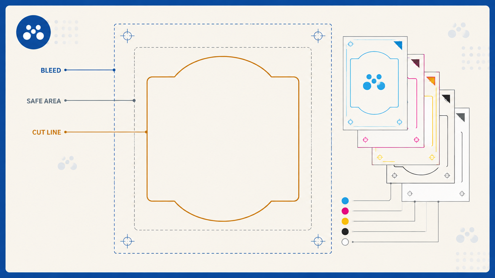
Most label reprints are not caused by the print. They are caused by artwork that was set up wrong: no bleed, text too close to the edge, a cut line that was a fill instead of a stroke, or white ink that did not separate properly. Every one of those is avoidable in about two minutes if you know what the printer actually needs.
This is exactly how to set up roll label artwork for us, straight from our production requirements. Follow it and your file goes to print first time, without a preflight query bouncing back.
The general rules that apply to every label
These apply whether your label is a simple square or a custom die-cut shape.
- Colour mode: CMYK. Set your document to CMYK, not RGB. RGB colours shift on conversion, so design in the colour space the label actually prints in.
- Pantones: Pantone C (Solid Coated) spot colours. If your artwork relies on a specific Pantone, specify it as a Pantone Solid Coated (C) spot colour so it is unambiguous.
- Bleed: 3mm. Extend your background and any colour that runs to the edge 3mm past the trim, so there is no white sliver if the cut moves slightly.
- Safe area: 5mm internal. Keep all important content, text, logos, anything that must not be clipped, at least 5mm inside the trim. This is because there can be up to 2mm of movement during cutting, and a 5mm safe margin absorbs that comfortably.
- Fonts: converted to outlines. Outline all type before export so there is no font substitution at our end.
- File format: PDF artwork only. Supply a print-ready PDF. It is the reliable, predictable format for production.
The 5mm safe area is the single most common thing people get wrong. Thin borders are the trap: a 1mm keyline around the edge of a label will look uneven if the cut shifts even slightly, showing more border on one side than the other. Either avoid thin edge borders entirely, or make them generous enough that a small movement does not show. Our design-tips guide to bleed and crop marks covers the underlying principle in more depth.
Square and circle labels: let our system do the cut
For standard square, rectangle, and circle labels, the setup is simple, because our system handles the cut line for you.
- No cut line needed. Do not draw your own cut line on square or circle labels. Our system adds it.
- Trimbox = your quoted size. Set the PDF trimbox to match the size you were quoted, for example 100 x 100mm.
- Bleedbox = trimbox plus 3mm. So a 100 x 100mm label has a 106 x 106mm bleedbox (3mm on every side).
That is it for standard shapes. Set the boxes correctly, extend the bleed, respect the safe area, and the file is ready.
Custom-shape labels: the Thru-cut line
Custom die-cut shapes need one extra step: you supply the cut line, and it has to be set up precisely.
- Cutline as a spot colour named "Thru-cut". Create a spot colour named exactly Thru-cut and draw your cut path in it.
- Thru-cut must be a stroke, not a fill. The cut path has to be a stroke. A filled shape will not read as a cut line.
- Thru-cut size matches the quoted size. The cut line should match the dimensions you were quoted, for example 100 x 100mm.
- 3mm bleed past the Thru-cut. Extend your artwork 3mm beyond the Thru-cut stroke, just as you would past a trim edge, so there is no unprinted edge if the cut moves.
- Trimbox matches the quoted size as well.
The two most common custom-shape errors are drawing the cut as a fill instead of a stroke, and forgetting to bleed past it. Get those two right and a custom shape is as reliable as a square.
White ink: setup for clear and silver stocks
Clear BOPP and silver BOPP need a white underprint so your colours read as solid rather than translucent or muted over the stock. Here is exactly how to set that up.
- White as a spot colour named "White". Create a spot colour named exactly White.
- Build it C10 M0 Y0 K0. That light cyan build is how the white separation is defined in the file.
- White prints first, CMYK over the top. In production the white ink lays down first, then your CMYK artwork prints over it. So anywhere you want solid colour on clear or silver, there needs to be white underneath it.
Because white and overprint behaviour is easy to get wrong, verify it before you send:
- Use Acrobat's Print Production > Output Preview to view the separations and confirm the artwork is set up correctly.
- Turn on Simulate Overprinting so the preview reflects how it will actually print.
- Check each separation, including the White spot plate, to confirm the white is where you expect it and the overprint settings are as intended.
Overprint is honoured on our end, so it must be set deliberately in your artwork rather than left to chance. If overprint is set wrong, elements can drop out or print over each other unexpectedly. The Output Preview check catches this before it becomes a reprint.
A pre-send checklist
Before you export and send, run through this:
- Document in CMYK, Pantones set as Pantone C spot
- 3mm bleed on all edges
- All key content inside the 5mm safe area
- Fonts outlined
- Square/circle: no cut line drawn, trimbox = quoted size, bleedbox = +3mm
- Custom shape: Thru-cut spot colour, stroke not fill, matches quoted size, 3mm bleed past it
- Clear/silver stock: White spot colour (C10 M0 Y0 K0), white under the CMYK, checked in Output Preview with Simulate Overprinting on
- Exported as print-ready PDF
Frequently Asked Questions
How much bleed do label files need? 3mm of bleed on every edge. Extend any colour or artwork that runs to the edge 3mm past the trim (or past the Thru-cut line on custom shapes), so there is no unprinted white edge if the cut moves slightly during production.
Why keep text 5mm from the edge? Because the cut can move by up to 2mm during production. A 5mm internal safe area gives that movement room to happen without clipping your text, logos, or other critical content. It also means thin edge borders are risky, since a small shift makes them look uneven.
Do I need to add a cut line to my label artwork? Only for custom shapes. For square, rectangle, and circle labels, do not draw a cut line, our system adds it. For custom die-cut shapes, supply the cut path as a spot colour named "Thru-cut", drawn as a stroke rather than a fill, matching your quoted size, with 3mm of bleed past it.
How do I set up white ink for clear or silver labels? Create a spot colour named "White" built as C10 M0 Y0 K0, and place it under any artwork that needs to read as solid. The white prints first and your CMYK prints over the top. Check it in Acrobat's Output Preview with Simulate Overprinting turned on, and review each separation including the White plate before sending.
What file format should I supply? A print-ready PDF, in CMYK, with fonts outlined. Set the trimbox to your quoted size and the bleedbox 3mm larger on each side. PDF is the only artwork format we take for labels, because it is predictable and reliable through production.
Key takeaways
- Design in CMYK, specify Pantones as Pantone C spot colours, and supply a print-ready PDF with fonts outlined.
- 3mm bleed on every edge, and a 5mm internal safe area to absorb up to 2mm of cut movement.
- Square and circle labels need no cut line, our system adds it. Trimbox = quoted size, bleedbox = +3mm.
- Custom shapes need a Thru-cut spot colour, drawn as a stroke not a fill, matching quoted size with 3mm bleed past it.
- Clear and silver stocks need a White spot colour (C10 M0 Y0 K0) under the CMYK, white prints first.
- Verify white and overprint in Acrobat Output Preview with Simulate Overprinting on before sending.
Send us print-ready label artwork
Set up correctly, label artwork goes straight to print with no back-and-forth. Mediapoint runs trade-only, blind-shipped roll labels across white, clear and silver BOPP and matt paper, laser cut with a clean edge and turned around from two business days. Have a look at roll labels or send your print-ready PDF through for a quote.