Roll Label File Setup: A Designer's Guide
Roll label file setup mistakes are the most common cause of prepress delays in trade label work. A file with missing bleed, incorrect colour space, unconfigured white ink, or a malformed dieline goes back to the designer for revision — and the production schedule slips. For sign shops, design studios, and trade resellers fulfilling roll label orders, getting the file setup right at the artwork stage is what separates the jobs that flow cleanly through production from the ones that bounce back.
This guide walks through Mediapoint's roll label file setup requirements with the actual technical specifications: document setup, bleed and safe area, colour configuration, the white ink workflow for clear and silver BOPP substrates, dieline preparation for custom shapes, and export settings. The audience is designers preparing roll label artwork and trade customers checking incoming client files before submission.
For sizing-specific guidance (dimensions, dielines, application sizing), see our roll label sizing and specifications reference. For substrate selection, see our trade printer's guide to roll label materials. This article covers the file preparation workflow that applies across all roll label work regardless of substrate or application.
Important: the specifications in this article reflect Mediapoint's current roll label production requirements. Specifications can change as production capabilities evolve. For large or critical jobs, confirm current requirements with Mediapoint trade support before final file submission. The customer is responsible for ensuring supplied artwork meets the specifications for the intended product and application.
The five non-negotiable file requirements
Before getting into specifics, these five requirements apply to every Mediapoint roll label file. Files that miss any of these go back for revision before production starts.
- PDF format only (exported with bleed enabled)
- CMYK colour space throughout (not RGB)
- 3mm minimum bleed on all four sides (5mm preferred for larger labels)
- Fonts converted to outlines before export
- Pantone spot colours specified as Pantone C references for brand-critical work
These five aren't negotiable. Files missing any of them won't process through prepress correctly. The rest of this article covers the workflow details that produce files meeting these requirements.
Document setup
The foundation of clean file setup is correct document configuration before any design work starts. Three things to get right at the new document stage.
Document size at 100% of finished label size
Build the document at the actual finished dimensions of the label. If the label is 90 × 100mm, the document is 90 × 100mm. Don't design at a larger scale and ask the printer to scale down — and don't design at a smaller scale planning to scale up. Scaling raster content softens images and shifts colour; vector content scales cleanly but the whole prepress workflow assumes 100% size files. Working at finished size from the start removes a category of problems entirely.
Bleed configured at 3mm minimum
When creating the document, set the bleed to 3mm on all four sides. In Adobe Illustrator: File > New Document > Advanced > Bleed: 3mm top/bottom/left/right. In Adobe InDesign: File > New Document > Bleed and Slug section, set Bleed to 3mm. This configures the bleed area as part of the document setup, which is what makes the bleed export correctly later.
For larger labels (over 100mm in any dimension) or labels with critical content near the trim edge, 5mm bleed is safer than 3mm. There's no production cost difference for larger bleed — it's purely insurance against trim drift.
CMYK colour space
Set the document colour mode to CMYK at the new document stage, before placing any imagery or applying any colour. Designing in RGB and converting to CMYK at export is one of the most common causes of unexpected colour shifts on printed labels. Brand colours that look vivid on screen render duller in print when the colour space conversion happens late in the workflow.
In Adobe Illustrator: File > Document Color Mode > CMYK Color. In InDesign: documents default to CMYK; verify in File > Document Setup.
Bleed and safe area in detail
The three-zone discipline that separates files that flow cleanly through prepress from files that bounce back.
Trim box
The trim box is the finished cut line — where the label actually ends. This dimension must match the quoted finished size exactly. For a 90 × 100mm label, the trim box is 90 × 100mm.
In the artwork file, the trim box is the document size you set at the new document stage. The system reads this dimension as the cut line. For custom-shape labels, the trim box should be the bounding box of the custom shape (the smallest rectangle that contains the entire shape).
Bleed box
The bleed box extends 3mm (or 5mm for larger labels) outside the trim on all four sides. Background colour, photographic imagery, and any decorative elements that visually fill the label to the edge must extend into the bleed area.
A common error: designing artwork to the exact trim dimensions with no extension. When the cutter trims to the trim line, any drift produces a thin white sliver along one or more edges where the substrate wasn't covered by ink. Bleeding the artwork 3mm beyond trim absorbs the cutter's natural drift and produces clean edges.
Safe area
The safe area is 5mm inside the trim edge. Critical content — brand names, logos, product names, mandatory compliance text (allergen declarations, pregnancy warnings, dangerous goods symbols) — must sit within the safe area.
The reason: Mediapoint's production can have up to 2mm of cutting movement. Content positioned within 2-3mm of the trim edge risks being clipped or sitting too close to the cut line for clean presentation. The 5mm safe area provides comfortable margin for the cutting tolerance.
For trade customers checking client artwork: scan the file for any critical text or logo elements within 5mm of the trim. If anything's encroaching, flag with the client and request the design be adjusted before submission.
Colour configuration
Roll label colour reproduction depends on correct colour space, correct Pantone specification, and correct white ink configuration for clear and silver BOPP substrates.
CMYK throughout the file
Every element in the file should be CMYK. This includes placed images, illustrated graphics, applied colour fills, and brand colour references. RGB elements in a CMYK document get converted by the prepress system at processing time, and the conversion never matches what the designer saw on screen during design.
For placed photographs: convert from RGB to CMYK in Photoshop before placing into the design file. Use the appropriate CMYK profile (typically U.S. Web Coated SWOP v2 for commercial print) and soft-proof the result before committing.
For brand colours: specify in CMYK values directly, or use Pantone spot colours.
Pantone C spot colours for brand-critical work
When the client has specific brand colours that must match across multiple SKUs or production runs, specify them as Pantone Coated (C) spot colours. Mediapoint's profile produces the closest CMYK match available to each Pantone C reference, consistent from job to job.
The Pantone library that matches Mediapoint's BOPP and paper roll label substrates is Pantone+ Solid Coated. Don't use Pantone Uncoated references for roll label work — the substrates are coated finishes (paper has a coated face; BOPP is a film substrate). The Uncoated library produces different colour builds that won't match expectations on coated stock.
For winery and brand clients with strict brand colours: a sample print before the full production run confirms the colour fidelity matches the client's expectations. The cost of a sample is much smaller than the cost of a reprint with off-brand colour.
Rich black builds
Pure C0 M0 Y0 K100 prints as a slightly washed-out grey on most substrates including BOPP and paper labels. For deep blacks where visual weight matters (premium label backgrounds, headline text on a dark label, sophisticated brand identities), build a rich black with additional CMY ink underneath the K plate.
A standard rich black build is C40 M30 Y30 K100. This adds depth without compromising the cleanness of the black. Don't use rich black for fine text or thin lines — the small registration drift between plates can cause coloured fringes around very small elements. Pure K100 is correct for fine text and thin lines.
The white ink workflow for clear and silver BOPP
White ink is the file setup requirement that catches more designers than any other. It applies to clear BOPP and silver BOPP substrates and is essential for opaque colour reproduction. Files supplied without white ink configuration produce washed-out or muted printed results that disappoint clients.
Why white ink is required
Clear BOPP is a transparent substrate. Without a white ink layer underneath colour artwork, printed colours render see-through, with the bottle or container background showing through and interfering with brand colour appearance. Silver BOPP has a metallic substrate. Without white ink underneath colour artwork, printed colours render muted and grey-shifted because the metallic surface reflects through the ink.
In both cases, white ink prints as a base layer, with CMYK colour printed on top. The white provides an opaque white background underneath the colour, producing the vivid colour rendering the client expects.
The technical specification
White ink is configured as a spot colour in the artwork file. The spot colour must be:
- Named exactly "White" (capital W, no variations like "White Ink" or "WHITE")
- Color Type: Spot Color (not Process)
- Color Mode: CMYK (with values that don't matter for the print output — the spot colour reference is what drives the print, not the CMYK preview values)
In Adobe Illustrator: Open the Swatches panel > New Swatch > Swatch Name: White > Color Type: Spot Color > Color Mode: CMYK > Set CMYK values to any visible colour (often C10 M0 Y0 K0 for a light blue preview that's visually distinct from process colours). Click OK to save the swatch.
Where to apply white ink in the artwork
White ink should be applied as a fill or stroke underneath every area of the artwork where opaque colour reproduction is required. Practically, this means:
- Underneath solid colour areas where the brand colour must appear vivid
- Underneath text and logos requiring opaque rendering
- Underneath any photographic content
- Underneath illustrated graphics with solid colour fills
White ink should NOT be applied:
- Underneath areas intentionally designed to show the container colour through (e.g., transparent design elements showing wine through the label on clear BOPP)
- Outside the visible label area
- In areas where the design intentionally uses the substrate's own appearance as part of the visual
The overprint setting
White ink prints first; CMYK colour prints on top. For this to work correctly, the CMYK elements must be set to overprint on top of the white ink layer. If overprint isn't set, the CMYK ink "knocks out" the white underneath, producing the opposite of the intended effect — white shows through gaps in the colour rather than acting as a base.
The standard approach is to set the white ink swatch with "Overprint Fill" enabled in the Attributes panel. This tells the printer to maintain the white ink layer where colour overlaps with it.
Verifying the white ink layer before submission
Use Adobe Acrobat's Print Production output preview to verify the white ink is configured correctly before submitting the file:
- Open the exported PDF in Adobe Acrobat
- Tools > Print Production > Output Preview
- In the Output Preview dialog: enable "Simulate Overprinting"
- The preview should show how the file will print, including the white ink layer behaviour
- Under "Separations," select each separation individually to verify the white ink spot colour is present and correctly positioned
- Verify that overprint settings are as intended — CMYK overprints on top of white, not vice versa
This verification step takes two minutes and catches the most common white ink errors. Files that pass this check generally pass Mediapoint's prepress check too.
Dieline preparation for custom shapes
Mediapoint runs labels in three shape categories: rectangles, squares and circles, and custom shapes. The file setup requirements differ by category.
Rectangles and squares
No cut line required in the artwork. Mediapoint's production system adds the cut line based on the trim box dimensions specified in the document. Set the trim box to the finished label size, set the bleed at 3mm, and that's the entire setup for rectangular labels.
This applies to most roll label work — wine front and back labels, beer bottle labels, food product labels, household chemical labels, beverage labels. The simplest case from a file setup perspective.
Circles
Same approach as rectangles. No cut line required. The system adds the cut line based on the trim box dimensions, which for circular labels should be the bounding box of the circle (width = height = diameter). Bleed extends 3mm in all directions beyond the circle outline.
Applications: jar-lid labels, cosmetic pot labels, beer crown labels, food product seal labels, decorative roundels.
Custom shapes
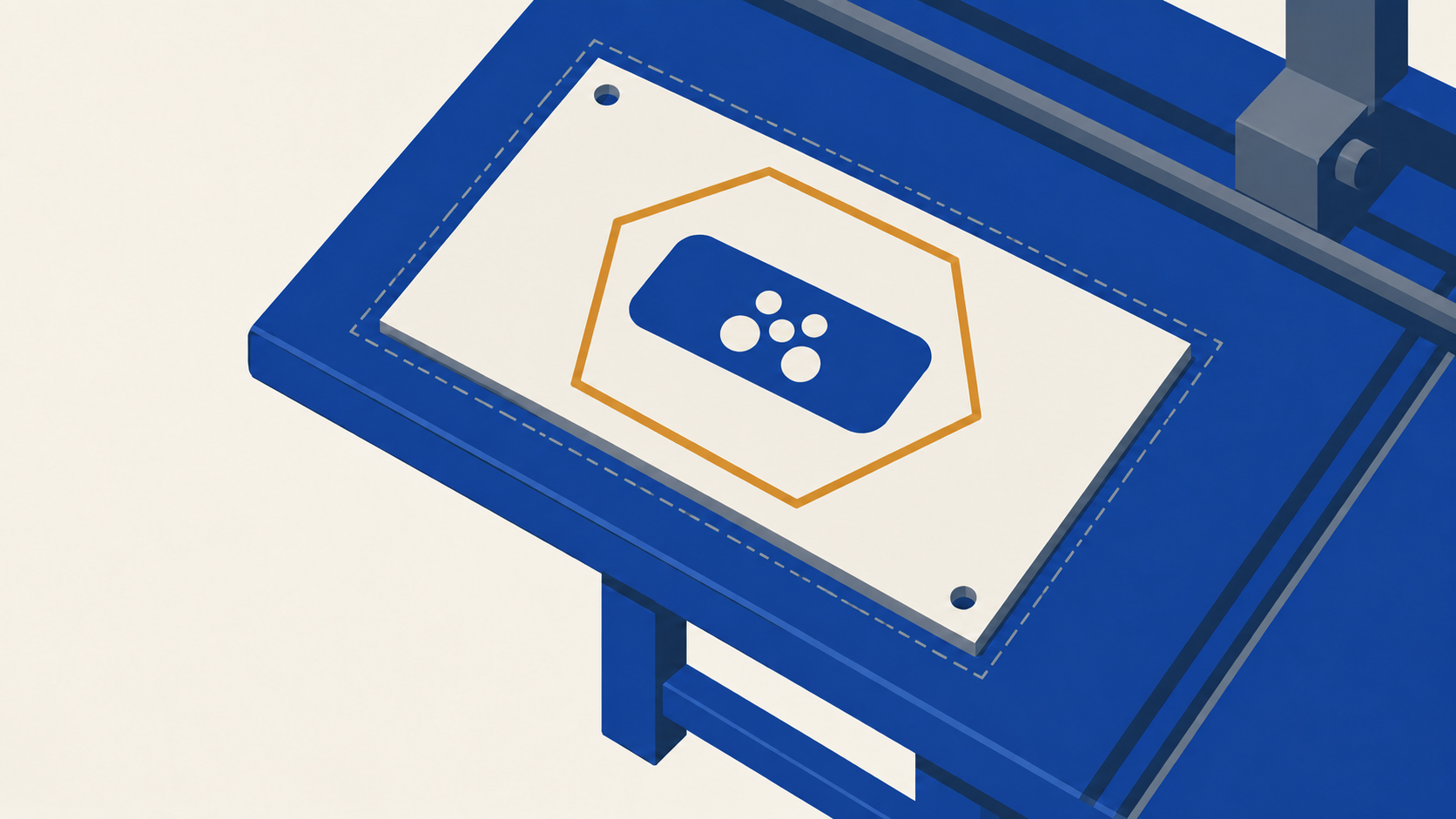
Anything that isn't a rectangle, square, or circle requires an explicit dieline in the artwork file. This is the most common source of file setup errors on incoming artwork.
The dieline specification:
- Drawn as a vector path (not a raster outline; not a placed image)
- Defined as a spot colour stroke (not a fill, not a process colour)
- Spot colour named exactly "Thru-cut" (capital T, hyphen, lowercase c-u-t)
- Stroke alignment centred on the path (not inside or outside)
- Closed path (no open ends)
- Trim box matches the Thru-cut path dimensions exactly
- 3mm bleed extends past the Thru-cut stroke on all sides
- One Thru-cut path per file (multiple cut paths confuse the production workflow)
In Adobe Illustrator: create the dieline path, open Swatches panel > New Swatch > Name: Thru-cut > Color Type: Spot Color > Color Mode: CMYK > Set CMYK to any visible colour (often magenta or cyan for visibility against the design). Apply the Thru-cut swatch as a stroke to the dieline path, not a fill. In the Stroke panel, set the alignment to "Align Stroke to Center."
Common custom-shape applications: wine labels with curved tops following the bottle shoulder, label outlines following branded product silhouettes, decorative badge shapes for limited editions, custom labels for unusual containers.
Verifying the dieline before submission
In the exported PDF, the Thru-cut path should be visible as a spot colour overlay on top of the artwork. Use Adobe Acrobat's Output Preview to verify:
- Tools > Print Production > Output Preview
- Under Separations, scroll to find the Thru-cut spot colour
- Toggle the Thru-cut separation on and off to verify it's present and follows the expected outline
- Verify the Thru-cut path is centred on the cut line (not offset to inside or outside)
- Verify the artwork extends 3mm beyond the Thru-cut path on all sides
Image and graphic requirements
Beyond colour space and bleed, raster and vector content has specific requirements for clean reproduction on roll labels.
Resolution for raster content
300dpi at 100% size for all raster content (placed photographs, raster graphics, scanned imagery). This applies regardless of label size — a small label viewed close-up needs the same resolution as a larger label viewed from the same distance.
Common error: photography pulled from websites or social media platforms at screen resolution (72-150dpi) placed into label artwork. The image looks fine on screen during design but renders soft and pixelated when printed. The fix is to request high-resolution source files from the original photographer or graphic creator before completing the design.
Vector vs raster guidance
- Logos, typography, illustrations with hard edges: always vector. These need crisp edges at any scale and must survive the prepress workflow without degradation.
- Photography and complex gradients: raster is fine, provided it's 300dpi at 100% size.
- Brand graphics with both vector and raster elements: export the vector elements as vector paths and the raster elements as embedded high-resolution images. Don't rasterise vector logos to "simplify" the file — it permanently degrades the logo quality.
Outlined fonts
All text in the artwork file must be converted to outlines before export. This is a Mediapoint requirement and a sound practice generally. Embedded fonts can fail at the RIP (the prepress system that processes the file for the press) and substitute incorrectly. Outlining text converts it to vector shapes, removing the substitution risk.
In Adobe Illustrator: select all text > Type > Create Outlines. In InDesign: select text > Type > Create Outlines.
After outlining, the text is no longer editable as text. Keep an editable master file with live text separate from the export-ready file for future revisions.
File export settings
The export step is where a well-set-up document either becomes a print-ready file or quietly breaks. Five things to get right.
PDF format
Mediapoint accepts PDF only — no native Illustrator (.ai), InDesign (.indd), Photoshop (.psd), JPEG, PNG, or TIFF files. PDF reliably preserves vector data, embedded fonts (or outlines), colour profiles, and spot colour information through the prepress workflow.
In Adobe Illustrator: File > Save As > Adobe PDF (.pdf). In Adobe InDesign: File > Export > Adobe PDF (Print). In Photoshop: File > Save As > Photoshop PDF.
PDF preset
Use the High Quality Print preset as the starting point. This preset preserves vector data, embeds fonts (relevant if you haven't outlined them, though outlining is required), and maintains print-ready resolution on raster content.
For Illustrator and InDesign: the High Quality Print preset is available in the PDF export dialog under "Adobe PDF Preset." Select it as the starting point, then adjust the bleed and marks settings as described below.
Bleed settings turned ON at export
In the PDF export dialog, navigate to "Marks and Bleeds" (or similar section depending on the application). Enable "Use Document Bleed Settings" or manually configure 3mm bleed on all four sides.
This is critical. The bleed configured in the document doesn't automatically export — it has to be explicitly enabled at the export stage. Without this checkbox enabled, the exported PDF ends at the trim line, regardless of how the document was set up.
No marks
Do NOT add trim marks, registration marks, or colour bars for rectangular roll label artwork. Mediapoint's production workflow doesn't require them, and including them complicates prepress processing. The bleed itself provides the production reference; printer's marks are unnecessary.
Exception: for custom-shape artwork where the Thru-cut spot colour layer is the production cut reference, no additional cut marks are needed — the Thru-cut path serves the purpose.
File size limit
Maximum file size is 2GB. Most roll label files come in well under this. If a file approaches the limit, the issue is almost always unflattened high-resolution imagery — typically a 600dpi or higher photograph that doesn't need to be that resolution at the label size. Trim unnecessary image resolution, re-export, and the file size drops dramatically.
Filename convention
Include the finished size, quantity, and (for multi-design orders) a unique identifier in the filename. Standard format: "90mm x 100mm qty 500.pdf" or for multi-design: "90mm x 100mm qty 500 wine label red.pdf".
For trade customers running regular volume: build this convention into your client intake template. Files that arrive with clear filenames flow through prepress faster.
Common file setup problems
The file-level problems Mediapoint's prepress team sees most often on incoming roll label artwork. For trade customers receiving client artwork from designers, this is the catch-list.
Bleed missing or insufficient
Consequence: white slivers on one or more trim edges. Watch for: artwork built to exact trim dimensions with no extension. Fix: set up 3mm bleed on all sides of the document, extend background colour and imagery into the bleed, enable bleed in PDF export settings.
RGB images placed without CMYK conversion
Consequence: shifted colours, particularly brand colours and photography skin tones or product colours. Watch for: photography or graphics exported direct from RGB-based workflow (Lightroom, Photoshop with RGB working space) without conversion. Fix: convert all images to CMYK in Photoshop before placing in the layout. Soft-proof before committing.
White ink missing on clear or silver BOPP files
Consequence: washed-out (clear) or muted grey-shifted (silver) colour rendering on the printed substrate. Watch for: clear or silver BOPP artwork without a spot colour layer named "White". Fix: create the White spot colour swatch, apply it as fill underneath all opaque colour areas, set overprint correctly, verify in Acrobat output preview.
Custom-shape dieline drawn as black ink instead of Thru-cut spot colour
Consequence: prepress can't identify the cut line; file rejected for revision. Watch for: cut line drawn as a regular black line in the artwork. Fix: change the swatch to a new spot colour named exactly "Thru-cut", colour type Spot Color, apply as stroke (not fill) on the cut path.
Trim box and Thru-cut path don't match dimensions
Consequence: prepress receives conflicting size information. Watch for: custom-shape artwork where the document trim box dimensions differ from the Thru-cut path's bounding box. Fix: align both — set the trim box to match the Thru-cut path exactly.
Fonts not outlined
Consequence: font substitution at the RIP; printed label uses the wrong typeface. Watch for: exported PDFs with live text. Fix: convert all text to outlines before exporting. Keep an editable master file with live text for future revisions.
Critical content within 3mm of trim edge
Consequence: production trim drift can clip critical text or logos. Watch for: brand names, compliance text, or important elements positioned right at the design edge. Fix: maintain 5mm safe area inside trim for all critical content.
Pantone Uncoated references on coated substrates
Consequence: brand colours render differently than the client expects. Watch for: Pantone Uncoated swatches used for label artwork (the substrates are coated). Fix: replace with Pantone Coated (C) references, or specify CMYK values directly with consultation with the client's brand guidelines.
Overprint applied unintentionally
Consequence: elements print over underlying colours and produce unexpected results. Watch for: design elements with unintended overprint settings. Fix: check overprint state in Acrobat Output Preview before submission. Adjust any unintentional overprint to "knockout" instead.
File submitted as JPEG, PNG, or native design file
Consequence: file rejected at submission; production delay. Watch for: clients submitting "the design as a JPEG" or providing the native Illustrator/InDesign file. Fix: PDF only; export from the native application with bleed enabled and fonts outlined.
The pre-flight checklist
Before submitting any roll label file, run through this checklist. Catches the issues that account for most prepress kick-backs.
- Document set up at 100% of finished label size, not scaled
- CMYK colour space throughout (no RGB elements)
- 3mm bleed on all four sides (5mm preferred for larger labels)
- All raster images at 300dpi minimum at 100% size
- All fonts converted to outlines
- Pantone references specified as Pantone Coated (C) for coated substrates
- Rich black builds (C40 M30 Y30 K100) used for solid dark backgrounds
- White ink configured for clear or silver BOPP work (spot colour named "White", applied underneath opaque colour, overprint correctly set)
- Custom-shape dieline configured as Thru-cut spot colour stroke (centred alignment, closed path, matching trim box)
- Critical content positioned at least 5mm inside trim edge
- File exported as PDF with bleed settings enabled
- No trim marks, registration marks, or colour bars added
- Filename includes finished size, quantity, and identifying detail
- Final file size under 2GB
- Output Preview verified in Adobe Acrobat (separations checked, overprint behaviour confirmed)
Frequently asked questions
Can I supply artwork in a different format than PDF?
No. Mediapoint accepts PDF only. Other formats (JPEG, PNG, TIFF, native Illustrator or InDesign files) won't process through the prepress workflow. PDF is the only format that reliably preserves vector data, spot colours, and colour profiles through production.
What if my client's designer uses Affinity, CorelDraw, or another design tool instead of Adobe?
The principles in this article apply regardless of design software. The specific menu paths and dialog locations differ, but every professional design application supports CMYK colour space, document bleed configuration, spot colour swatches, and PDF export with bleed enabled. The designer should confirm their software's specific workflow for each of the requirements.
Why does Mediapoint require fonts to be outlined?
The prepress system that processes files for the press (the RIP) can substitute fonts if it doesn't have the original font installed or can't read the embedded font correctly. The substituted font produces unexpected results on the printed label. Outlining converts text to vector shapes, removing the substitution risk entirely. The trade-off is that outlined text can't be edited, so designers should keep a separate editable master file for revisions.
Can I use Pantone Coated references for paper labels?
Yes. Pantone Coated (C) is the correct library for both paper and BOPP roll labels at Mediapoint. The substrates are coated finishes that respond to colour reproduction the way coated paper stocks do. Pantone Uncoated (U) would produce different colour builds that don't match expectations.
How precise does the white ink layer need to be?
The white ink layer should align closely with the opaque colour areas above it. Small registration drift between the white and CMYK plates is normal and acceptable — the prepress system handles this. What matters is that white ink is present where opaque colour is required and absent where the substrate's appearance is intentionally part of the design.
What if my client doesn't supply a high-resolution version of their logo?
The logo should be supplied as a vector file (AI, EPS, or SVG). If only a raster version exists, request the original vector file from the client's brand identity work — it should exist somewhere. As a last resort, the raster logo should be at high resolution (300dpi or higher at the size it'll appear on the label), but vector is always preferred for crisp reproduction.
Key takeaways
The points worth remembering when preparing or checking roll label artwork.
PDF only, exported from the design application with bleed enabled. No other format works through Mediapoint's prepress workflow.
CMYK colour space throughout — no RGB elements anywhere in the file. Convert images before placing.
3mm minimum bleed on all four sides (5mm preferred for larger labels). Critical content stays 5mm inside the trim edge for production cutting tolerance.
Fonts converted to outlines before export. Pantone Coated (C) references for brand-critical colour work.
White ink spot colour named exactly "White" for clear and silver BOPP substrates. Applied underneath opaque colour areas with correct overprint behaviour.
Custom-shape dielines configured as Thru-cut spot colour strokes, centred alignment, closed path, matching the document trim box.
Run the pre-flight checklist before every submission. Five minutes of file verification catches the issues that account for most prepress rework.
Verify white ink and dieline configuration in Adobe Acrobat's Output Preview before submitting. The two-minute verification step prevents the most common preventable errors.
Working with Mediapoint on roll label artwork
Mediapoint's prepress system runs file checks at submission, but files set up correctly the first time skip the back-and-forth and move straight to production. Standard turnaround starts from the next business day after file approval, for files received before the daily cut-off. Order minimum is $120 + GST per job. Trade pricing is available for design studios, sign shops, and resellers running regular roll label volume.
View our roll labels product page for current ordering options and substrate variants. For sizing guidance, the roll label sizing reference covers dimensions, dielines, and application-specific sizing decisions. For substrate selection, the roll label materials guide covers the four substrate options and their applications.
A final note on file submission responsibility: the file specifications in this article reflect Mediapoint's current production requirements and may be updated as production capabilities evolve. The customer is responsible for ensuring supplied artwork meets specifications for the intended product, substrate, and application. For large or business-critical jobs, confirm current specifications with Mediapoint trade support before final file submission.