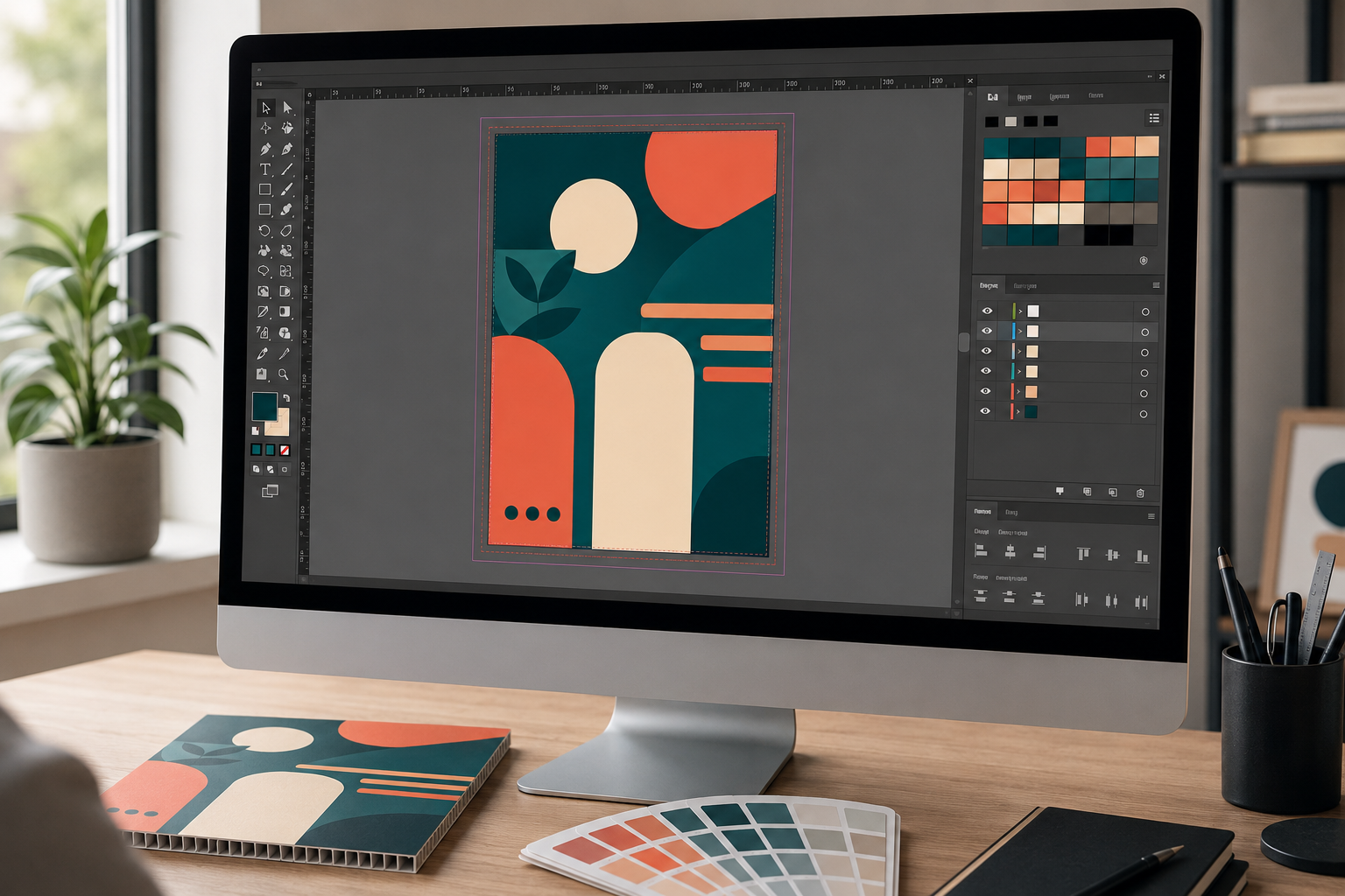
How to Set Up Print Files for Corflute Signs: A Designer's Guide
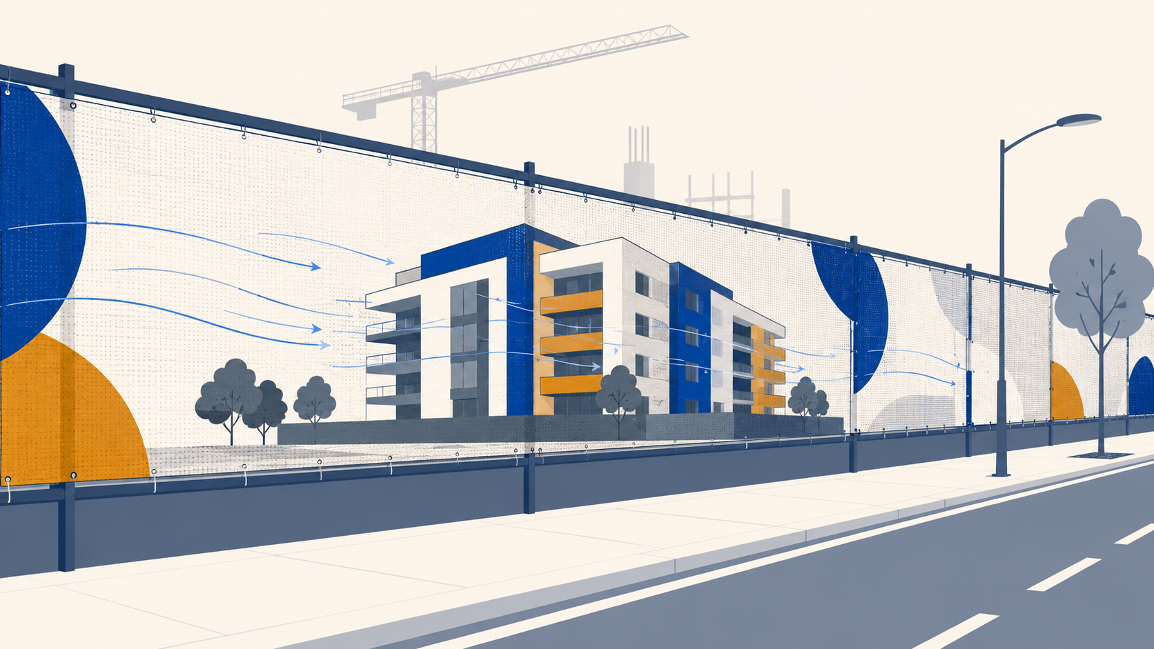
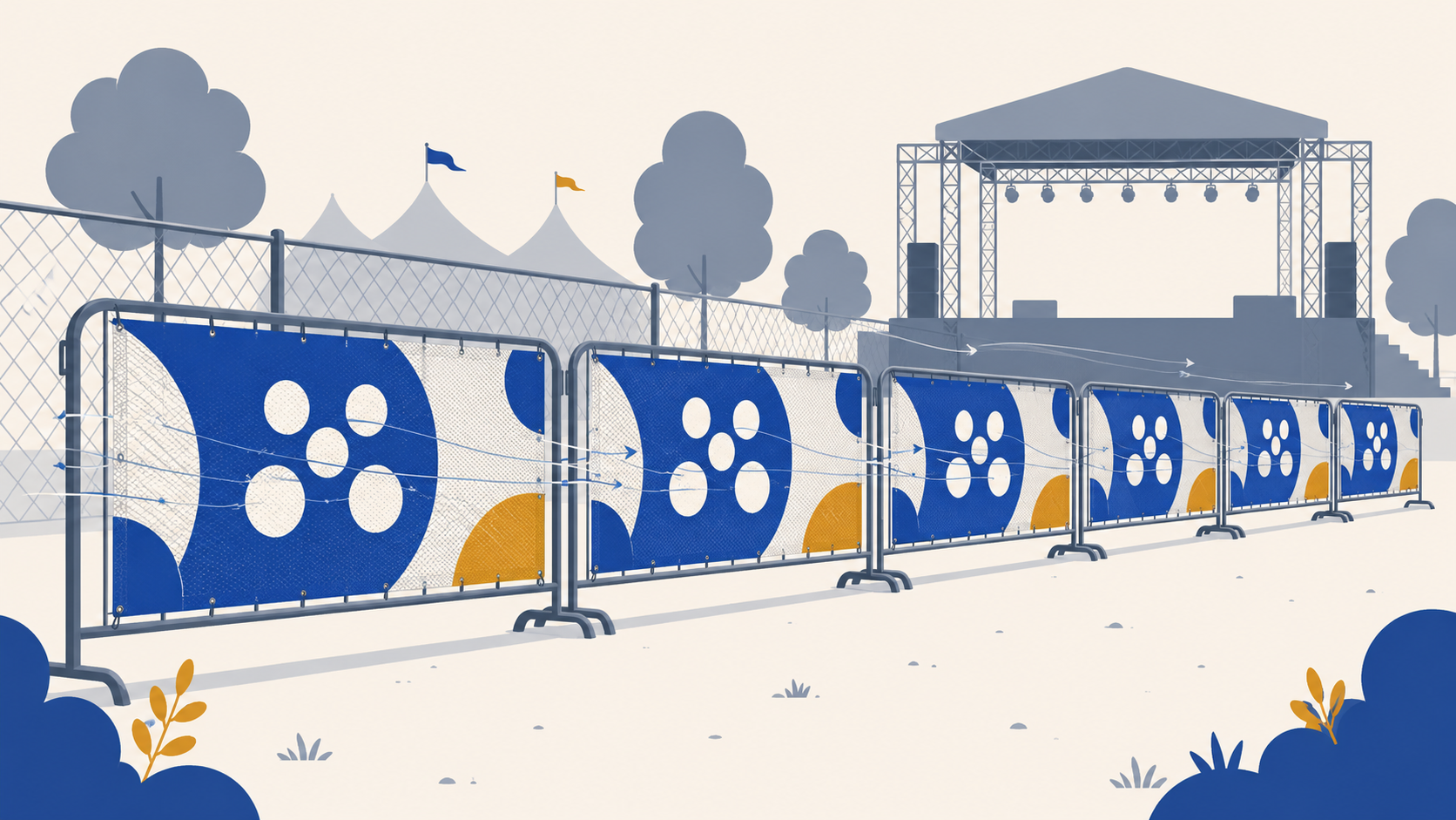
Corflute is the Australian default for outdoor signage. Real estate, events, construction, election campaigns. The artwork that goes onto it has to survive a press run, a sheet cutter, and 12 to 24 months of Australian weather. File setup mistakes that don't matter on a business card become very visible on a 600 × 900mm corflute sign printed at 100% size.
This guide walks through the file setup essentials specifically for corflute, drawing on Mediapoint's prepress requirements and the design principles that make corflute artwork actually work in the field. The goal is a file that goes through prepress without intervention, prints right the first time, and holds up in the conditions it was designed for.
For the comprehensive overview of corflute signage in Australia (material specs, durability, custom shapes, applications) see the complete guide to corflute signs in Australia. This article is the focused companion piece on artwork setup.
Important: this article reflects Mediapoint's current file setup specifications and general corflute prepress practice. Specifications may change over time, and large or critical jobs benefit from confirming current requirements with Mediapoint before submission. The customer is responsible for ensuring the supplied artwork meets the specifications for the intended product and application.
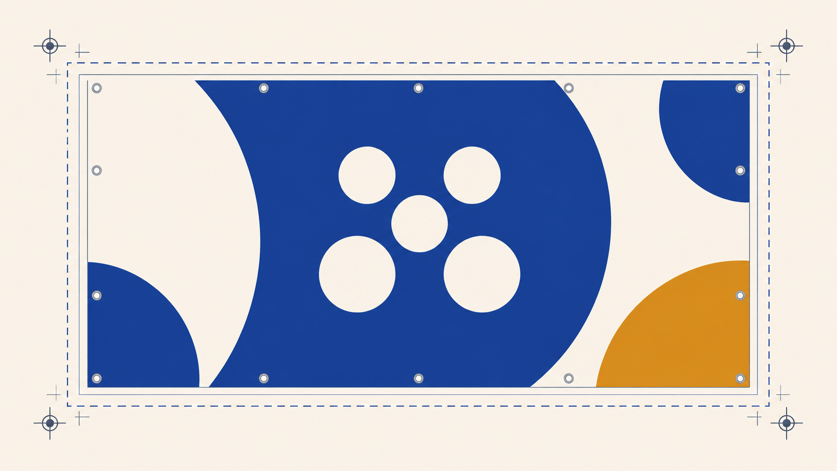
Document size and bleed
Set the document up at the finished size, at 100%, with bleed extending past the trim edge. That is the foundation. Everything else in the file setup follows from these three things being right.
Why 100% size matters
Build the document at the actual finished dimensions of the sign. If you are designing a 600 × 900mm picket sign, your document is 600 × 900mm. Don't design at half scale and ask the printer to scale it up at their end. Scaling raster content up in prepress softens the image and shifts colour. Vector elements scale fine, but everything raster (photos, textures, anything that isn't a clean vector shape) loses fidelity. Working at 100% from the start means what you see is what comes off the press.
Mediapoint's standard sizes
Three standard corflute sizes do most of the work in Australia: 600 × 900mm (close to A1, but slightly larger), 600 × 450mm (close to A2), and 900 × 1200mm (close to A0). These sizes are standard because they tile efficiently into the 2440 × 1220mm master sheet, which makes them cheaper to produce per piece than custom sizes. If your job can be designed to a standard size, designing to a standard size will save your client money. For a deep dive on standard sizing and how sheet yield drives pricing, see our reference guide to standard corflute sign sizes.
Bleed: 3mm minimum
Bleed is the extra artwork that extends past the trim edge. It exists because no cutting process is mathematically perfect. Sheet cutters drift by a fraction of a millimetre on each pass, and without bleed that drift produces a thin white sliver on one or more edges of the trimmed sign. Mediapoint's minimum bleed for single-sided Corflute Print Only is 3mm on all four sides. For double-sided artwork on the Corrugated Plastic product, bleed extends to 5mm minimum to allow for registration drift between the two passes. If your file is going onto Corflute Print Only, design with 3mm bleed and you are safe.
Trim box, bleed box and safe zone
Three boundaries matter on a print file. The trim box is the finished cut line — where the sign actually ends. The bleed box is 3mm beyond the trim, where artwork extends to absorb cutter drift. The safe zone is 5 to 10mm inside the trim, where critical content (text, logos, key imagery) should sit so that any trim drift doesn't eat into it. Background colour and imagery extend to the bleed box. Critical content stays inside the safe zone. Everything in between is acceptable but not protected. This three-zone discipline is what separates a forgiving file from a fragile one.
Resolution for outdoor viewing
The standard rule for print is 300dpi at 100% size. For corflute, that rule has nuance worth understanding.
300dpi is essential for text-heavy signs read from close distance: interior office display boards, A-frame inserts that pedestrians read from a metre away, anything where a viewer's eye is doing detailed work on the surface. At those viewing distances, 150dpi raster looks soft and 72dpi looks pixellated.
For very large signs viewed from 20+ metres (highway-adjacent signage, major construction hoardings) 300dpi is technically overkill. The human eye cannot resolve that level of detail at distance. Some print contexts allow lower resolution for big-distance work to keep file sizes manageable. Corflute is not one of those contexts. Mediapoint's prepress system flags low-resolution files regardless of intended viewing distance, and sending below 300dpi risks the file being kicked back for revision.
The practical guidance: build all raster content at 300dpi at 100% size, every time. It avoids the rejection, it gives you headroom if the artwork ever gets repurposed at a closer viewing distance, and it makes the prepress conversation simpler. The extra file weight is rarely worth optimising against the rework risk.
CMYK and colour for outdoor signs
Print is a CMYK process. RGB is a screen colour space; it describes light emitted from a display. CMYK describes ink absorbed by a substrate. The two systems can't produce identical colours, and what looks vivid on screen can look noticeably duller in print. The conversion is what catches designers out.
CMYK only
Mediapoint accepts CMYK only. RGB files will be converted in prepress, and the conversion never matches what you saw on screen. The fix is to design in CMYK from the start. Set up your document in CMYK colour space, place CMYK images, soft-proof everything in your design app before exporting. RGB-to-CMYK conversion at the end is the most common cause of 'that's not the colour I designed' conversations after a print run goes through. This is particularly relevant for designers working on real estate signs, where agent headshot skin tones can shift noticeably under late-stage RGB-to-CMYK conversion; for the broader treatment of real estate-specific design conventions including photography reproduction, brand compliance and franchise colour requirements, see our real estate corflute signs guide.
Pantone matching
If your client has brand colours that need to match across jobs, specify them as Pantone C spot colours in the artwork. Mediapoint's profile produces the closest possible CMYK match to the Pantone reference. The match is consistent from job to job, but it is not perfect because corflute is not a coated stock. For brand-critical work, confirm the CMYK build with the client before a large run.
Outdoor UV and which colours fade first
This is corflute-specific guidance that designers from a stationery or packaging background might not know. Sustained outdoor UV breaks down printed inks unevenly. Magenta and yellow are the first to shift. A bright pink or orange brand element that looks perfect on day one will look noticeably tired at 18 months in direct Australian sun. Cyan, blue and black hold up longer. If the design depends on magenta or yellow for legibility (text colour, brand colour for the call-to-action), consider higher saturation builds, or a complementary colour treatment that doesn't depend on the colour holding for the full life of the sign.
Building rich blacks
Pure C0 M0 Y0 K100 prints as a slightly washed-out grey on most substrates, including corflute. For deep blacks where the visual weight matters (large background fills, headline text on a dark sign) build a rich black: something in the range of C40 M30 Y30 K100. The added CMY ink underneath the K plate gives the black its depth. Don't use rich black for fine text or thin lines, because the small registration drift between plates can cause coloured fringes; pure K100 is correct for those.
Vector vs raster artwork
Vector artwork is defined mathematically and scales without losing quality. Raster artwork is a grid of pixels and softens when scaled up beyond its native resolution. Knowing what to use where is the basis of clean print files.
Logos and text: always vector
Logos, typography, icons, illustrations with hard edges. Always vector. They need to remain crisp at any scale, and they need to survive prepress processing without degradation. A vector logo at 5cm or 50cm renders identically. A raster logo at the same sizes renders progressively softer as it scales up.
Photography and gradients: raster is fine
Property photos, agent headshots, lifestyle imagery, complex gradients with smooth tonal transitions. These work as raster, provided they are at 300dpi at 100% size. Vector versions of photographic content don't exist (photographs are inherently raster), so the goal is to start with high enough resolution that scaling doesn't become an issue.
Outline all fonts before exporting
This is a Mediapoint requirement and a sound practice generally. Convert all live text to outlines before exporting the PDF. Embedded fonts can fail at the RIP (the prepress system that processes your file for the press) and substitute incorrectly, which means your carefully chosen typeface arrives on the press as Arial. Outlined fonts become vector shapes, which removes the substitution risk entirely. The trade-off is that outlined text cannot be edited in the PDF, so always keep an editable master file separately.
Custom shapes and Thru-cut
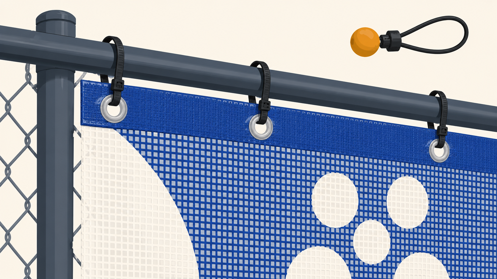
If your sign uses a custom outline shape rather than a rectangle, the cut path needs to be a vector spot-colour stroke named exactly 'Thru-cut', with stroke alignment set to centre, as a closed shape. One Thru-cut path per file. The rules are specific because the cutter follows the spot colour directly. Our mounting hardware guide covers Thru-cut setup in detail; for now, just know that custom shapes are absolutely available, and the file setup is precise.
File format and export
The export step is where a well-set-up document either becomes a print-ready file or quietly breaks. Five things to get right.
PDF only
Mediapoint accepts PDF only. No native Illustrator (.ai), InDesign (.indd), Photoshop (.psd), JPEG, PNG, or TIFF files. PDF is the only format that reliably preserves vector data, embedded fonts (or outlines), and colour profiles through the prepress workflow. If you work in Illustrator or InDesign, the export step matters more than the design step for whether the file survives prepress.
File size limit
Maximum file size is 2GB. This is generous and most corflute files come in well under it. If your file is approaching 2GB, the issue is almost always an unflattened raster image at unnecessary resolution (a 600dpi photograph that doesn't need to be 600dpi, or an embedded TIFF that should have been a compressed JPEG). Trim the raster content, re-export, the file shrinks dramatically.
Marks and bleeds settings
In your PDF export dialog, turn the document bleed settings ON. This is what tells the export engine to extend artwork past the trim into the bleed area you set up in the document. Without this checkbox, your bleed disappears at export and the printer receives a file that ends exactly at the trim line. Don't add trim marks, registration marks or colour bars for rectangular corflute artwork; Mediapoint prefers the file without them.
Pages, not spreads
Multi-design corflute orders should export as separate single pages, not facing-page spreads. If you have three designs in one InDesign document, export them as a 3-page PDF where each page is one design at finished size. Spreads (two pages laid out side-by-side as you'd see in a printed magazine) confuse the prepress system because each 'page' is actually two designs.
Overprint check
Overprint is a print attribute that tells the press to print one ink colour on top of another rather than knocking out the underneath colour. It exists for good reasons (deliberate colour mixing, fine black text on colour) but it can be applied accidentally. Any element set to overprint will print over what's underneath it, which can produce unexpected results — a black logo set to overprint will appear darker against a coloured background, but lighter background imagery may show through it. Check the overprint state of your file in PDF output preview (Acrobat Pro has this; most design apps have a similar overprint preview mode) before submitting. Accidental overprint is one of the more common causes of 'that's not what I designed' reprints.
Common corflute file mistakes
These are the file-level problems that cost designers the most time. Each one is preventable with a thirty-second check before exporting.
Bleed missing or insufficient
Consequence: white slivers on one or more trim edges. Fix: set up 3mm bleed on all sides of the document, extend background colour and imagery into the bleed area, turn ON the bleed setting in your PDF export.
Fonts not outlined
Consequence: font substitution at press; the sign prints with the wrong typeface. Fix: convert all text to outlines before exporting. Keep an editable master file with live text for future revisions.
RGB images placed without conversion
Consequence: shifted colours, particularly skin tones and brand colours. Fix: convert all images to CMYK in Photoshop before placing them in the layout. Soft-proof before approving.
Resolution too low
Consequence: pixellated or soft images on the printed sign. Fix: 300dpi at 100% size for all raster content. If you don't have a 300dpi version, request the source file from the photographer or client rather than working from a website-grade JPEG.
Filename doesn't include size and quantity
Consequence: prepress delays while order details are confirmed against the file. Fix: use the convention '600mm x 900mm qty 50.pdf' (covered in detail in the next section).
Overprint applied unintentionally
Consequence: elements print over underlying colours and produce unexpected results. Fix: check overprint settings in PDF output preview before submitting.
Sending double-sided artwork to a single-sided product
Consequence: order delay while the right product is selected. Fix: confirm the product type before designing. Mediapoint's Corflute Print Only is single-sided. For double-sided signs (most agency real estate boards, sandwich boards, A-frame inserts read from both sides), use the Corrugated Plastic product instead. The bleed requirement also changes: 3mm for single-sided, 5mm for double-sided.
Filename naming convention
Filename matters more than designers tend to expect. Trade printer prepress workflows handle thousands of files a week. Filenames that include the order details let prepress staff schedule, sheet up, and quote the job in a single glance, without opening the file or cross-referencing the order.
Mediapoint's convention is straightforward: include the finished size and quantity in the filename. The standard format is '600mm x 900mm qty 50.pdf'. That filename tells the prepress team everything they need to schedule the job, without ambiguity. Compare that to a generic filename like 'final_v3.pdf' or 'artwork_FINAL_FINAL.pdf', which adds a manual step every single time the file is touched.
For multi-design orders (three different designs printed in the same job, for example), use unique filenames per design: '600mm x 900mm qty 50 design A.pdf', '600mm x 900mm qty 50 design B.pdf', and so on. This is especially important when client artwork comes in stages over a few days; clear filenames prevent the wrong version going to press.
This is one of those small habits that designers who work with trade printers regularly have already built. If you are new to trade work, building it now will save you and your printer hours over the course of a year.
Pre-flight checklist before submitting
Five minutes before you hit 'send', run through this list. It catches the artwork problems that account for the majority of prepress kick-backs.
- Document set up at 100% size, not scaled
- 3mm bleed on all four sides (single-sided Corflute Print Only) or 5mm bleed (double-sided Corrugated Plastic)
- CMYK colour space throughout, with Pantone C spot colours for any brand match requirements
- All raster images at 300dpi minimum at 100% size
- All fonts converted to outlines
- Filename includes finished size and quantity, e.g. '600mm x 900mm qty 50.pdf'
- PDF exported with bleed settings turned ON
- No trim marks, registration marks or colour bars on rectangular artwork
- Multi-design orders exported as separate pages, not spreads
- Overprint state checked in PDF output preview
- Final file size under 2GB
- Right product confirmed (Corflute Print Only for single-sided, Corrugated Plastic for double-sided)
Key takeaways
If you only remember a handful of points from this guide, these are the ones that prevent the most reprints.
PDF only, maximum 2GB, set up at 100% size.
3mm bleed for single-sided Corflute Print Only. 5mm bleed for double-sided Corrugated Plastic.
300dpi for all raster content. CMYK colour space throughout. Fonts outlined before export.
Filename convention: '600mm x 900mm qty 50.pdf'. Include the size and quantity, every time.
Most reprints are caused by missing bleed, RGB images not converted to CMYK, or unintentional overprint. A five-minute pre-flight catches all three.
Working with Mediapoint on corflute artwork
Mediapoint's prepress system runs file checks at submission, but files set up correctly the first time skip the back-and-forth and move straight to production. Turnaround starts from the next business day after file approval, for files received before the daily cut-off. Trade pricing is available for resellers, sign shops and design studios with regular volume.
View our Corflute Print Only product for current sizing and ordering options. If you are designing for a sign that will be visible from both directions, the Corrugated Plastic product is the double-sided alternative. Either way, the file setup principles in this guide apply; only the bleed requirement changes.
A final note on file specifications: Mediapoint's file setup requirements reflect current production capabilities and may be updated as production processes evolve. For large or business-critical jobs, confirm current specifications with Mediapoint before final file submission. The customer is responsible for ensuring supplied artwork meets the specifications for the intended product, application and ordering parameters.