In the vibrant world of commercial printing, colour plays a pivotal role in capturing attention and conveying messages. Yet, the colours you see on your screen don’t always translate directly onto paper.
This discrepancy lies in the fundamental difference between the RGB (Red, Green, Blue) colour model used by electronic displays and the CMYK (Cyan, Magenta, Yellow, Key/Black) colour model that dominates commercial printing.
Understanding why CMYK is the industry standard over RGB is crucial for anyone looking to produce printed materials that accurately reflect their vision. Whilst much of this will be taken care of thanks to software default settings / your graphic designers – it’s handy to understand why this colour model is used.
The Basis of CMYK in Printing
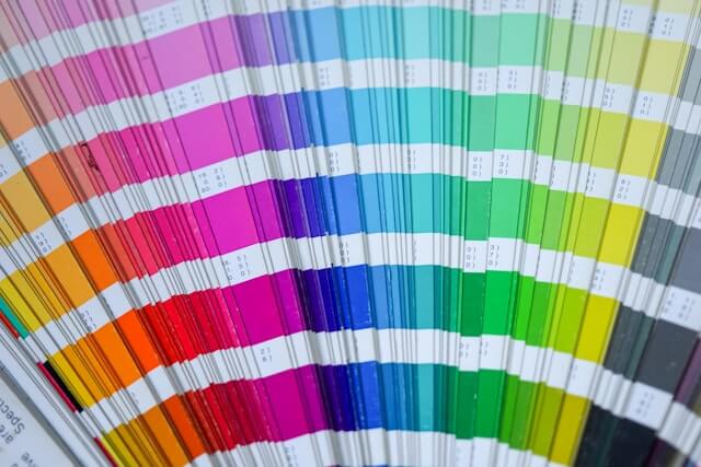
The CMYK model is essentially a subtractive colour model used in colour printing. Unlike RGB, which adds light to create colours (additive colour model), CMYK works by subtracting brightness from white light, reflecting specific colours back to the eye.
This process is more aligned with the way printed materials are consumed—through the reflection of light rather than the emission of light.
1. CMYK is Complementary to the Printing Process
Commercial printing equipment is designed to apply inks in the CMYK spectrum. This system is a direct descendant of the four-colour printing process, where each colour layer is applied separately to build up the final image.
The use of CMYK inks is tailored to this process, allowing for a wide range of colours to be produced by overlaying these four basic colours in varying intensities.
2. Greater Material Versatility
The CMYK model’s reliance on physical ink makes it highly adaptable to a variety of printing surfaces, whether it’s paper, cardboard, fabric, or even plastic.
This versatility is crucial for commercial printing, where the demand spans across numerous types of materials, each with its own ink absorption and colour reflection properties.
3. Cost-Effectiveness of CMYK
Printing in CMYK is economically more viable for mass production. The RGB model, with its reliance on light to create colours, is not suitable for printing on physical media.
CMYK inks, on the other hand, can be mixed in precise quantities to achieve the desired hues without the need for additional colours, keeping the production costs manageable.
Addressing the Limitations of RGB in Printing
RGB’s primary limitation in the context of printing lies in its design for digital displays, which can produce a broader spectrum of colours by combining light.
When RGB images are converted for printing, for things like (signs, stickers or labels) some colours may appear muted or different because the CMYK colour space is inherently narrower.
This can lead to discrepancies between the on-screen preview and the final printed product, emphasising the importance of designing in CMYK for materials intended for printing.
Navigating Colour Conversion Between CMYK & RGB
The transition from RGB to CMYK can be managed with careful planning and understanding of colour spaces. Designers often work within this colour space when creating materials for print to ensure what they see on their screens closely matches the final output.
So if you or a customer have got a designer creating work for you it’s highly likely this is already taken care of. But it never hurts to double check!
Advanced software and colour management tools can also aid in predicting how colours will change during this conversion, allowing for adjustments before the printing process begins.